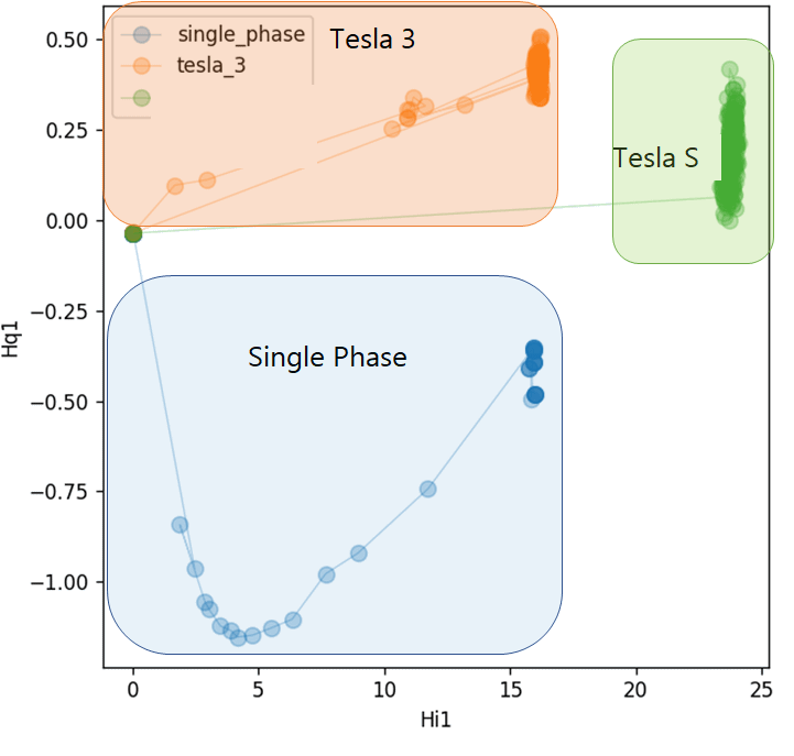
It started with a strange spike in our office energy data. I wasn’t even looking for anything serious. I was just curious why the EV chargers were suddenly drawing more power than usual. I pulled a few days of harmonic data (Hi1 and Hq1), tossed it into Python, and out came this scatter plot.
What I didn’t expect were three clear, well-formed clusters. No labels, no machine learning, just raw patterns in the way different cars pulled power. Tesla Model S, Model 3, and even single-phase EVs each left behind their own signature. A few hours of digging ended up revealing exactly how our chargers were being used.
Posted by Fluid_Dish_9635
6 comments
I followed a strange energy spike and ended up uncovering charging patterns hidden in plain sight. Full breakdown here if you’re curious:
[https://medium.com/@sriram1105.m/how-i-used-python-and-time-series-data-to-detect-energy-spikes-from-ev-chargers-bc90a8da35bc](https://medium.com/@sriram1105.m/how-i-used-python-and-time-series-data-to-detect-energy-spikes-from-ev-chargers-bc90a8da35bc)
Incomprehensible axis labels
Gah why is your legend not in the lower right corner
I think you meant to post this on r/dataisconfusing
WTF is Hi1 and Hq1
Since OP is apparently intentionally beinc cryptic, let me try to clarify:
Most people are aware that voltage is sent over AC power in a sin wave. The missing piece is that electrical devices draw current in a sin wave that can be out of sync. If you just plug in a resistor (a toaster), it’ll be in perfect sync, as the amps its drawing will rise and fall perfectly with the sin wave coming from the power company.
However when you make things more complicated by adding capacitors, inductors, semiconductors, etc, these waves become slightly out of sync.
Hi1 is measuring how much of these two waves are in sync with one another (think overlapping 2 sin waves), and is a measure of how much power goes into the batteries (or gets wasted as heat somewhere along the way)
Hq1 is measuring how much of these two waves are shifted by 90º (think overlapping a sin and cos wave), and is basically a measurement of energy not being used to charge the batteries, but that goes through the system before being returned
I’m struggling to come up with a great analogy, but maybe this works: When you order food at a restaurant, your primary goal is to get food (Hi1), however in order to get this food you also need to borrow some plates from the restaurant (Hq1). Power companies need to have enough power to supply this borrowed energy, even though they get it back.
So, exactly how are your chargers being used?
That’s the claim.
So, how does this graph show how chargers are being used?
Comments are closed.