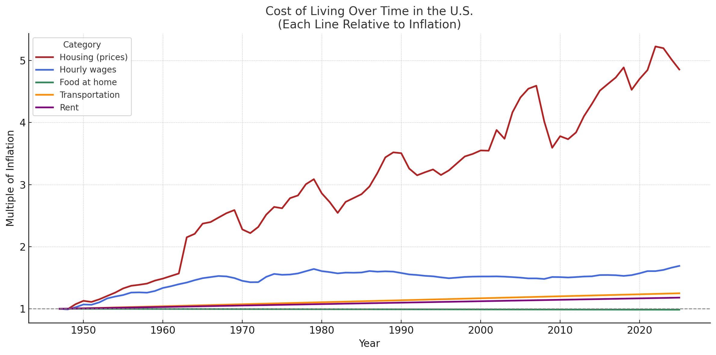
Suspicious that rent is decoupled from housing here.
Scaling the Y axis as a multiple of a rate is an interesting decision — clearly the intent is to represent that housing price increase is outpacing inflation as a whole, but the 4 metrics seemingly unmoving may not be very helpful. When the rate of inflation is already ~1200% since 1950, perhaps mapping inflating and the increase of housing prices specifically in reference may be a better pick?
Look at all the decades of adults who didn’t do fucking anything about this
Not really a beautiful chart, although it is informative.
What’s your source for the data?
How has rent stayed flat if housing hasnt
Crazy what happens when demand for housing goes up but you don’t build any housing where people want to live.
Is nobody reading the graph?
A line at y=1 means it’s at pace with inflation. So if inflation is 2% and this computer is 1,000. The line would be flat if the price rose by $20.
What this graph tells us is which prices are increasing RELATIVE to inflation. Not the price of an item normalized.
Yeah data is not beautiful here…The U.S. Department of Housing and Urban Development considers housing to be affordable when it consumes no more than 30% of a household’s gross income. Households exceeding this threshold are deemed “cost-burdened,” and those spending over 50% are classified as “severely cost-burdened.” In 2023, nearly half (49.7%) of renter households in the U.S. were cost-burdened.
All of the old homeowners I know have the complain about rising numbers of homeless people in their neighborhoods. Sounds like a nice problem to have.
I think healthcare and tuition fees should be pretty interesting additions to the graph. But apart from home prices those lines looj suspiciously flat.
@OP do you actually have multiple timestamps or just a begin and end value interpolated as a straight line in between?
House “price” isn’t the right metric. You need “mortgage payment to income ratio per square foot” to account for interest rates, income and housing size if you want to compare “affordability” over time for anyone with a mortgage. “Price” is only valid for cash buyers.
it’s a chart about cost of living but is presented in a way that suppresses the actual information presented by being packaged with the “housing (prices)”, just not great presentation visually, and data wise just terrible, not to mention how it’s presented annually
Rent has more than tripled in most places over the last 20 years. In busy areas, places that used to cost 600/mo are going for 2400 or more now. Prices for everything else have gone up too, but there’s no way it’s had a linear correlation unless it’s considered a major aspect of inflation.
Yet the cost of love has remained the same: free 🙂↕️
This seems incorrect. Rent has definitely gone up significantly.
Yet the percent of homeowners in USA has risen between 1960 and now (an always hovered in the 60% range). Soooooo….how do we explain that? Very curious.
Garbage graph. No way transportation, rent, and food are linear over time.
I’m not American, I do not live in America but I can 100% say without a doubt that this graph is clearly utter bullshittery
Dang, not beautiful, just another graph that’s meaningless to someone colorblind.
Curious to see other competing countries. Canada, UK, Germany, Australia, NZ, France, etc
Easy, just pull yourself up from your bootstraps /s
Looks more like the loss of value of the American dollar.
Just adjust everything by inflation or include inflation CPI in the chart and index everything.
![[OC] Cost of Living Over Time in the U.S.](https://www.europesays.com/wp-content/uploads/2025/05/6fzgyrtj3m1f1-1920x1024.jpeg)
25 comments
Suspicious that rent is decoupled from housing here.
Scaling the Y axis as a multiple of a rate is an interesting decision — clearly the intent is to represent that housing price increase is outpacing inflation as a whole, but the 4 metrics seemingly unmoving may not be very helpful. When the rate of inflation is already ~1200% since 1950, perhaps mapping inflating and the increase of housing prices specifically in reference may be a better pick?
Look at all the decades of adults who didn’t do fucking anything about this
Not really a beautiful chart, although it is informative.
What’s your source for the data?
How has rent stayed flat if housing hasnt
Crazy what happens when demand for housing goes up but you don’t build any housing where people want to live.
Is nobody reading the graph?
A line at y=1 means it’s at pace with inflation. So if inflation is 2% and this computer is 1,000. The line would be flat if the price rose by $20.
What this graph tells us is which prices are increasing RELATIVE to inflation. Not the price of an item normalized.
Yeah data is not beautiful here…The U.S. Department of Housing and Urban Development considers housing to be affordable when it consumes no more than 30% of a household’s gross income. Households exceeding this threshold are deemed “cost-burdened,” and those spending over 50% are classified as “severely cost-burdened.” In 2023, nearly half (49.7%) of renter households in the U.S. were cost-burdened.
All of the old homeowners I know have the complain about rising numbers of homeless people in their neighborhoods. Sounds like a nice problem to have.
I think healthcare and tuition fees should be pretty interesting additions to the graph. But apart from home prices those lines looj suspiciously flat.
@OP do you actually have multiple timestamps or just a begin and end value interpolated as a straight line in between?
House “price” isn’t the right metric. You need “mortgage payment to income ratio per square foot” to account for interest rates, income and housing size if you want to compare “affordability” over time for anyone with a mortgage. “Price” is only valid for cash buyers.
it’s a chart about cost of living but is presented in a way that suppresses the actual information presented by being packaged with the “housing (prices)”, just not great presentation visually, and data wise just terrible, not to mention how it’s presented annually
Rent has more than tripled in most places over the last 20 years. In busy areas, places that used to cost 600/mo are going for 2400 or more now. Prices for everything else have gone up too, but there’s no way it’s had a linear correlation unless it’s considered a major aspect of inflation.
Yet the cost of love has remained the same: free 🙂↕️
This seems incorrect. Rent has definitely gone up significantly.
Yet the percent of homeowners in USA has risen between 1960 and now (an always hovered in the 60% range). Soooooo….how do we explain that? Very curious.
Garbage graph. No way transportation, rent, and food are linear over time.
I’m not American, I do not live in America but I can 100% say without a doubt that this graph is clearly utter bullshittery
Dang, not beautiful, just another graph that’s meaningless to someone colorblind.
Curious to see other competing countries. Canada, UK, Germany, Australia, NZ, France, etc
Easy, just pull yourself up from your bootstraps /s
Looks more like the loss of value of the American dollar.
Just adjust everything by inflation or include inflation CPI in the chart and index everything.
Some other charts on house prices
Adjusted by inflation, mean I believe
https://fred.stlouisfed.org/series/QUSR628BIS
Unadjusted median
https://fred.stlouisfed.org/series/MSPUS
OP has cited ChatGPT as their[source](https://www.reddit.com/r/dataisbeautiful/s/OKxj3UWacQ). Take this all with a grain of salt
Just rent and you’ll be way better off than I the 50’s, wages have increased way more than food, rent and transportation. Or shitty data.
Comments are closed.