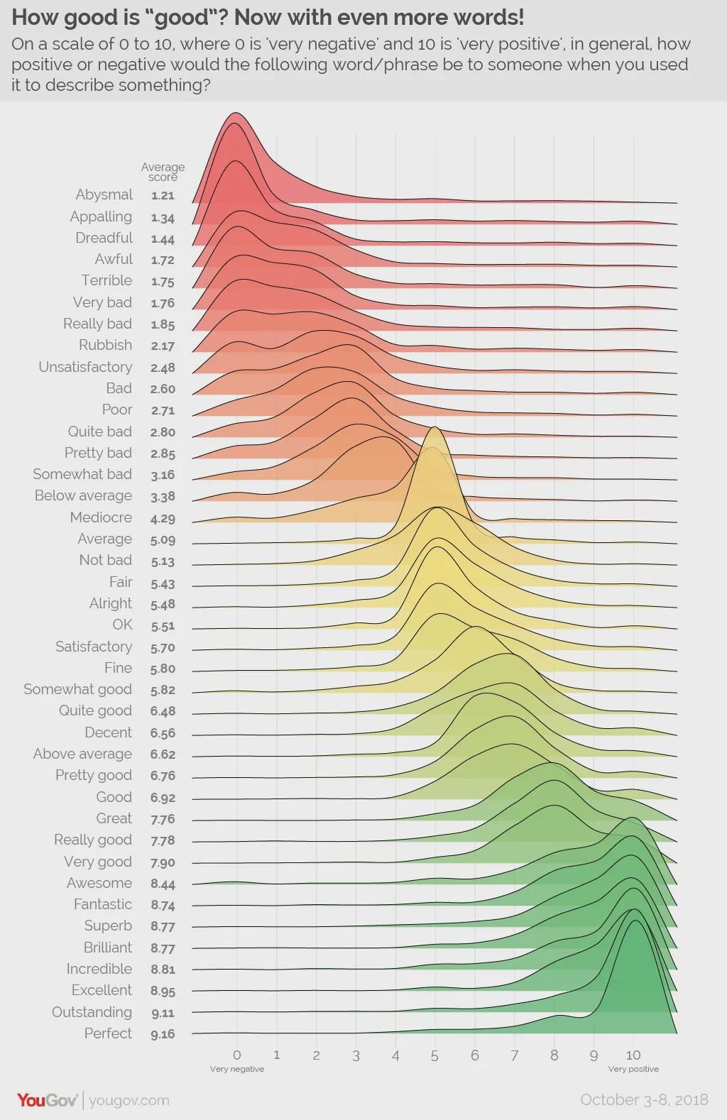
one guy like “this is perfect, by which i mean it’s about a 7.5 out of 10”
“Not bad” would be a couple notches higher for me. Maybe between satisfactory and fine.
This is fantastic data. I wouldn’t say it’s perfect, but it’s definitely above average.
My biggest personal difference is unsatisfactory should be a fair few places higher!
I’d say “good” is a lot worse than it’s rated there. If someone tells me something is good I wonder what’s wrong with it.
‘Rubbish’ is were ‘fucking rubbish’ would be.
Rubbish is ‘pretty bad’ not ‘really bad’.
For me, it’s equivalent to ‘a bit shit’.
I really like how below average is clustered around the middle.
The use of **Fine** really depends on context… It could be bottom, top and the middle all at once.
Need a second spike for the sarcastic voice versions of words like great and perfect
Below and above average = 10
Love that peak at ‘average’, best bit of the diagram for me.
Someone put Awesome as 0.
Perfect can be either a 10 or a 1 depending on how sarcastic I’m feeling.
Sad that “crap” isn’t featured
I would put incredible at a higher level than excellent but they are pretty close.
[deleted]
Abysmal I agree with 100%. I’ll never forget the collective dread mixed with disbelief in my class after my chemistry teacher told us we’d done “abysmally” in the class test 🤣
Honestly we need one just for the breadth of the word “Shit”.
The biggest outliers are “not bad” which I think could have gone anywhere from “somewhat good” to “very good” but should be a lot higher than it is. Also “perfect” which definitionally should be 10, it’s insane it’s not.
Also the pedantic nerd in me doesn’t like that the lines actually go past 0 and 10 and imply some people voted 11. 0 and 10 should be hard cutoff lines.
Why isn’t shite on the list?
I love stuff like this
This is piss poor
IMO Pretty bad should be worse than quite bad
Incredible > Excellent
Shambolic – higher or lower than abysmal?
‘Not Bad’ should cover between 2.70 to 8.70.
You’ve got ‘not bad’ but you need a ‘not bad at all’, which sits somewhere between excellent and outstanding.
I disagree with the data representation of this graph spilling over 10 and 0. x-axis should have a hard cutoff imo
How ironic that “Average” is not the average value…
I wouldn’t rank “quite good” below “above average”.
Great joy division record
Great, really good, and very good are back to front…
According to this list, you’d say Pretty Good to be better than Quite Good, however you’d say Quite Bad, rather than Pretty Bad.
We consider Quite and Pretty to have stronger meanings at different ends of the spectrum.
Noice
I would like to see “Mid” sampled like this. I can imagine two distinct peaks forming along mostly generational lines
this kind of graph is sometimes known as a joyplot.
In the right context alright can mean top notch.
Perfect: “Am I a joke to you?”
What I love about this is if you add standard levels of sarcasm the chart would flip completely.
There is a bump on abysmal at 5, there is also a bump on perfect at 5. What is worse for abysmal for that one person? Likewise, what is better than perfect?
Who are the muppets who gave “perfect” an 8?
I came here to say this. Fine dining, fine wines etc do not come below decent and somewhat good.
I thought it was a Joy Division album cover for a minute.
I suppose it still is, in a way.
I feel every strongly positive sentiment should have a significant peak in the very poor end of the scale.
Because if you’re going to use a word that strongly positive then your sarcasm likelihood is astounding.
why such a significant bump for 0-1 ratings for “awesome”?
45 comments
https://yougov.co.uk/society/articles/21568-how-good-good
https://d3nkl3psvxxpe9.cloudfront.net/documents/YouGov_Word_Sentiment.pdf
https://d3nkl3psvxxpe9.cloudfront.net/documents/YouGov_Word_Sentiment_2.pdf
one guy like “this is perfect, by which i mean it’s about a 7.5 out of 10”
“Not bad” would be a couple notches higher for me. Maybe between satisfactory and fine.
This is fantastic data. I wouldn’t say it’s perfect, but it’s definitely above average.
My biggest personal difference is unsatisfactory should be a fair few places higher!
I’d say “good” is a lot worse than it’s rated there. If someone tells me something is good I wonder what’s wrong with it.
‘Rubbish’ is were ‘fucking rubbish’ would be.
Rubbish is ‘pretty bad’ not ‘really bad’.
For me, it’s equivalent to ‘a bit shit’.
I really like how below average is clustered around the middle.
The use of **Fine** really depends on context… It could be bottom, top and the middle all at once.
Need a second spike for the sarcastic voice versions of words like great and perfect
Below and above average = 10
Love that peak at ‘average’, best bit of the diagram for me.
Someone put Awesome as 0.
Perfect can be either a 10 or a 1 depending on how sarcastic I’m feeling.
Sad that “crap” isn’t featured
I would put incredible at a higher level than excellent but they are pretty close.
[deleted]
Abysmal I agree with 100%. I’ll never forget the collective dread mixed with disbelief in my class after my chemistry teacher told us we’d done “abysmally” in the class test 🤣
Honestly we need one just for the breadth of the word “Shit”.
The biggest outliers are “not bad” which I think could have gone anywhere from “somewhat good” to “very good” but should be a lot higher than it is. Also “perfect” which definitionally should be 10, it’s insane it’s not.
Also the pedantic nerd in me doesn’t like that the lines actually go past 0 and 10 and imply some people voted 11. 0 and 10 should be hard cutoff lines.
Why isn’t shite on the list?
I love stuff like this
This is piss poor
IMO Pretty bad should be worse than quite bad
Incredible > Excellent
Shambolic – higher or lower than abysmal?
‘Not Bad’ should cover between 2.70 to 8.70.
You’ve got ‘not bad’ but you need a ‘not bad at all’, which sits somewhere between excellent and outstanding.
I disagree with the data representation of this graph spilling over 10 and 0. x-axis should have a hard cutoff imo
How ironic that “Average” is not the average value…
I wouldn’t rank “quite good” below “above average”.
Great joy division record
Great, really good, and very good are back to front…
According to this list, you’d say Pretty Good to be better than Quite Good, however you’d say Quite Bad, rather than Pretty Bad.
We consider Quite and Pretty to have stronger meanings at different ends of the spectrum.
Noice
I would like to see “Mid” sampled like this. I can imagine two distinct peaks forming along mostly generational lines
this kind of graph is sometimes known as a joyplot.
In the right context alright can mean top notch.
Perfect: “Am I a joke to you?”
What I love about this is if you add standard levels of sarcasm the chart would flip completely.
There is a bump on abysmal at 5, there is also a bump on perfect at 5. What is worse for abysmal for that one person? Likewise, what is better than perfect?
Who are the muppets who gave “perfect” an 8?
I came here to say this. Fine dining, fine wines etc do not come below decent and somewhat good.
I thought it was a Joy Division album cover for a minute.
I suppose it still is, in a way.
I feel every strongly positive sentiment should have a significant peak in the very poor end of the scale.
Because if you’re going to use a word that strongly positive then your sarcasm likelihood is astounding.
why such a significant bump for 0-1 ratings for “awesome”?
Comments are closed.