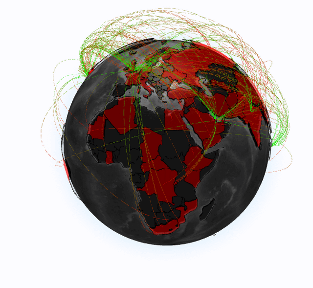
I’ve been building Kosmopulse, a geospatial search engine that maps how global news narratives evolve across space and time and mapped on a globe. Think of it like a visualised RSS.
Here’s a snapshot from a search I ran this morning:
“Trump” + “conflict”, filtered to articles from the last 2 days, displayed in arc map mode.
🔴 Red polygons show countries that were frequently mentioned in articles containing both terms.
🟢 Arcs show where the mentions originated from — that is, which countries’ news outlets are discussing “Trump” in the context of conflict.
As you might expect, the U.S. and its closest allies are hotspots — but several African countries also appeared in cross-regional mentions — notably NCentral African Republic and South Africa — often in the context of U.S. foreign policy, global conflict commentary, or regional diplomatic positioning.
Posted by Serious-Parking-2625
8 comments
If you wanted to make this graphic the most beautiful, bestest graphic in the world that many people would tell you is a big, beautiful graph, the arcs would be whisps of gold and the earth would be bronze.
**Data Source(s):**
* Custom scrapers pulling live articles from 13+ global media sources, including: BBC, The Guardian, NPR, Al Jazeera, AP NewsDW, and more.
* Content is parsed, geotagged, and enriched using NLP and entity recognition pipelines and some GNN architecture based algorithms.
**Tools Used:**
* **Scraping**: Python (BeautifulSoup, Scrapy)
* **Database**: PostgreSQL (tsvector full-text + spatial tagging and some SQL magic)
* **Backend**: Node.js several VPS servers
* **Frontend**: WebGL (Globe.gl + custom overlays + animated arcs)
* **Enrichment**: spaCy + custom named entity pipeline (tags, countries, people, orgs)
**Query shown in post:**
* Tags: `”Trump”`, `”conflict”`
* Date range: **Last 2 days**
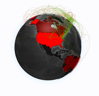
* Display mode: **Source map** (mentions by + of each country)
**Purpose of Kosmopulse:**
To map global narratives by **who’s being mentioned**, **who’s doing the mentioning**, and **how those connections evolve**. It helps researchers, journalists, and curious humans track how world events are covered differently by region if youre interested, check out my original post here: [https://www.reddit.com/user/Serious-Parking-2625/comments/1kr8lxb/i_built_kosmopulse_a_geospatial_search_engine/](https://www.reddit.com/user/Serious-Parking-2625/comments/1kr8lxb/i_built_kosmopulse_a_geospatial_search_engine/)
Could have included images of South America and Asia. Interesting post nontheless
Would be nice to see the Asian heat map a little better
Otherwise great job. I love it
Except actually it’s not quite clear what the green and red means. A scale would be nice but you mention green arcs and red polygons but it looks like the arcs turn from green to red…
What does it mean?
Nice post, would be great to get one clearly showing Oceania!
Mexico does not give a fuck at this point
not informative at all
a flat map should be better, so we see everything in one figure
color scale and unit are missing
Fear mongering is going crazy
Comments are closed.