Created while considering a purchased to help decide between new and used as well as evaluating deals being pushed across the table at me by my local Ford dealer.
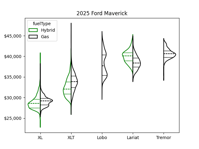
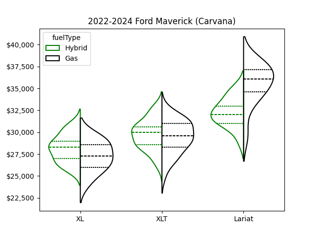
Each shows a violin plot of the 5 trim packages broken down by gas vs hybrid.. Median price is the dashed line and the middle 50% of pricing is bound by the dotted lines. Wider points have more vehicles available at that price.
I looked up the specifics of the outliers. The highest priced XL is about $7k over MSRP and the XLT is about $9,500 over MSRP. Not clear if these are mistakes or intential.
This was helpful to me in making the new vs. used decision as well as understanding huge variation in dealer installed options, ultimately making it possible for me to confidently insist on what I wanted at a fair price. Having a list of advertised prices for the exact trim level, options, color, etc. from competitors across the country, makes negotiations go much faster and with less stress.
In the end I bought new because the ~$1,500 difference bought me 20+k fewer miles, 2 years newer, and significant tech upgrades.
Posted by AccordionWhisperer
9 comments
Would be wayyyy easier to compare if the plots had the same y-axis
I like the violin charts. But I’m curious what you think of the vehicle itself?
Nicely done and nice choice in the end
Hybrid resale value is good, gas is more expensive and resells for less except higher trims
I wonder what sales volumes of the different drivetrains look like given the relative price parity.
That’s great. You should try CyberTrucks next.
It looks like the best bang for your buck is the ’25 hybrid XL or XLT. They are cheaper then their gas variant and also retain their value better based on the used data.
At least the lower trim seems to hold their value pretty well
Violin charts are neither useful nor beautiful.
Comments are closed.