Okay this might be one of my favorite posts on here. That first slide is just such an interesting idea
Very cool!
But bruh, do it with meters.
Or at least go all the way to nonsense and do it in cheeseburgers and unicorns.
But still cool xD
r/washingtondc would find this cool!
I love the idea and info! It would be really interesting to compare this info across various famous galleries/museums, kind of like people visualizing “Nobel Prize Lag By Field”, but this time it’s “Mainstream Art Appreciation Lag By Gallery” or something.
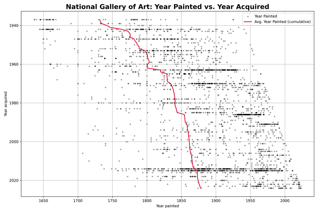
Minor nitpick: I don’t like the y axis on slide 2. I agree with your decision to put “present day” on the intersecting axis and go further into the past as you move away from it, but I feel it would work better with the x-axis on the top not the bottom of the image. That way you could still have the “expected” relationship of the year acquired increasing towards the top of the graph. Basically: my brain would prefer x-axis labels on top and the numerical order of the y-axis flipped so that 2020 was on top and 1940 was on bottom.
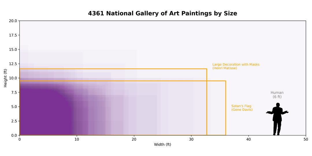
To save everyone who is curious a click, Satan’s flag (the version referenced in the graph) isn’t as half as exciting/interesting as you might imagine…
And yes, it’s huge, it’s painted on two 9’x15′ panels and hung/joined together. One of them links it to a previous painting he did as it’s inscribed on the back with “Black Panther II” (he painted a similar work “Black Panther” the year before in 1970.
6 comments
Submission Comment
National Art Gallery Washington
[https://www.nga.gov/](https://www.nga.gov/)
has a very good open dataset at [https://github.com/NationalGalleryOfArt/opendata](https://github.com/NationalGalleryOfArt/opendata)
I saw this 538 article by Oliver Roeder about Moma and decided to learn how to do some of the graphs in it. [https://fivethirtyeight.com/features/a-nerds-guide-to-the-2229-paintings-at-moma/](https://fivethirtyeight.com/features/a-nerds-guide-to-the-2229-paintings-at-moma/)
Python code at [https://gist.github.com/cavedave/d015246a66d28ff57c83663d9047c186](https://gist.github.com/cavedave/d015246a66d28ff57c83663d9047c186) I have not cleaned it up yet but if people are interested in these graphs i will
Okay this might be one of my favorite posts on here. That first slide is just such an interesting idea
Very cool!
But bruh, do it with meters.
Or at least go all the way to nonsense and do it in cheeseburgers and unicorns.
But still cool xD
r/washingtondc would find this cool!
I love the idea and info! It would be really interesting to compare this info across various famous galleries/museums, kind of like people visualizing “Nobel Prize Lag By Field”, but this time it’s “Mainstream Art Appreciation Lag By Gallery” or something.
Minor nitpick: I don’t like the y axis on slide 2. I agree with your decision to put “present day” on the intersecting axis and go further into the past as you move away from it, but I feel it would work better with the x-axis on the top not the bottom of the image. That way you could still have the “expected” relationship of the year acquired increasing towards the top of the graph. Basically: my brain would prefer x-axis labels on top and the numerical order of the y-axis flipped so that 2020 was on top and 1940 was on bottom.
To save everyone who is curious a click, Satan’s flag (the version referenced in the graph) isn’t as half as exciting/interesting as you might imagine…
Here it is:
https://preview.redd.it/zwbxyk9kq73f1.png?width=3000&format=png&auto=webp&s=c5e62d43465e033b13d7ff985314d2700f52fe7f
And yes, it’s huge, it’s painted on two 9’x15′ panels and hung/joined together. One of them links it to a previous painting he did as it’s inscribed on the back with “Black Panther II” (he painted a similar work “Black Panther” the year before in 1970.
About the artist:
[https://en.wikipedia.org/wiki/Gene_Davis_(painter)](https://en.wikipedia.org/wiki/Gene_Davis_(painter))
[https://artsandculture.google.com/entity/gene-davis/m09yt9b?hl=en](https://artsandculture.google.com/entity/gene-davis/m09yt9b?hl=en)
Comments are closed.