![[OC] Snowfall History Visualized in 3D - Interactive](https://www.europesays.com/wp-content/uploads/2025/05/uklhrvkzqc3f1-1920x1024.png)
Data source: https://www.nrcs.usda.gov/
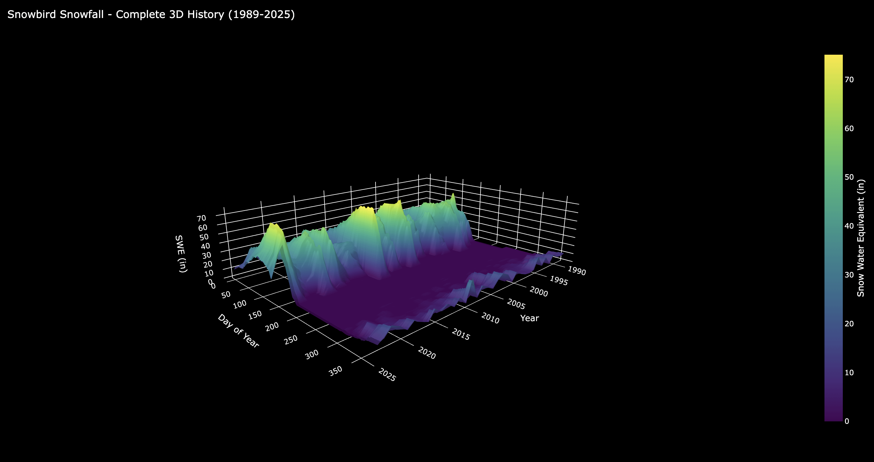
This is a time-series visualization of the snowfall history at Snowbird in Utah since 1989. I used Python, BigQuery, and Plotly Graph Objects.
It's interactive! Check it out here: https://mat-foucher.github.io/Snowbird-3D-Weather-History/index.html
Posted by mallnin
3 comments
I love the python big data libraries they got out there. Great stuff 👏
Useless 3D plot hides half the information of interest.
Edit: in fairness I retract my previous comment; interactive 3D is way better than 2D.
I would do water year instead of calendar year. Starting snowfall with jan 1 with the edge of an axis breaks the season data.
Comments are closed.