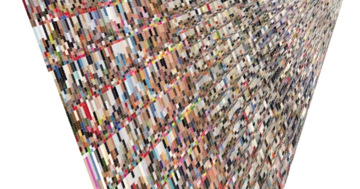
A visualisation of the colours of every cover of Vogue Magazine since its inception. There are some distinct bands of colours, most interesting of which is a darkening of the covers that map almost perfectly to the periods covering the two world wars.
Posted by viva_last_blues
3 comments
This is so interesting, thank you for sharing!
I opened up a Vogue magazine for the first time in a while the other day, and I was kind of appalled at how little of it was actually words. It felt like the entire first half of the magazine was ads. But maybe that is the point? Showcasing all those extravagant fashion items and accessories? It was still really off-putting for me. I love fashion, but I was more interested in the interviews and stuff.
I had no idea that magazine was so old. That’s really neat.
I was kind of hoping for an eigen-cover, but this is nice, and I guess more informative
Comments are closed.