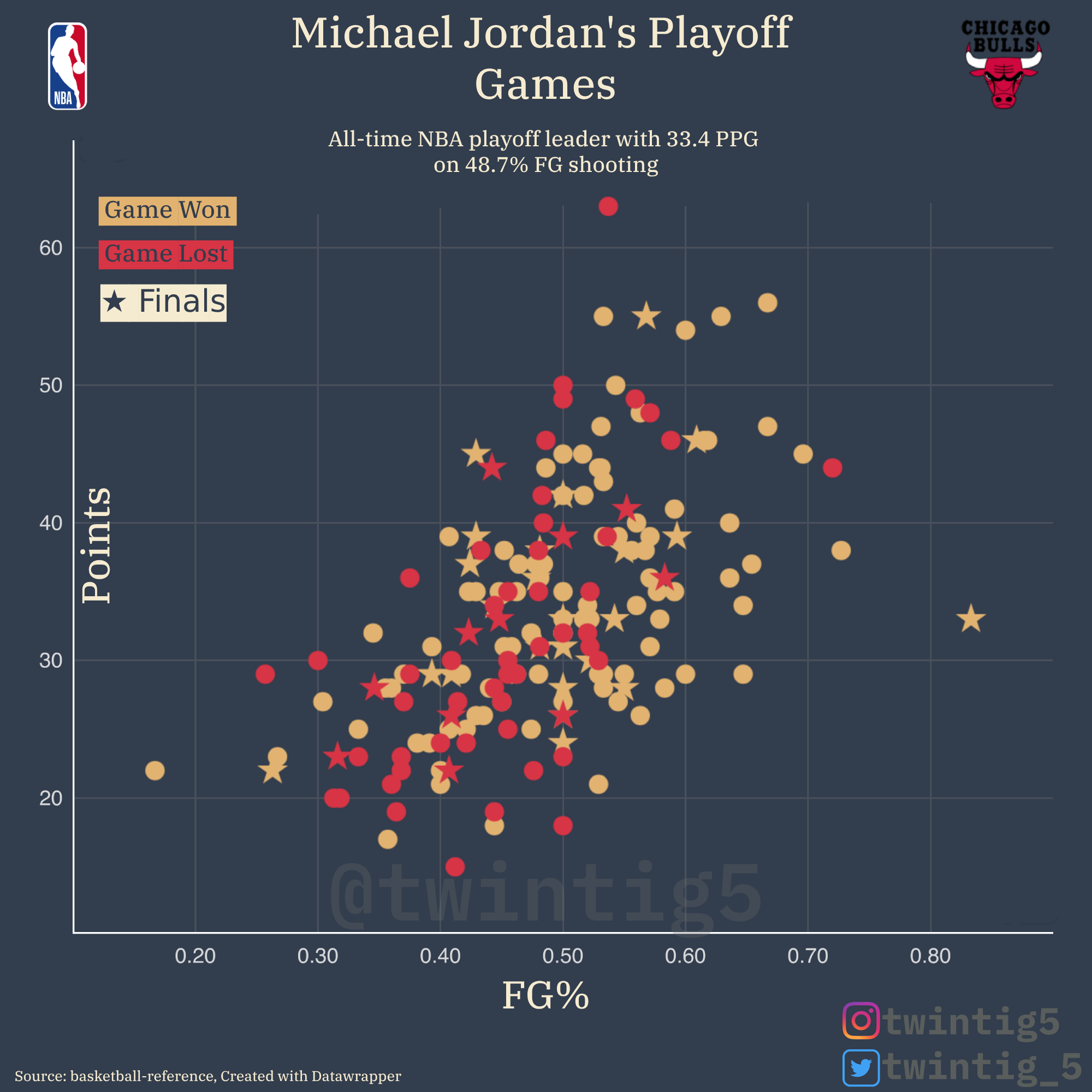
Losing a game where one player put up 60+ points is insane
what does this graph exactly tell me? he was more likely to score more points if his FG% was higher?
Looks like MJ shooting over ~55% was the most robust indicator for a win. Efficiency wins out.
I really want to see Lebron’s now just to compare the ages. (I’m Team Michael, btw)
This is great. Trend lines would be nice but looks like higher points and lower fg% in losses. Interesting, cool scatterplot.
What is the r value for this data?
I like the idea, but think it’d be better to segment on player instead of wins and losses. Put Jordan in Red, LeBron in Yellow, and Kobe in Purple on the same chart and see how they compare…win or lose.
Wonderful graphic!
The one pillar of truth in my life is that MJ is the greatest basketball player I’ve ever witnessed with my own eyes.
![[OC] Michael Jordan's Playoff Game Scoring Breakdown](https://www.europesays.com/wp-content/uploads/2025/05/eeseg8z02l3f1-1920x1024.png)
10 comments
* source: Basketball reference
* tools: excel, Datawrapper, Photopea
GOAT statistics for the GOAT player
Losing a game where one player put up 60+ points is insane
what does this graph exactly tell me? he was more likely to score more points if his FG% was higher?
Looks like MJ shooting over ~55% was the most robust indicator for a win. Efficiency wins out.
I really want to see Lebron’s now just to compare the ages. (I’m Team Michael, btw)
This is great. Trend lines would be nice but looks like higher points and lower fg% in losses. Interesting, cool scatterplot.
What is the r value for this data?
I like the idea, but think it’d be better to segment on player instead of wins and losses. Put Jordan in Red, LeBron in Yellow, and Kobe in Purple on the same chart and see how they compare…win or lose.
Wonderful graphic!
The one pillar of truth in my life is that MJ is the greatest basketball player I’ve ever witnessed with my own eyes.
Comments are closed.