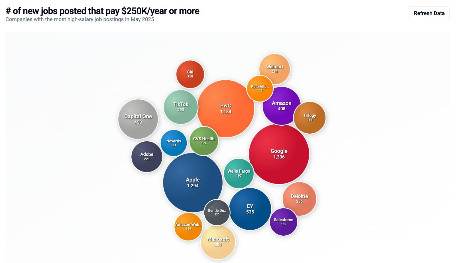
Data Source:
US high-salary job postings data from May 2025, aggregated from LinkedIn and major job board APIs, filtered for positions with compensation ≥$250,000/year (where compensation is listed)
Tools Used:
D3.js for circular bubble chart visualization and force simulation
React.js with TypeScript for component framework
Custom color palette with radial gradients
BigQuery for data processing and aggregation
Methodology:
Filtered job postings with stated compensation of $250,000+ annually
Aggregated by company name, showing top 20 companies by job count
Circle size represents number of high-paying job postings using square root scaling
Force simulation algorithm for optimal bubble packing with minimal overlap
Interactive tooltips display exact job counts for each company
Key Insights:
Technology and consulting firms dominate high-compensation job postings
Circle packing layout efficiently shows relative scale between companies
Data represents new postings specifically advertising high compensation ranges
Technical Notes:
Radial gradients with 3D lighting effects for visual depth
Elastic animation timing for engaging user experience
Responsive text sizing based on bubble radius
White stroke borders for clear visual separation
Posted by aaghashm
6 comments
**Data Source:**
US high-salary job postings data from May 2025, aggregated from LinkedIn and major job board APIs, filtered for positions with compensation ≥$250,000/year (where compensation is listed)
**Tools Used:**
D3.js for circular bubble chart visualization and force simulation
React.js with TypeScript for component framework
Custom color palette with radial gradients
BigQuery for data processing and aggregation
**Methodology:**
Filtered job postings with stated compensation of $250,000+ annually
Aggregated by company name, showing top 20 companies by job count
Circle size represents number of high-paying job postings using square root scaling
Force simulation algorithm for optimal bubble packing with minimal overlap
Interactive tooltips display exact job counts for each company
**Key Insights:**
Technology and consulting firms dominate high-compensation job postings
Circle packing layout efficiently shows relative scale between companies
Data represents new postings specifically advertising high compensation ranges
**Technical Notes:**
Radial gradients with 3D lighting effects for visual depth
Elastic animation timing for engaging user experience
Responsive text sizing based on bubble radius
White stroke borders for clear visual separation
Working for CVS seems like it would be pretty chill.
Interesting thing is, that those employees making 250k/yr at Google/Apple are only getting a very small fraction of the millions and billions of dollars generated from the code/hardware they’ve written.
Gentle De… ?
If you redid this by profession rather than company, I’m sure you’d see a lot more doctors and lawyers.
You’d think some major hospital systems would show up here, given doctor salaries.
Those high-paying job bubbles are simultaneously inspiring and depressing for a non-tech job holder like me. Big ups to Google and tech dominance!
Comments are closed.