![[OC] Cost of Living: Systemic Crisis or Personal Choice?](https://www.europesays.com/wp-content/uploads/2025/06/7t0122HoCmie2n4lJfAPmf7gDOP9qYOLcUBx1v9jXsw-1280x1024.png)
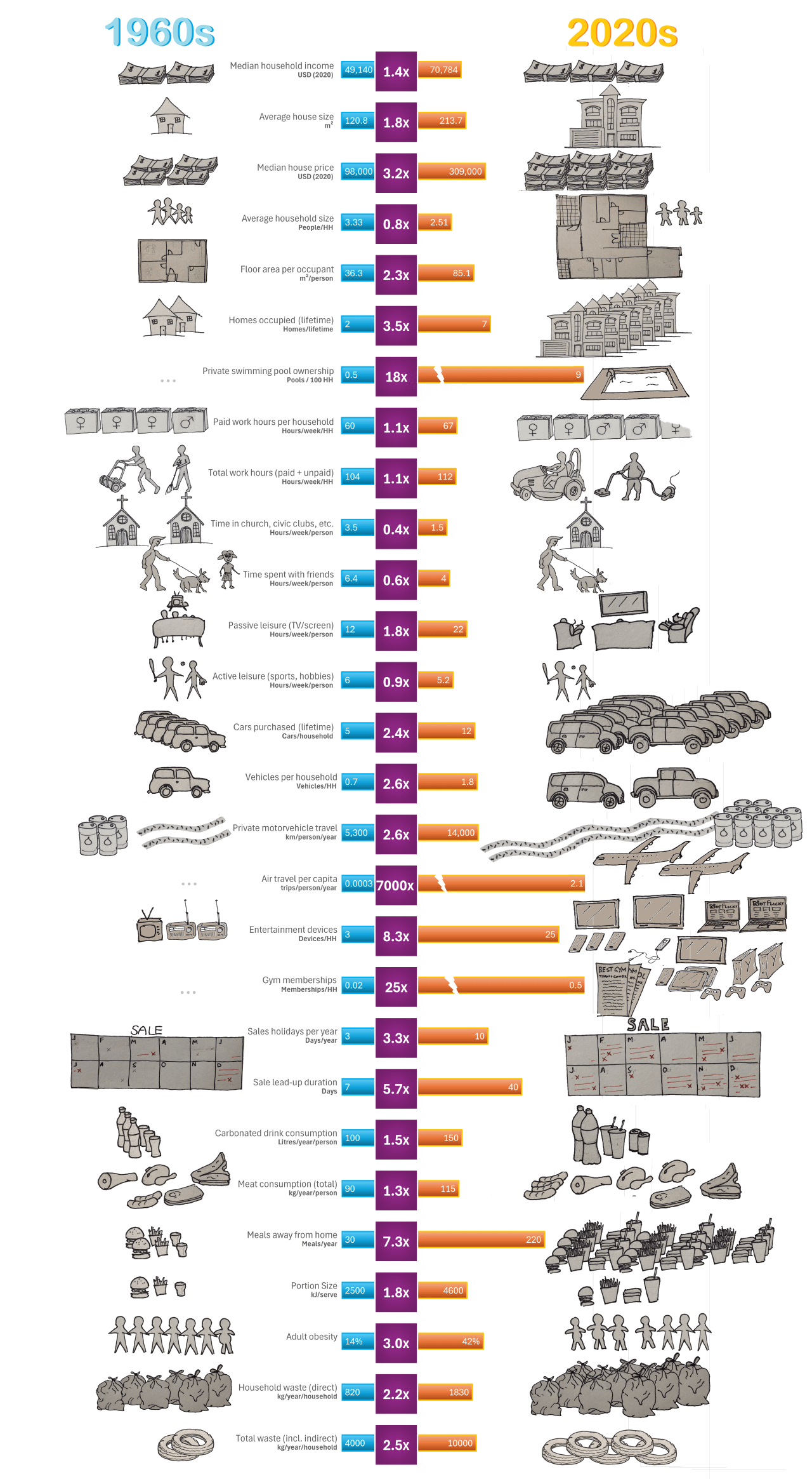
As part of a bigger project challenging norms on how we perceive happiness and what to prioritise in life, I have put together this comparison of the lifestyle of a typical U.S. middle-class household in the 1960s vs the 2020s. Using predominately government and academic sources, I charted key metrics like income, housing, transport, time use, consumption, and waste.
While real incomes have risen about 40%, the average house is now nearly twice the size, with 2.3× more space per person. Families own more than twice as many cars, eat out 7× as often, and average over 25 personal entertainment devices. At the same time, we spend less time with friends or in community, and screen use has doubled.
Some costs have risen faster than income (like housing and healthcare), but many pressures seem to be self-inflicted. They have been driven by rising expectations and lifestyle inflation. The data shows that we (in Australia too) now work fewer hours and have more leisure time, but feel more stressed and financially insecure.
Note I'm not attempting to blame or shame individuals, but to question our assumptions. We have more control than we think. Lowering our aspirations and living more with less might be the best way to reclaim time, reduce stress, and restore balance. I was pleased to see the recently shared post showing that 43% of Americans already feel that money won't buy them happiness, so I guess the next question is looking at why we're all still striving so hard for more money.
The data was collated in Excel and exported as multiple .png files. Images are hand-drawn, photographed and all composed in Paint.
Some of the data is best estimate from the nearest available time series. It is indicative at best, but if anyone has better figures for any of the key points I'm happy to update. Much more detail and references for all sources on my blog.
Posted by LivingMoreWithLess
18 comments
So things like gym memberships are sort of a new phenomenon. I wonder what things people spent money on in the 60s that we don’t even think about today and so didn’t make it into the list.
Would be curious about recycling waste. I assume it wasn’t included as it might have been very close to 0 in the 1960s. Overall very interesting.
Wow! That’s eye-opening, and presented engagingly. Fascinating. It’s one of those charts that just draws you in.
I’d love for you to do the same for the UK…
There is so little causation between these data points that it makes it meaningless. Also many of these things are being portrayed as living a more indulgent or lavish lifestyle but are actually symptoms of the broken economy that are inflicting more costs on modern families. The car example for instance, modern cars break down much more frequently due to their complexity or cost saving measures on materials. It’s not possible to only own two cars in your lifetime any more. That’s a huge additional expense pushed on consumers because cars are not designed to last like they used to.
And then you go to Silicon Valley, where most of the houses are small things built around 1960 but cost more than a new McMansion anywhere else.
Yikes, this is not beautiful. It is cherry-picked heavily and provides no correlation.
Where are grocery prices? Car prices? Utilities? Child care? Is this adjusted for inflation?
I suggest adding a reference link to the image or a QR code that directs users to your blog. The Internet is fast, authorship and sources get lost easy.
I love that the graphics are made in paint and I’ve subscribed to your blog. You’re hitting the head of the nail on the connection between modern western culture’s consumption and mental health problems.
These entries are not remotely organized and there’s zero sense of proportion. Housing costs have way more impact than “private pool costs” or gym memberships but the chart barely reflects that.
Only some of these line items are universal, there’s no indication of demographics which might be paying for these either in the past or now.
A few entries are just ??? – Sales holidays? What *is* that? We’re buying… time off from… sales? What?
And food is still a massive need and yet here it’s presented extremely awkwardly. Meat prices only? Portion size but not restaurant spend in general.
Like, is this chart actually just bait?
Great job! Some people might be mad when they see this but don’t let that deter you. This is really insightful!
There have been 85 years of productivity and technology advancements. If we’re supposed to judge our current cost of living based on a 1960 lifestyle, whats the point of any of those advancements? This is the sort of stuff billionaires use to justify massive income inequality “the poors have cell phones and aren’t working 90 hours a week, they’d be rich by 1920s standards”.
Tvs used to be a major investment, now they’re basically free. Of course we have more of them. You can still only watch one at a time
A lot of what you’re pointing to as “choice” has a heck of a lot more to do with income inequality, globalized cheap junk, and work culture, all systemic factors, not “individual choice.” Trying to paint this as “everyone suddenly and for no reason got lazy and gluttonous” rather than “globalization burned through the whole world and there was no one left to exploit but ourselves” is a bit of a silly slant
It is systemic.
Your infographic lacks the fact that we shouldn’t have to work for basic needs.
On top of that, we want to enjoy life. We cope with existence.
You lost me at two plane trips a year for everybody? Is there a Spider George who never disembarks or have most people I know been living a secret life of air luxury?
this is when the poverty rate in the US was 2x it is now. Yes, people consumed less 60 years ago because they had less and living standards were lower. Just because living costs are higher doesn’t take away the overall good fact that people are now better off
You cannot mix averages across these different categories and hope to get a representative survey. There’s a lot of correlation between them, and the distributions of some of these items are way more heavily skewed than others. That’s to say nothing of mixing median with mean across these categories.
Read “The End of Average” by Todd Rose to understand why taking the average across each individual characteristic does not give you a good picture of the “true” average, if there even is one.
If you don’t want to read the whole book, this article captures a lot of the key points:
https://www.thestar.com/news/insight/when-u-s-air-force-discovered-the-flaw-of-averages/article_e3231734-e5da-5bf5-9496-a34e52d60bd9.html
I don’t see this explicitly called or in the graphic, but you should point out those 1960’s numbers are all adjusted to present purchase power.
The median home value in 1960, for example, was really like $11,600.
I wish they built more starter homes, but it’s not as profitable, apparently. A house of the 1960s average size is still much less affordable than it was. I live in (rent) a townhouse around the old average size and they are now selling for over 530k (NJ). 12 years ago they sold for 260k. What are we doing?
Comments are closed.