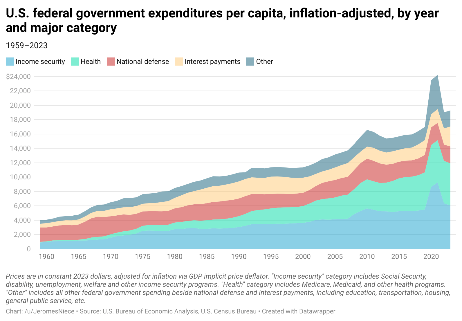
[OC] U.S. federal government expenditures per capita, inflation-adjusted, by year and major category
Posted by JeromesNiece
![[OC] U.S. federal government expenditures per capita, inflation-adjusted, by year and major category](https://www.europesays.com/wp-content/uploads/2025/06/vkhefuueuj5f1-1592x1024.png)
[OC] U.S. federal government expenditures per capita, inflation-adjusted, by year and major category
Posted by JeromesNiece
12 comments
Sources:
* [Federal government current expenditures by function](https://fred.stlouisfed.org/release/tables?rid=53&eid=1228625&od=2023-01-01#), US Bureau of Economic Analysis via FRED
* Data series used:
* [Total federal current expenditures](https://fred.stlouisfed.org/series/AFEXPND)
* [Interest payments](https://fred.stlouisfed.org/series/G160441A027NBEA)
* [National defense](https://fred.stlouisfed.org/series/G160461A027NBEA)
* [Health](https://fred.stlouisfed.org/series/G160661A027NBEA)
* [Income security](https://fred.stlouisfed.org/series/G160721A027NBEA)
* [Gross domestic product (implicit price deflator)](https://fred.stlouisfed.org/series/A191RD3A086NBEA), U.S. Bureau of Economic Analysis via FRED
* [Total Population: All Ages including Armed Forces Overseas](https://fred.stlouisfed.org/series/POP), U.S. Census Bureau via FRED
Created via data wrapper. [Link](https://www.datawrapper.de/_/UZLvI/) to interactive version. Resubmitted after immediate and overwhelming feedback about the poor color selection last time, lol.
It’s almost like these expenses are directly correlated to, and what causes inflation.
Love the visual
If you’re skeptical that these figures are adjusted for inflation, the inflation-unadjusted total spending per capita in 1959 was $509. Adjusted for inflation it is $4,072.
This is using the GDP price deflator to adjust for inflation, so use caution if comparing to a CPI-based inflation calculator. GDP price deflator is a more appropriate price deflator in this context because the spending here includes a broader array of goods and services, and uses a chain-type price index which is more appropriate for long term data series.
“National defense”. Such funny words when used for a country known to fight wars wherever it pleases…
Yup. We’re spending too much money
That’s a pretty big uptick in interest payments at the end. The government really needs to get the deficit under control if interest rates remain elevated.
Looks like someone got a little excited around 2020. Schwing! AMIRITE?
I’d love to see the same figures expressed as YoY real growth rates
Stacked graphs are not beautiful. They make it unnecessarily hard to compare figures because you have to track the delta across the entire graph to determine where the change occurred. Instead, use lines, then a sum value.
Proportionally, not much change except healthcare jumping a bit when ACA started … And covid
When “other” is this big, you need to specify.
The thing that should be noteworthy here is how much health has ballooned compared to the other categories
Comments are closed.