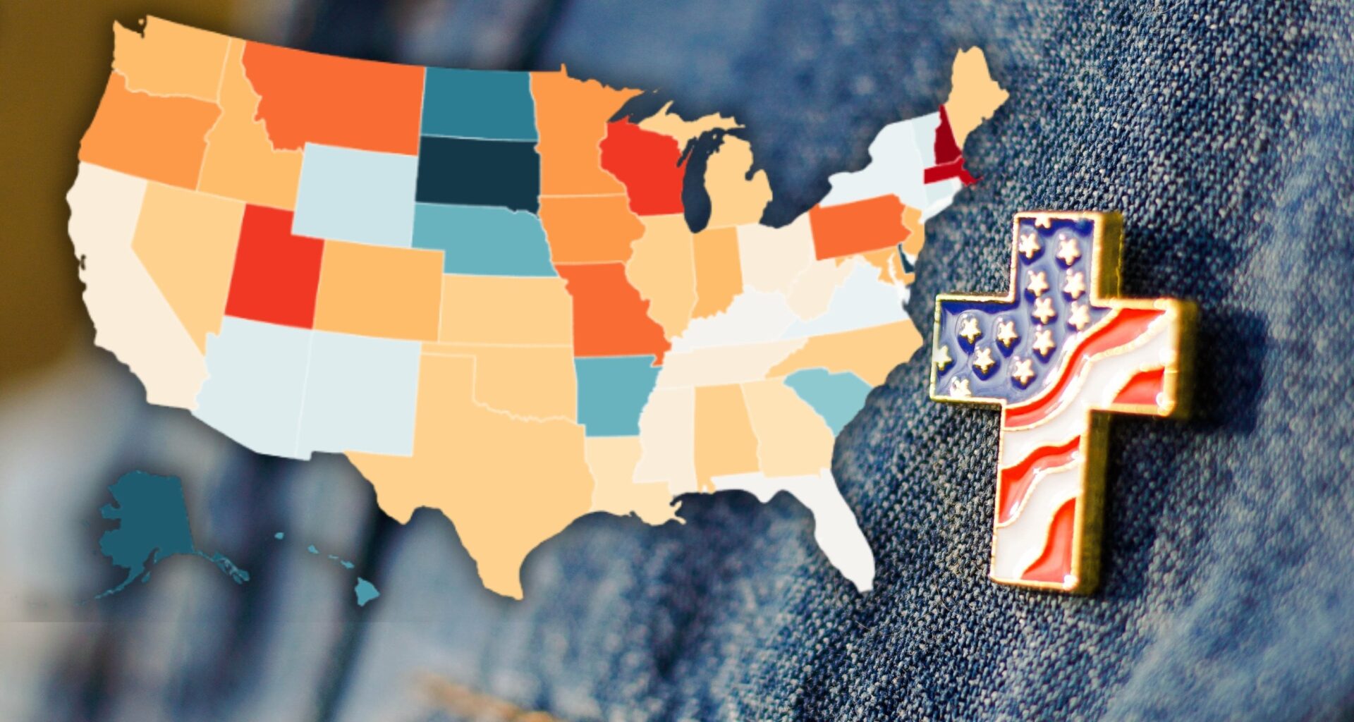
I think it’s a poor design choice to use two colors for this map. Since all values are negative, it should be monochromatic or similar. There’s no significance to the shift between red and blue, so the map is misleading.
The color scale on that map is silly. Blue states are a decrease (except one, which is an increase), while red are an even larger decrease
The data is interesting, but the execution of the map is horrible.
Although I am happy about the findings, this data is not presented beautifully.
Maybe I’m being dumb, but why is the change negative on the map when the article refers to growth?
Does the map actually refer to change in religiously *affiliated* people? The article says Pennsylvania has a growth in religiously unaffiliated people, but the map says it’s a decrease. Terrible article.
Interesting to see Utah doubled the number of its religiously unaffiliated residents. Religion seems to be the only thing holding the state back from turning blue, so just give it a decade or two. Statistically Utah is similar to New England in many important categories like education, which shouldn’t be surprising, given how many residents have roots in New England.
This chart says nothing about the starting point, from which the data is derived.
If 50% of the people were religious, and then 10% of those left religion, that state is still much more religious than one that started at 20% and only dropped 1% (or, for that matter, increased by 10%).

8 comments
I think it’s a poor design choice to use two colors for this map. Since all values are negative, it should be monochromatic or similar. There’s no significance to the shift between red and blue, so the map is misleading.
The color scale on that map is silly. Blue states are a decrease (except one, which is an increase), while red are an even larger decrease
The data is interesting, but the execution of the map is horrible.
Although I am happy about the findings, this data is not presented beautifully.
Maybe I’m being dumb, but why is the change negative on the map when the article refers to growth?
Does the map actually refer to change in religiously *affiliated* people? The article says Pennsylvania has a growth in religiously unaffiliated people, but the map says it’s a decrease. Terrible article.
Interesting to see Utah doubled the number of its religiously unaffiliated residents. Religion seems to be the only thing holding the state back from turning blue, so just give it a decade or two. Statistically Utah is similar to New England in many important categories like education, which shouldn’t be surprising, given how many residents have roots in New England.
This chart says nothing about the starting point, from which the data is derived.
If 50% of the people were religious, and then 10% of those left religion, that state is still much more religious than one that started at 20% and only dropped 1% (or, for that matter, increased by 10%).
Comments are closed.