I need deciphering to get something meaningful here.
I like this method of displaying information, but I find it a bit hard to compare the social mobility between countries
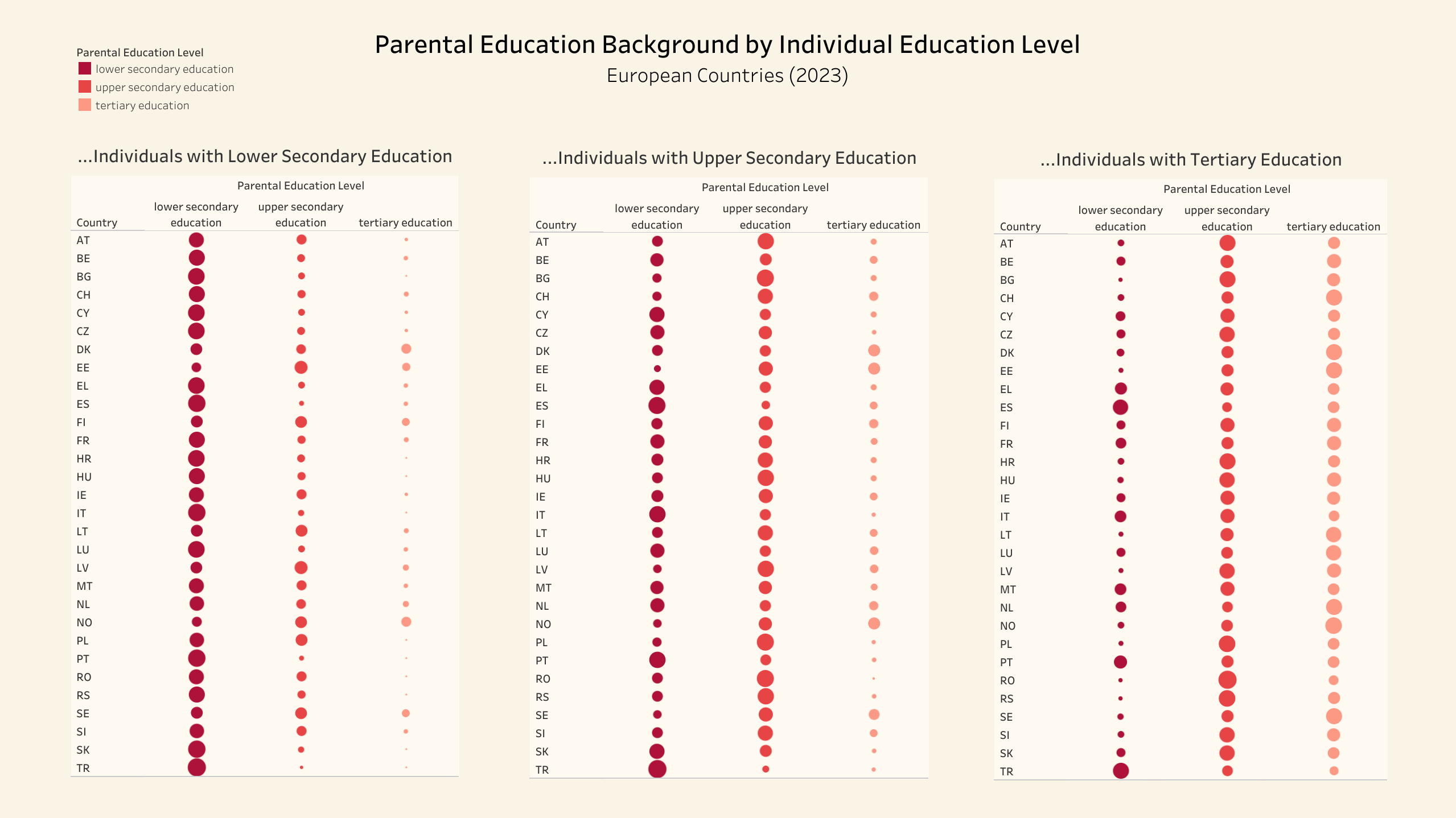
Why would you make everything visualized as circle sizes when they’re already sorted into rows in a way that would make bar graphs work better?
This data is not beautiful. The topic is interesting. I’d like to see something meaningful, but I can’t figure out what this graphic is showing. What do the dot sizes mean? Sort by social mobility, not alphabetically to highlight the story the data tells.
Would it kill you to spell out the countries? I mean I know HR is Croatia but that isn’t always obvious… and how do you not have Germany ?
Education Level **≠** Social Mobility
Your graph shows the relationship between parental education and the education level of their offspring. Nothing more, nothing less.
Massively wasted potential here. You should print out the full name of each country, there will be very few people who will know all these abbreviations. Since each line has the same country over all three data sets, you don’t need to print out the name of the country 3 times.
The colors aren’t useful here, since all the information in the colors is also shown by the column headers.
Ahhhhhh Brexit. I always look for the UK in these.
I found this chart bafflingly hard to decipher. (and it’s an area that I’ve long been interested in, and have looked up data for, and am a bit familiar with).
Your chart lets you look up a child’s education, and see how well the parents were educated. That feels BACKWARDS. One’s natural instinct is to see how children do given how their parents did.
Your chart ostensibly compares European countries. But it doesn’t really because there are too many of them, they’re identified by appreviations that are hard to make sense of, you can’t line them up visually across the three charts without your eyes loosing track of which line you’re on, and the difference in size of circles is too slight to get an adequate reading. For instance in the middle block is the circle for DK bigger or smaller than that for SE? How are they grouped?
I think you need a drastically different visualization!
When it comes down to it, I think the data can be quite small. “To what extent does a a parent’s education level let us deduce the child’s education level?” This could even be just a single number that aggregates all three. You could do a map and shade each country for a really simplistic approach to see if there are regional trends.
You’re heading talks about “social mobility” but your data is actually about educational level, which feels like a close proxy. I’m interested to do about financial mobility too?
![Social Mobility in various European Countries [OC]](https://www.europesays.com/wp-content/uploads/2025/06/a5ruqmdvcq6f1-1920x1024.png)
12 comments
Source: [https://ec.europa.eu/eurostat/databrowser/view/ILC_IGTP01__custom_1619253/default/table](https://ec.europa.eu/eurostat/databrowser/view/ILC_IGTP01__custom_1619253/default/table)
Tool: Tableau Public
How did you miss Germany and UK in your dataset?
I need deciphering to get something meaningful here.
I like this method of displaying information, but I find it a bit hard to compare the social mobility between countries
Why would you make everything visualized as circle sizes when they’re already sorted into rows in a way that would make bar graphs work better?
This data is not beautiful. The topic is interesting. I’d like to see something meaningful, but I can’t figure out what this graphic is showing. What do the dot sizes mean? Sort by social mobility, not alphabetically to highlight the story the data tells.
Would it kill you to spell out the countries? I mean I know HR is Croatia but that isn’t always obvious… and how do you not have Germany ?
Education Level **≠** Social Mobility
Your graph shows the relationship between parental education and the education level of their offspring. Nothing more, nothing less.
Massively wasted potential here. You should print out the full name of each country, there will be very few people who will know all these abbreviations. Since each line has the same country over all three data sets, you don’t need to print out the name of the country 3 times.
The colors aren’t useful here, since all the information in the colors is also shown by the column headers.
Ahhhhhh Brexit. I always look for the UK in these.
I found this chart bafflingly hard to decipher. (and it’s an area that I’ve long been interested in, and have looked up data for, and am a bit familiar with).
Your chart lets you look up a child’s education, and see how well the parents were educated. That feels BACKWARDS. One’s natural instinct is to see how children do given how their parents did.
Your chart ostensibly compares European countries. But it doesn’t really because there are too many of them, they’re identified by appreviations that are hard to make sense of, you can’t line them up visually across the three charts without your eyes loosing track of which line you’re on, and the difference in size of circles is too slight to get an adequate reading. For instance in the middle block is the circle for DK bigger or smaller than that for SE? How are they grouped?
I think you need a drastically different visualization!
When it comes down to it, I think the data can be quite small. “To what extent does a a parent’s education level let us deduce the child’s education level?” This could even be just a single number that aggregates all three. You could do a map and shade each country for a really simplistic approach to see if there are regional trends.
You’re heading talks about “social mobility” but your data is actually about educational level, which feels like a close proxy. I’m interested to do about financial mobility too?
Comments are closed.