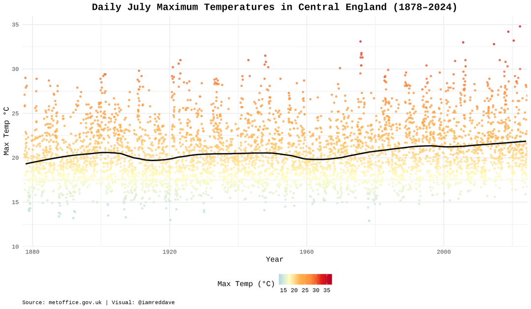
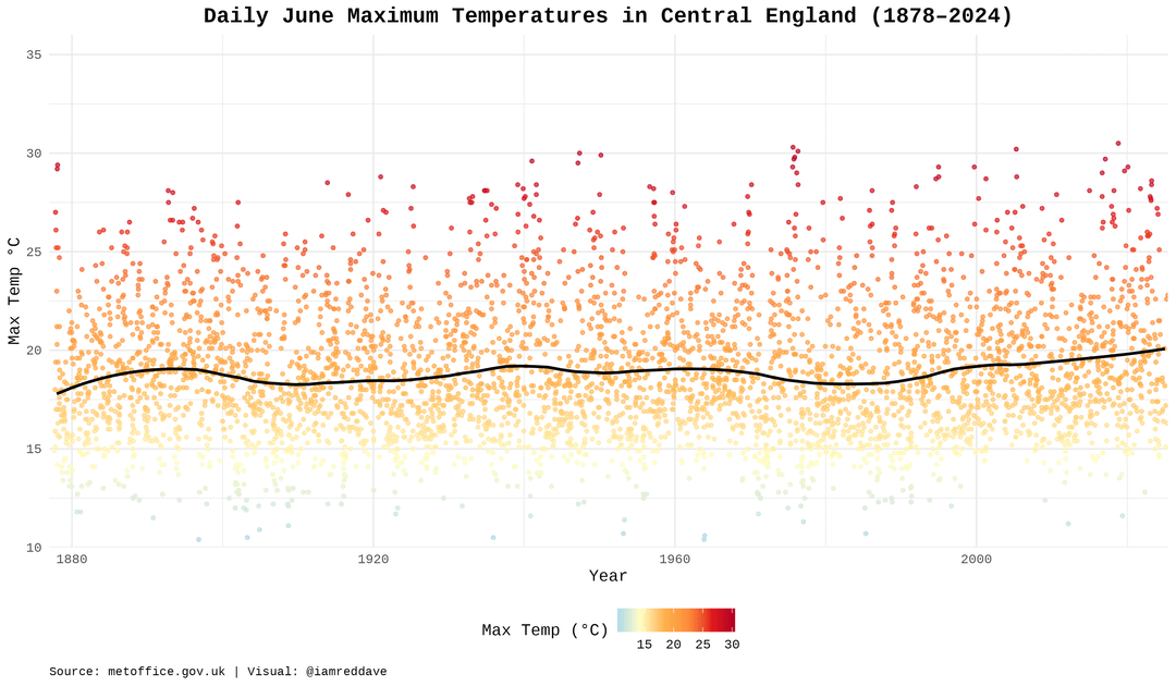
I made this because I keep seeing Boomers go on about the summer of 1976 and I wanted to see how it compared to more recent summers. It does seem to have been the warmest July since 1878.
No need to colour the dots on the same scale as the y-axis. That is saying the same thing twice.
By using a lower contrast colour for the cooler days, they are less clearly visible. I realise you want to stress the hotter days, but that does open the door for boomers to claim “you are misrepresenting the data and actually it is not that bad”, completely ignoring the clear trend and refocusing on the data representation rather than the problem you like to demonstrate.
In addition to the general trend, it looks like there is an underlying cycle of about 55/60 years.
Any insight on that ? Is it just noise or could it be something more relevant regarding climate small cycles?
Yeah, it used to be that going above 30°C was very, very unusual. Now it’s standard for the hottest few weeks.
The rise is so much more pronounced in mainland Europe and North America
Horizontal lines should be more pronounced. I can barely see the difference between the start and end of trend line
There’s no way that the max temperature is just 22C (about 71F).
7 comments
Made with R package and ggplot2 and met office data from [https://www.metoffice.gov.uk/hadobs/hadcet/data/](https://www.metoffice.gov.uk/hadobs/hadcet/data/)
Code at if you want to remix it or visualise another month [https://gist.github.com/cavedave/293e2fa9c86fd70f165f32b96a77a847](https://gist.github.com/cavedave/293e2fa9c86fd70f165f32b96a77a847)
I made this because I keep seeing Boomers go on about the summer of 1976 and I wanted to see how it compared to more recent summers. It does seem to have been the warmest July since 1878.
No need to colour the dots on the same scale as the y-axis. That is saying the same thing twice.
By using a lower contrast colour for the cooler days, they are less clearly visible. I realise you want to stress the hotter days, but that does open the door for boomers to claim “you are misrepresenting the data and actually it is not that bad”, completely ignoring the clear trend and refocusing on the data representation rather than the problem you like to demonstrate.
In addition to the general trend, it looks like there is an underlying cycle of about 55/60 years.
Any insight on that ? Is it just noise or could it be something more relevant regarding climate small cycles?
Yeah, it used to be that going above 30°C was very, very unusual. Now it’s standard for the hottest few weeks.
The rise is so much more pronounced in mainland Europe and North America
Horizontal lines should be more pronounced. I can barely see the difference between the start and end of trend line
There’s no way that the max temperature is just 22C (about 71F).
Comments are closed.