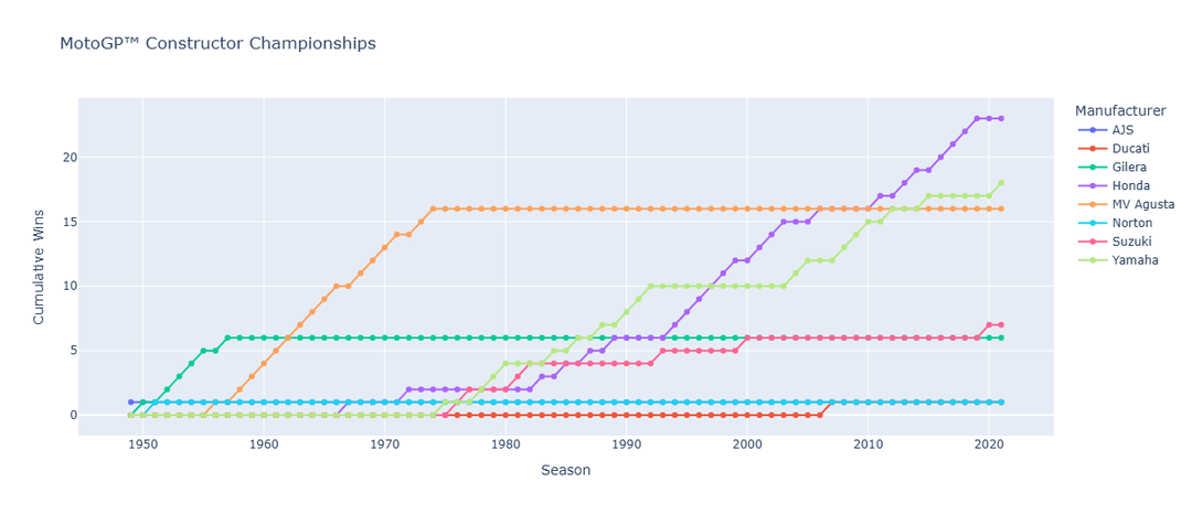
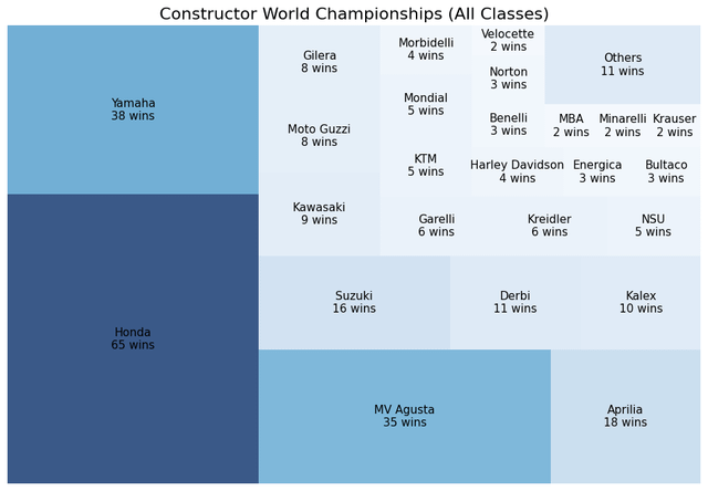
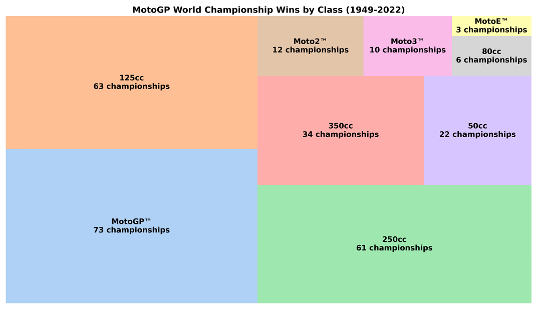
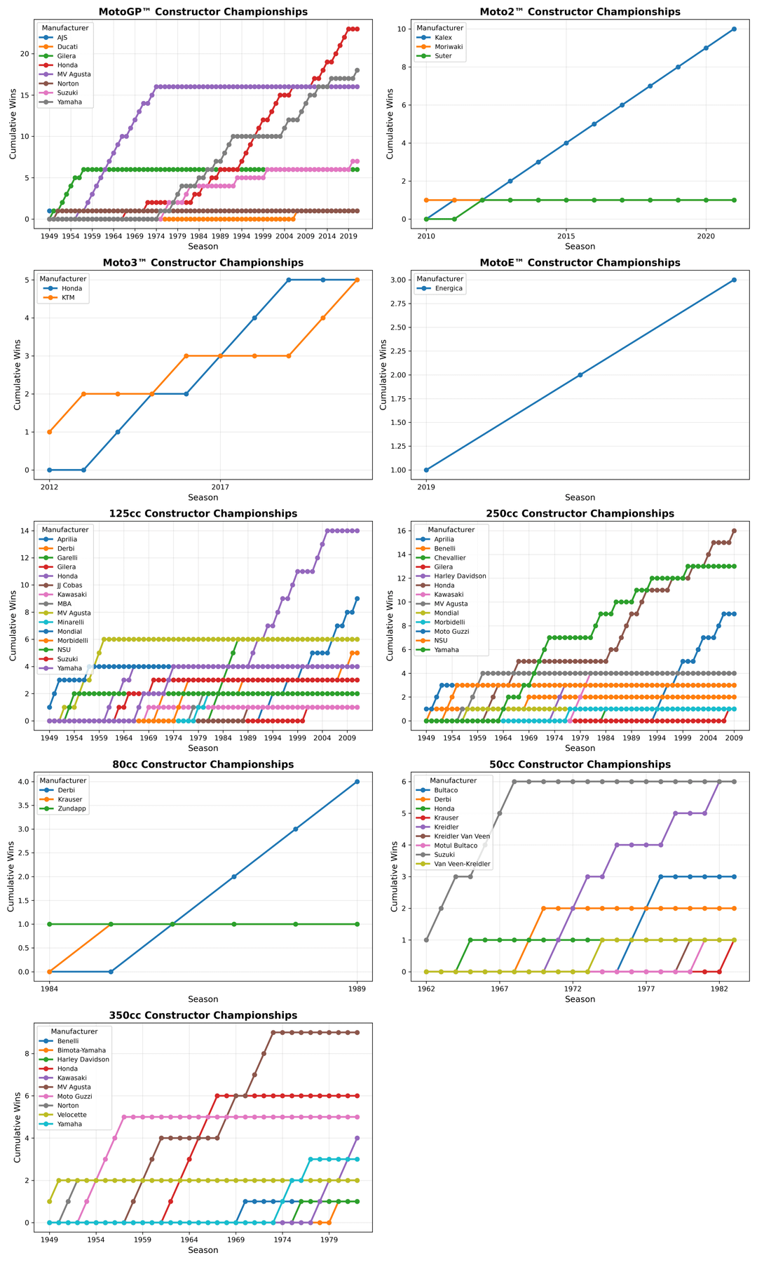
I recently completed an analysis of the MotoGP World Championship from 1949 to 2022, covering over seven decades of racing history. Using Python (Pandas, Matplotlib, Seaborn, Plotly, etc.), I created a series of visualizations that reveal long-term trends and interesting insights.
Some of the visualizations include:
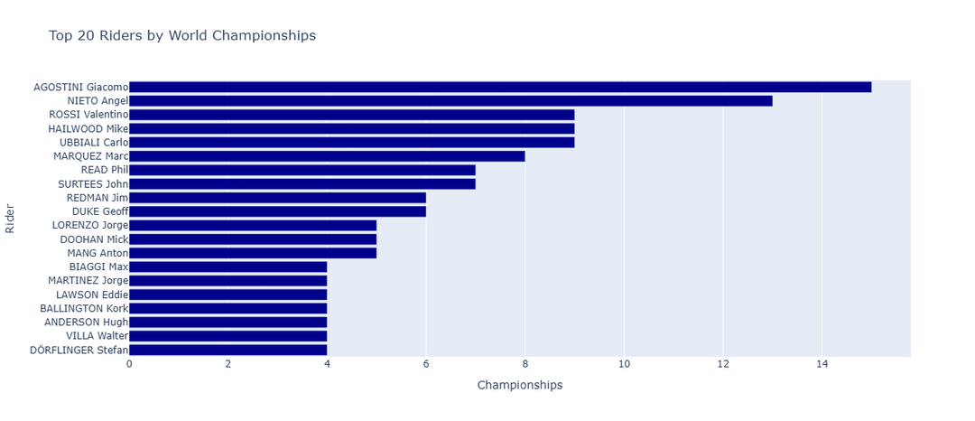
- Rider and constructor world championship counts over the decades
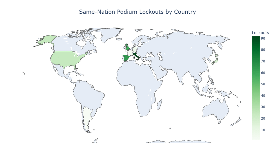
- Same-nation podium lockouts by year and country
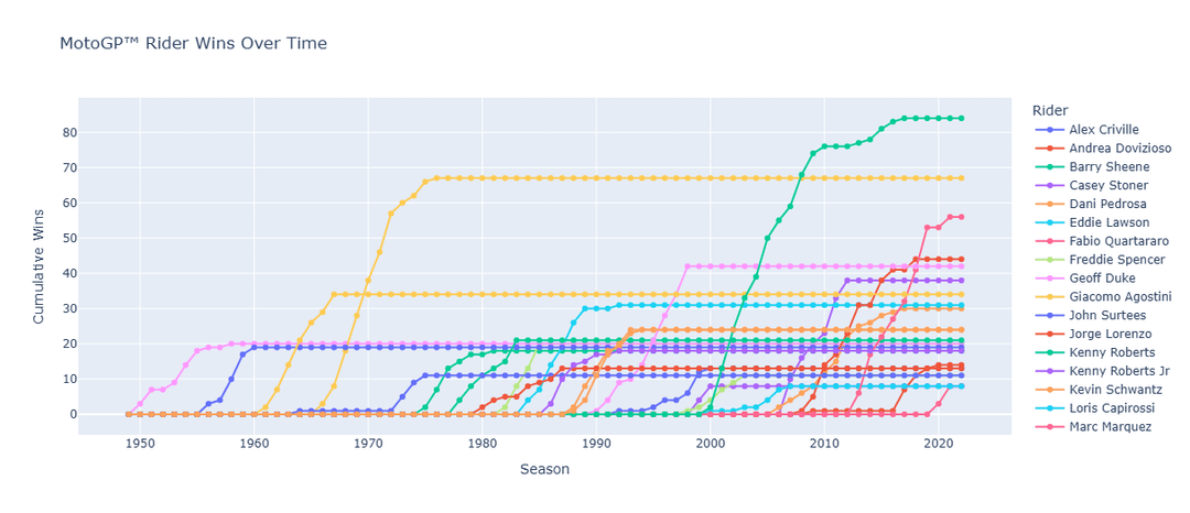
- Wins by top 20 riders in history
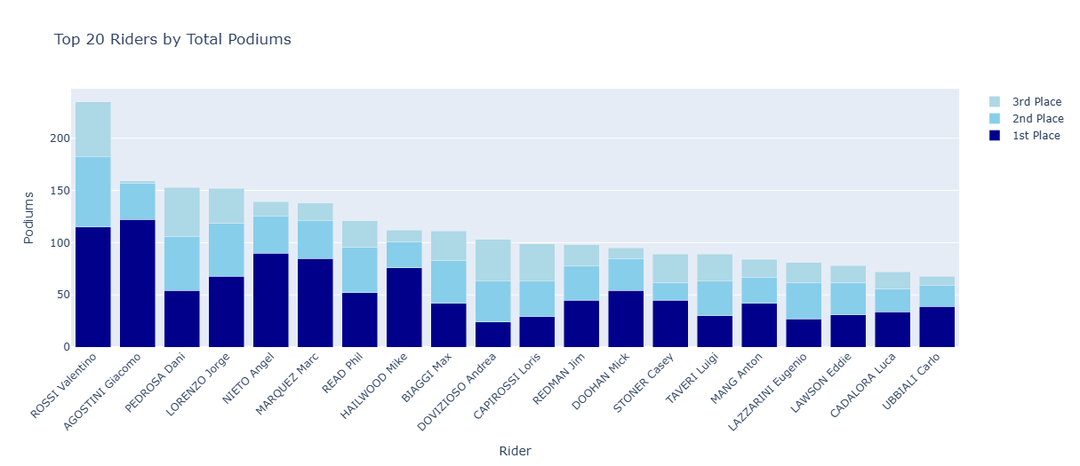
- Total wins by riders and manufacturers
- Seasonal standings and performance comparisons
The dataset includes every recorded race, finishing position, constructor, and championship detail up to 2022.
Posted by thanosisred
3 comments
Why isn’t Rossi in the first graph?
Good effort! But just scrolling quickly I see many mistakes
Ducati only one championship?
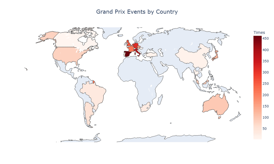
No indian GP in the map?
(Edit: I see now is up to 2022)
Also, I find uselessly confusing having the lines going all the way to 2022 when a rider or a constructor retired years or decades before. IMHO would be more readable if the line stopped the year of retirement.
Also your color palette has only ten unique colors then starts repeating again. So for instance, I can’t tell if it’s Barry Sheene or Kenny Roberts who has the highest cumulative wins.
Comments are closed.