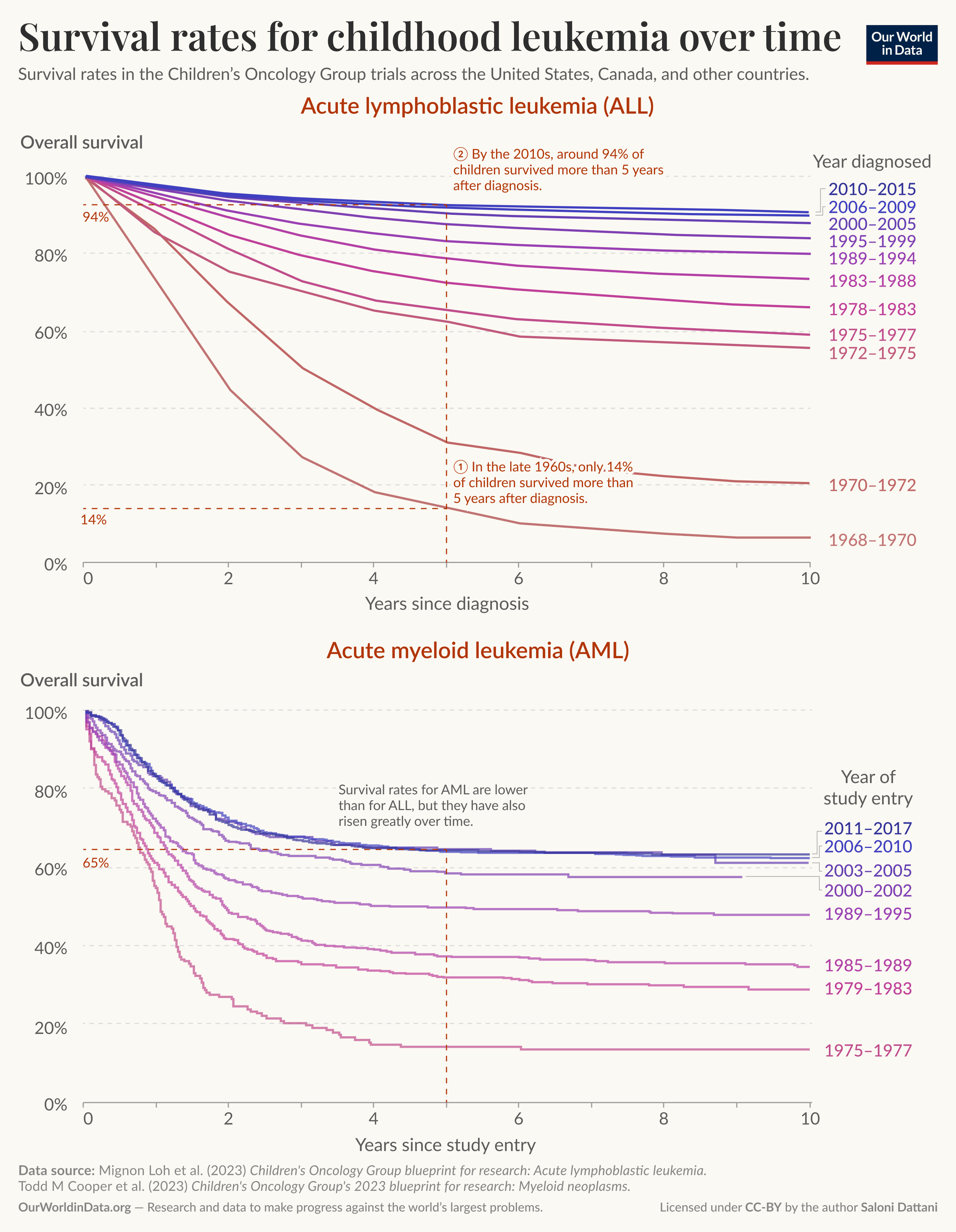
A visualization I made for an article titled "Childhood leukemia: how a deadly cancer became treatable" on Our World in Data.
Posted by salonium_
![[OC] Survival rates for childhood leukemia have improved dramatically](https://www.europesays.com/wp-content/uploads/2025/06/mu4fapzlbi7f1-1920x1024.png)
A visualization I made for an article titled "Childhood leukemia: how a deadly cancer became treatable" on Our World in Data.
Posted by salonium_
1 comment
[OC] I made this visualization in Figma, adapted from two studies: [Mignon Loh et al. (2023)](https://onlinelibrary.wiley.com/doi/10.1002/pbc.30585) and [Todd Cooper et al. (2023)](https://onlinelibrary.wiley.com/doi/10.1002/pbc.30584).
The visualization is part of an article I wrote for Our World in Data called [Childhood leukemia: how a deadly cancer became treatable](https://ourworldindata.org/childhood-leukemia-treatment-history). The article has much more detail about some of the concrete reasons for progress in treatment for childhood leukemia.
Comments are closed.