Does venture funding correlate with cheap money… ? I’d like to see cheap money against these.
What are you counting as “big tech”. Because just being post IPO doesn’t make you big tech.
There really isn’t a point to show absolute numbers of pre IPO vs post IPO. Obviously the companies that are post IPO will be larger and thus have more layoffs. The ratio of their workforce tells a much more interesting story which is completely lost here.
A little hard to see the pre-IPO numbers. I see on the [layoffs.fyi](http://layoffs.fyi) site they separate y axes for them, so you can more easily compare, which i think I like more. Maybe the venture funding could be on a separate (smaller) graph above or below the main plot.
Doesn’t make any sense without the “hiring” numbers. Layoffs can be a result of restructuring, but those employees get immediately picked up by somebody else.
Low layoffs doesn’t instantly mean “good” either, because if they correspond with hiring freezes then it’s also really bad, but your chart lacks this data.
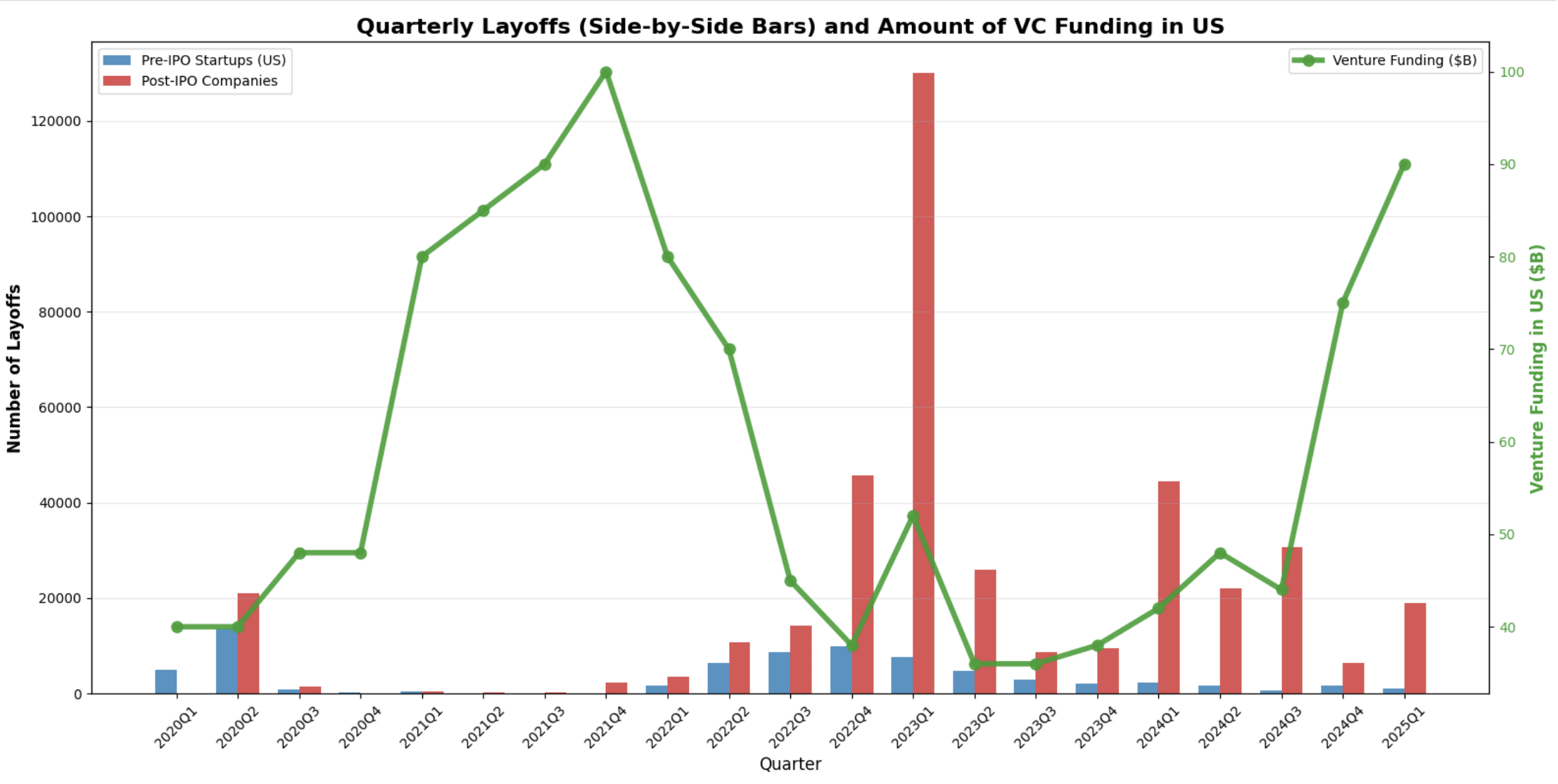
![[OC] Number of US Tech Layoffs: Big Tech Vs Startups](https://www.europesays.com/wp-content/uploads/2025/06/zfnssfz2gp7f1-1920x1024.png)
7 comments
Data is from [https://layoffs.fyi/](https://layoffs.fyi/) for layoff counts
Data is from [https://nvca.org/document/q1-2025-pitchbook-nvca-venture-monitor/](https://nvca.org/document/q1-2025-pitchbook-nvca-venture-monitor/) for venture funding amount
I made the chart using Pandas
Does venture funding correlate with cheap money… ? I’d like to see cheap money against these.
What are you counting as “big tech”. Because just being post IPO doesn’t make you big tech.
There really isn’t a point to show absolute numbers of pre IPO vs post IPO. Obviously the companies that are post IPO will be larger and thus have more layoffs. The ratio of their workforce tells a much more interesting story which is completely lost here.
A little hard to see the pre-IPO numbers. I see on the [layoffs.fyi](http://layoffs.fyi) site they separate y axes for them, so you can more easily compare, which i think I like more. Maybe the venture funding could be on a separate (smaller) graph above or below the main plot.
Doesn’t make any sense without the “hiring” numbers. Layoffs can be a result of restructuring, but those employees get immediately picked up by somebody else.
Low layoffs doesn’t instantly mean “good” either, because if they correspond with hiring freezes then it’s also really bad, but your chart lacks this data.
I hate your x axis with a passion
Comments are closed.