Hey everyone!
I'm launching my new YouTube channel "Visualized", focused on animated data visualizations about history, economics, and global trends.
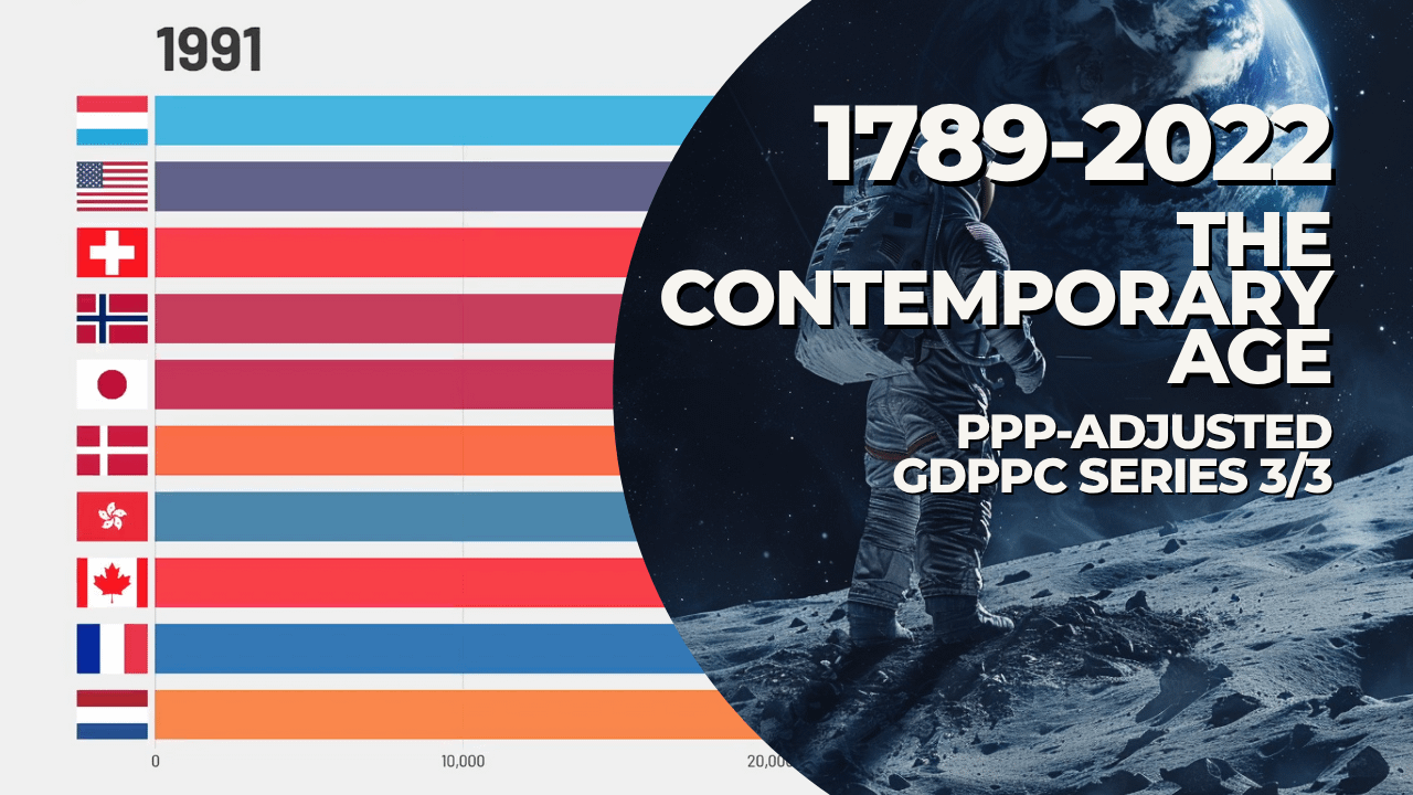
My first video premieres tomorrow (Thursday) at 11:00 AM ET / 08:00 AM PT (for American viewers) and 16:00 BST (UK), 17:00 CEST (Madrid/Paris time), and it's a bar chart race showing the top 10 countries by PPP-adjusted GDP per capita from 1789 to 2022.
Based on data from the Maddison Project Database, the video visualizes how global wealth and standards of living evolved across revolutions, wars, and industrial shifts.
Premiere Link:https://www.youtube.com/watch?v=MmJCrorZCOA
I’d love to hear your thoughts or feedback. And if you enjoy this kind of content, subscribing would really help. More videos are on the way covering earlier periods too.
Thanks a lot for checking it out!
Posted by Fertitad