![Solar and Nuclear Power in China and the USA [OC]](https://www.europesays.com/wp-content/uploads/2025/06/z4n4g4wqsx7f1-1920x1024.png)
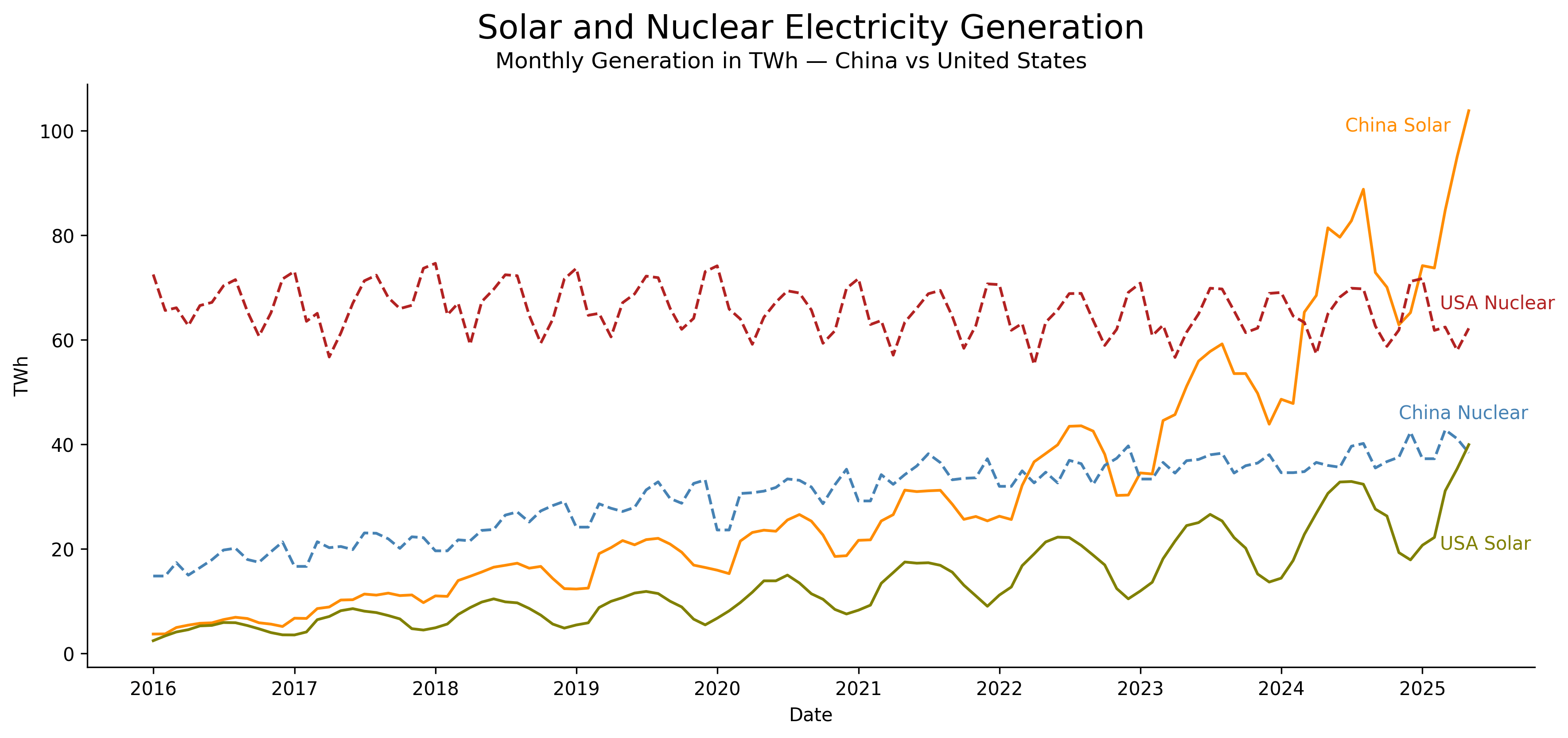
data from https://ember-energy.org/data/monthly-electricity-data/ Most recent data is from May 1st 2025.
code python matplotlib here https://gist.github.com/cavedave/9a430d65496b1b0a4b9726f002c61005 the dataset has loads of countries and electricity sources and other kinds of measurements than TWh. And if you have a question hopefully the code helps you answer it.
Posted by cavedave
5 comments
The waveform of the US nuclear curve is interesting: fairly regular cycles, and the downward portion often has a small upward step.
What is the interpretation?
Interesting. I wonder if the graph would be faster to interpret if you had both lines from china (and likewise for USA) be the same color, but keep solar and nuclear different line styles.
Solar is a lot less seasonal than I expected. In China the low season generates as much power as the high season from 1-2 years ago.
Yes, China is still industrialising. Do coal as well and you’ll see a similar pattern.
China is starting to see electricity prices go negative due to this massive increase in supply and a decline in economic activity.
Comments are closed.