![[OC] Armed Conflict Casualties from 1990 to 2024](https://www.europesays.com/wp-content/uploads/2025/06/xjtdyszhy19f1-1920x1024.png)
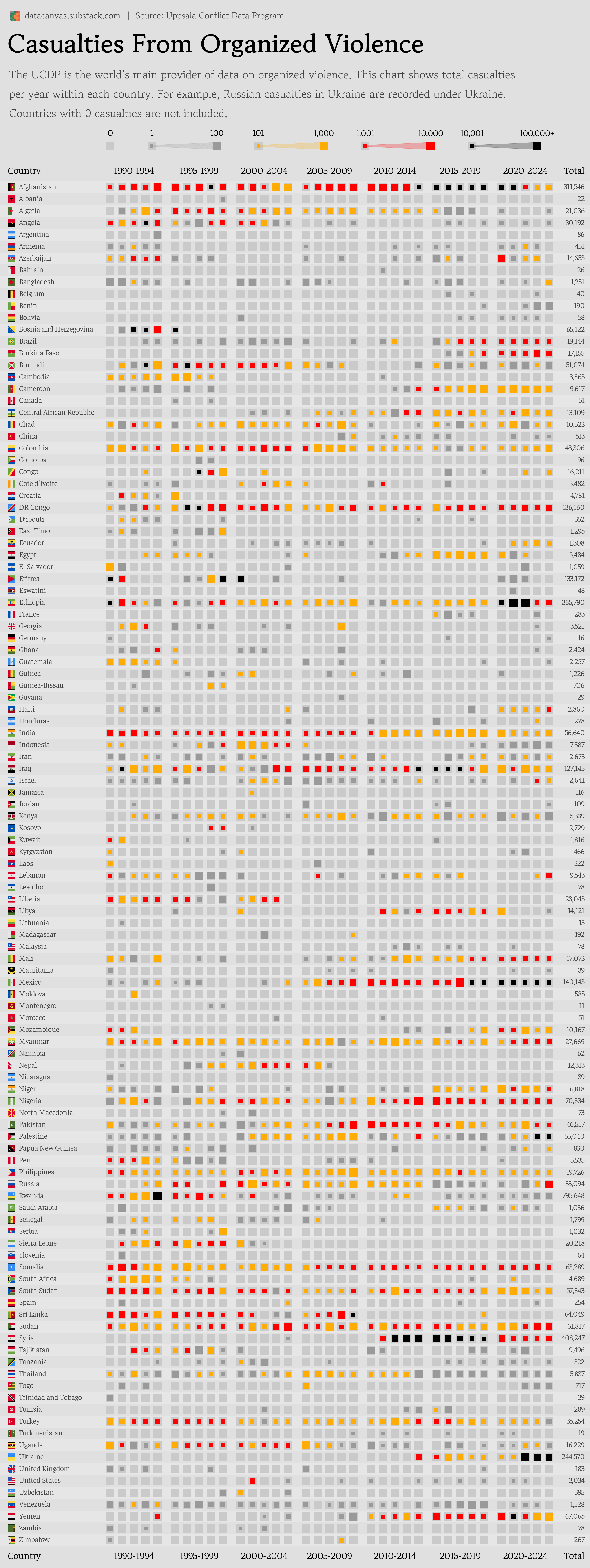
Data source: https://ucdp.uu.se/downloads/ processed by Our World in Data (Deaths in armed conflicts based on where they occurred)
Tools used: Matplotlib
I tried to squeeze as much information into this chart as possible, but I understand if it's a case of information overload.
Note that casualties are recorded based on where they happened, not based on the nationality of the deceased.
This means for example that Russian soldiers killed in the war with Ukraine falls under Ukraine in the chart.
Posted by oscarleo0
26 comments
Seems a bit unfair that Ukraine’s chart gets all of the Russian casualties included as well, given an important piece of armed conflict context is that one side is usually the aggressor and tens-to-hundreds of thousands of people from another country who are serving that country, get thrown into another country’s stats.
Aren’t Russian casualties past 1 million by now in the Russo-Ukraine war? If we’re going by confirmed deaths then casualty isn’t the word to use. Casualties are confirmed deaths, confirmed injuries, confirmed imprisonments, and missing in action.
Casualties in Germany? What’s that supposed to be?
Questionable data source: The First and Second Congo Wars (1996–2003) have an estimated 5.4 million casualties. I am curious about how the total was calculated.
My only gripe is referring to it as casualties from organized violence rather than deaths in armed conflicts. Casualties include more than deaths and there is organized violence outside of armed military/terrorist conflicts.
I’m going to take Australia’s absence as a good sign lol
Palestine seems like a massive undercount? It was already “officially” at 50k or so at the end of 2024 in the current Gaza Genocide?
Russia losing under 1k in the first years of war is a good joke. And 10k in 2024 as well
Thanks for clarifying! I will indeed treat that as a good sign lol
My main gripe would be with the choice of colours.
Grey-yellow-red-black makes the *worst* conflicts less visually apparent, by assigning them a ‘cooler’ colour. (Despite the traditional western association of black with death, which I assume is what motivated the choice.)
Grey-black-yellow-red might be a more intuitive order. From a distance, what colours would stand out most, and seem to imply the greatest degree of hazard?
Not a huge fan of black colour being higher than red. But nice otherwise.
Maybe yellow orange red scale instead
What is an armed conflict? Particularly interested as it relates to Mexico.
India is so high probably because of the Kashmiri hindu Exodus.
The Russia count is hilariously wrong
Organised violence. Shouldn’t that include death at the hands of police?
Cool data but not very readable. I’m not sure that level of year-by-year granularity is necessary given how you’re already making 5 year groups. It’s kind of hard to read when you have to scroll left to see the countries. Also the alternating color you’ve chosen to distinguish rows is too similar in color to your grey squares.
Very nicely done. I have a suggestion if you decide to make a follow-up post.
I suspect that many of us looked for the countries in which there were high casualty counts. I suggest that you make a variant on this where the lines are sorted by number of casualties (high counts at the top). You could also sort by casualty to population ratio (perhaps using 1990 populations).
Also per capita data would be better. This chart shows big countries is much worse light.
amazing work! do you have github?
it would be interesting if you divide deaths by population at the time to see the relative impact.
Needs to be population adjusted. 1000 deaths in a country of 10000 vs 100000000 mean very different things
What is happening in Uganda
As one of the worlds, primary organizers of violence, is interesting to see that the United States has been, basically, at zero for the last 20 years.
I hate the colors for different ranges. It adds ambiguity when not light to dark or one color to another or following a rainbow spectrum.
Black to me looks closer to gray that red. The gray is too close to the low *or* No Data.
The sizes are silly. A tiny black dot is hardly noticeably but a whole magnitude greater than the big yellow?
It’s creative but not made with unbiased visualization in mind.
Interesting that the wave of terrorist attacks in Iraq and Afghanistan started at the same time, but the Iraq ones ended when ISIS was defeated.
But what about disorganized violence?
I’m curious how 51 Canadians died in armed conflicts within Canada in the 90s. Um… No they did not.
Comments are closed.