![Total Fertility Rate by Country (2022) [OC]](https://www.europesays.com/wp-content/uploads/2025/06/p00ukykevi9f1-1920x1024.png)
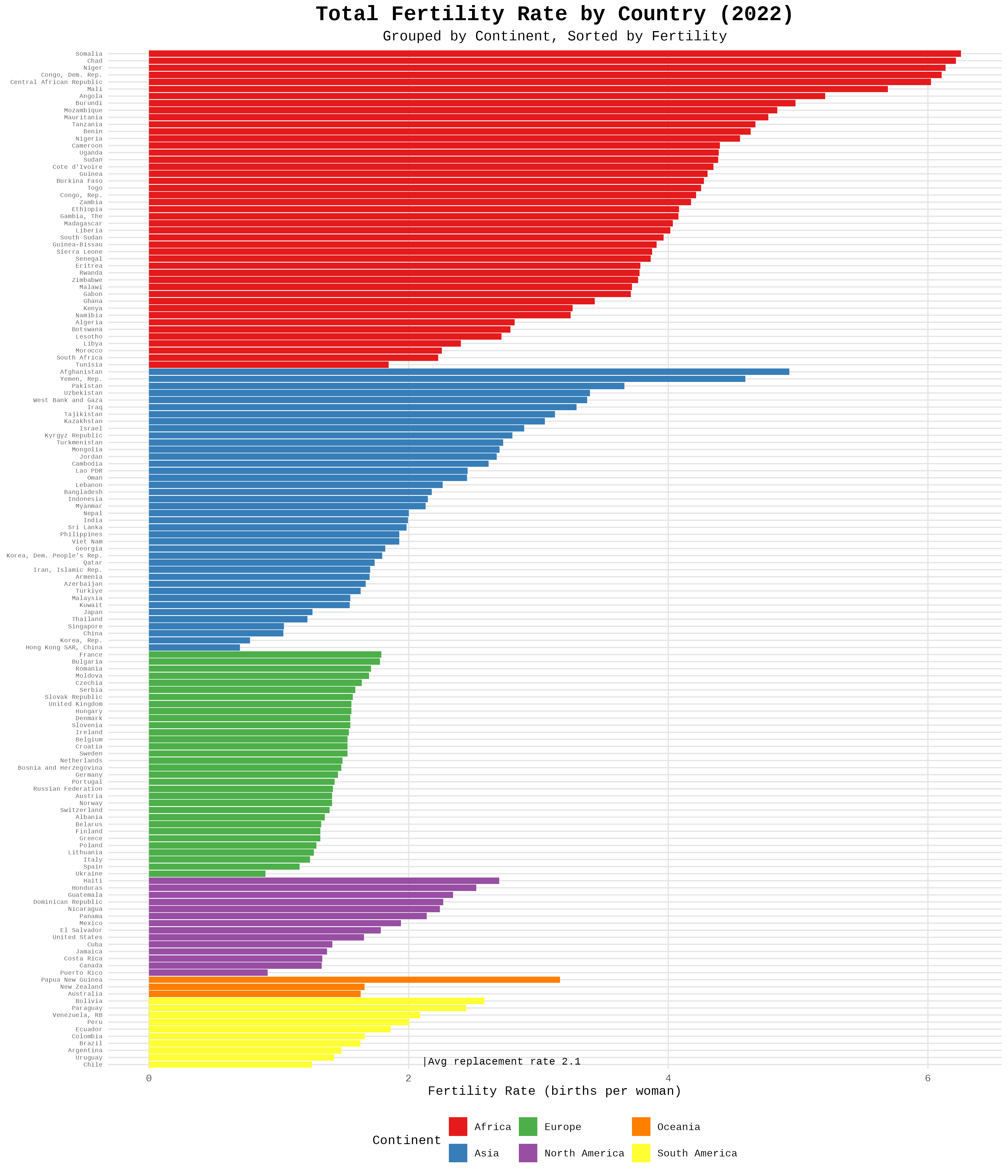
data from https://data.worldbank.org/indicator/SP.DYN.TFRT.IN?most_recent_value_desc=true
with some small countries removed using population from https://data.worldbank.org/indicator/SP.POP.TOTL
r package ggplot2 code at https://gist.github.com/cavedave/82a96b9380506ecfb631cbf8cf253eb1 so if you want to remix it or fix that faroe islands are still there or whatever that should help.
The 2.1 kids need for replacement varies a lot by country. Especially the really poor ones where lots of kids still unfortunately die.
Posted by cavedave
15 comments
If this was a type of insect or animal, all scientists would be working 24/7 to figure out why.
Great data but difficult to read in this graph. I should be able to read the specific value for each line.
Difficult to read, but otherwise very interesting
Dont worry about it.
Who needs a pension… or a future.
I’m curious if you made the width the population of each country 🤔
Fertility rates are like pitbull populations the lower the income the higher the rate.
I’m surprised that Hungary has such a higher rate than Poland.I honestly didn’t think very highly of social programs paying people for children based on the ones in Poland, but maybe they are more effective than I thought…
And btw, very nice graph OP!
We’re setting ourselves up to be overthrown by AI.
Explains the migration problem in Europe and North America. We got to keep up or we’re going to invaded not in our time but our children’s time. Start making babies USA 🇺🇸
puerto rico is part of the us ❤️💙💖
Oceania is a region. Australia is a continent.
If the thickness of the bar is weighted by population, that’d be great
China, population ~1.4 billion has more than three times the population of the entirety of South America, and their TFR is abysmal
Ukraine had the highest death rate and lowest birth rate in the world
In other words Africa 2100 = Asia 2020
“breed like rabbits” once someone used this term about certain ethnicity…. I was like well ok i am either not gonna have any kids or maybe just one lol.
Comments are closed.