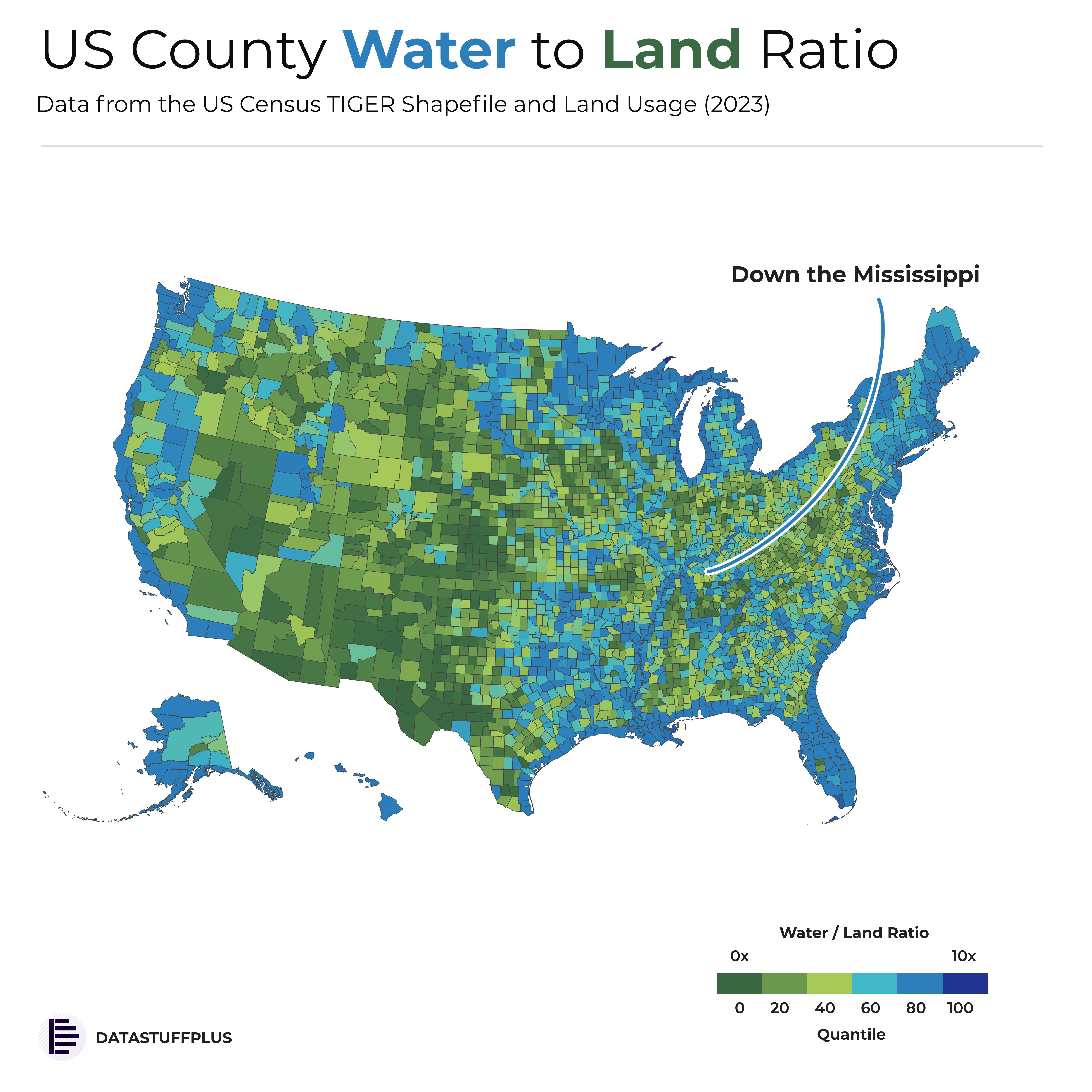
Repost from earlier taking into account the lack of legend etc. Hope its more clear!
Source: US Census TIGER data
Tools: Python/Photopea
Posted by datastuffplus
![[OC] US County Water to Land Ration - UPDATED](https://www.europesays.com/wp-content/uploads/2025/06/1751108350_9xc5pc0hwh9f1-1920x1024.png)
Repost from earlier taking into account the lack of legend etc. Hope its more clear!
Source: US Census TIGER data
Tools: Python/Photopea
Posted by datastuffplus
12 comments
There is no explanation about what this means? Closeness to a body if water? Amount of wetlands?
Why is this better than a normal map that shows green/brown for land and blue for water?
Now your legend shows the water to land ratio for the extreme colors, but nothing in the middle. I don’t know how to interpret the colors. I can see that further right in the scale means more water, but I can’t tell by how much. Because you divided the scale into quantiles, I can’t even guess how each color’s ratio relates to the others. You’re ostensibly showing a physical measure, but all I can glean from the map is a rough ranking. Medium green means what? 100x as much land as water? 1000x? Obviously each color represents a range, but I have no idea what the range might be.
Somehow adding that legend has made this graph more confusing [than the last one](https://www.reddit.com/r/dataisbeautiful/comments/1llvw7a/oc_ratio_of_water_to_land_area_by_county_in_the/).
First, quantiles that are out of 100 are called percentiles
Second, you don’t use quantiles if your map is not dividing whatever that is being counted into equal buckets
Third, it doesn’t even look like you are dividing the counties into buckets, it looks like you are just using it to divide up the Water-Land Ratio color scale itself.
Fourth, what is the unit of measure of Water/Land? Is it area? What is even counted in this area? There is no way the county that Las Vegas is in is about 6x more Water than Land.
Why is there a line bisecting ny that says down the Mississippi?
It’s a cool map that can start conversations, but I don’t know how much usable information there is. The idea that the Willamette Valley is similar to Las Vegas makes me scratch my head.
This should go in the HOF of bad graphics.
Instead of a random sentence like “down the Mississippi” you should point out the most and least. Or any other interesting examples.
I think this data gives the Great Salt Lake too much credit for being “water”.
Pretty good representation of how awesome Minnesota is
I am very confused by San Diego county. There are no natural lakes and a lot of the county is a desert. Is it just because it’s by the ocean?
Consider simplifying the map and the legend. Instead of using multiple colors, consider using a single color on a gradient scale, with the softer end of the gradient signifying “Low Water to Land Ratio” and the darker end of the gradient signifying “High Water to Land Ratio”. This would remove the need to add numerical values to the legend.
The concept would be similar to [these graphs](https://commons.m.wikimedia.org/wiki/File:NPR_HEAT_GRAPH.png)
Comments are closed.