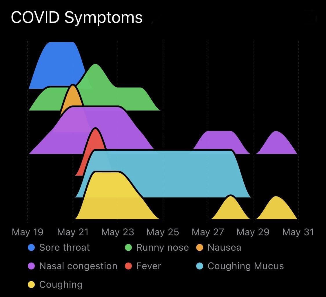
Last month I posted the progression of my COVID symptoms with a line chart, and received a lot of good feedback about how to improve the visualization. One of the suggestions was using a ridgeline plot – I think this looks much clearer than the original. Thanks to all the constructive commenters!
Source: I manually recorded daily symptom intensity data on a 0-4 subjective rating scale.
Tools: The data recording and visualization were performed with Reflect, a personal tracking app I'm developing.
Posted by WarAgainstEntropy
10 comments
Last month I posted [the progression of my COVID symptoms](https://www.reddit.com/r/dataisbeautiful/comments/1kvzmfg/oc_my_covid_progression_of_symptoms/) with a line chart, and received a lot of good feedback about how to improve the visualization. One of the suggestions was using a ridgeline plot – I think this looks much clearer than the original. Thanks to all the constructive commenters!
**Source:** I manually recorded daily symptom intensity data on a 0-4 subjective rating scale.
**Tools:** The data recording and visualization were performed with [Reflect](https://apps.apple.com/us/app/reflect-track-anything/id6463800032), a personal tracking app I’m developing.
Very nice vizualisation… And clearly not the same symptoms as 5 years ago. You just made me realize i might’ve gotten the same variant as yours last week…
On May 25-27, how were you coughing mucus when you weren’t coughing?
Nice job! Easy to follow, complex enough to be interesting but accessible, pleasing to look at, and pretty original in presentation.
No loss of smell or taste? New COVID not sticking to some of its most unique symptoms, making everything taste like styrofoam.
Really nice visualization. I’ve only had it once, but I dubbed it the “clown flu” because I just never knew what the day would bring. I would wake up, take some Tylenol, and think, “I feel okay,” and then by noon I’d be in a Zoom meeting and think, “I’m gonna barf, gotta go.” Rinse and repeat. It wasn’t too bad (thanks vaccination!) but it was truly strange.
Was expecting to see “razorblade throat” on there.
> on a 0-4 subjective rating scale.
Interestingly, it looks like you never used a 1 or 3, just 0, 2 and 4.
Not saying you’re unusual or wrong in doing that, just an interesting point about subjective data and error bars.
The 22nd must of been one hell of a day
Ridgeline plots only make sense with quantitative data where the amount matters. For binary yes/no data, you could have just done linear tracks without the “ridge”
Comments are closed.