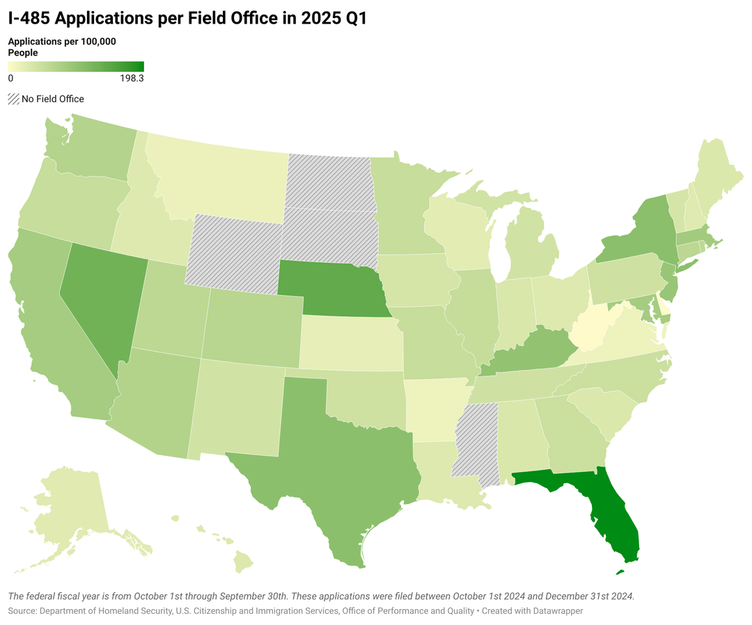
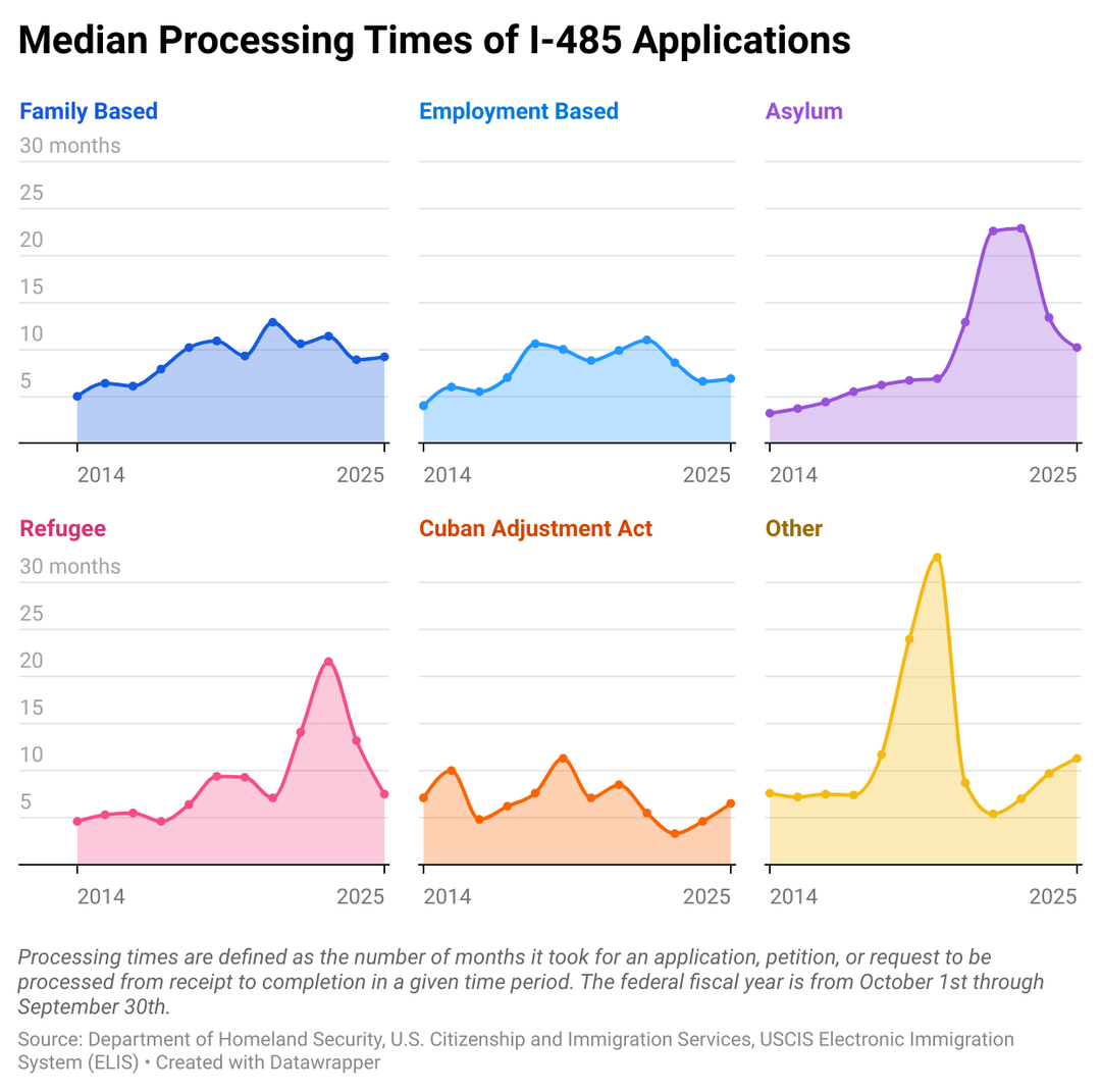
Source: Department of Homeland Security, U.S. Citizenship and Immigration Services, Office of Performance and Quality. Accessed via the USCIS website.
Historic processing time data was also from the USCIS website.
Tools: I used R studio to extract AOS data from the 12 CSV files (one for each year) and compile it into one file. Data was visualized using Datawrapper.
Posted by Reaniro
11 comments
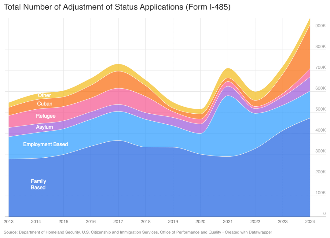
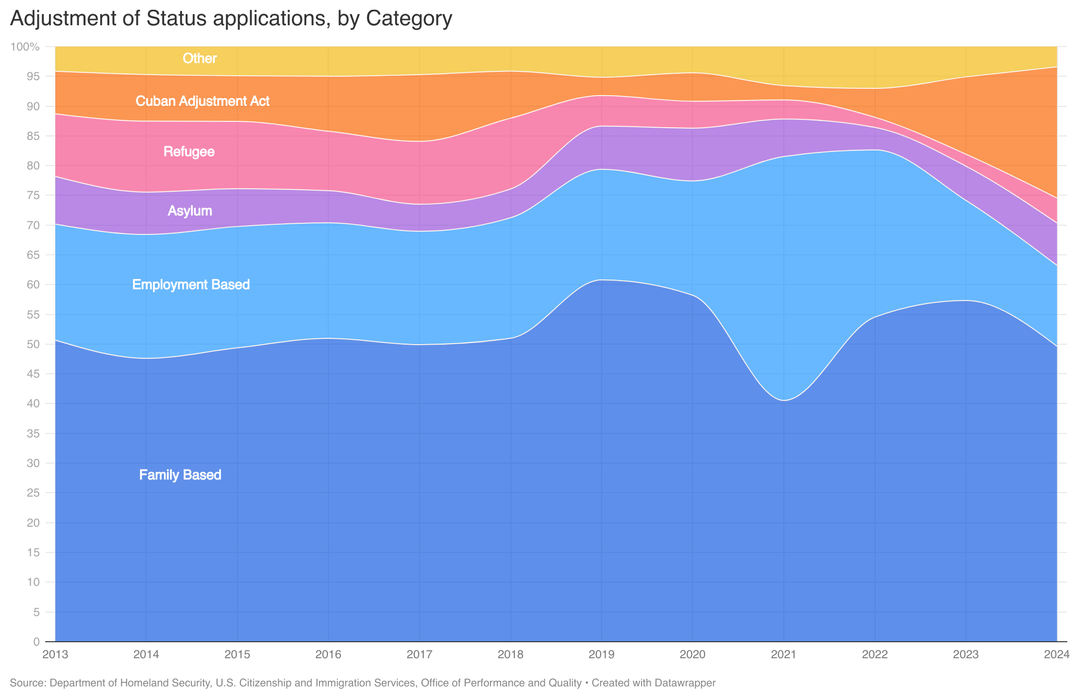
Adjustment of Status is the process by which people currently in the US apply for a green card.
I wanted to see how the number of applications for AOS, as well as the distribution of basis has changed over time.
Source: Department of Homeland Security, U.S. Citizenship and Immigration Services, Office of Performance and Quality. Accessed via the [USCIS website](https://www.uscis.gov/tools/reports-and-studies/immigration-and-citizenship-data?topic_id%5B%5D=33682&ddt_mon=&ddt_yr=2025&query=&items_per_page=10).
Historic processing time data was also from the [USCIS website](https://egov.uscis.gov/processing-times/historic-pt).
Tools: I used R studio to extract AOS data from the 12 CSV files (one for each year) and compile it into one file. Data was visualized using Datawrapper.
“Employment based” is way too low of the percentage. We should be importing high skilled workers.
The employment based bump in 2021 is due to unused quota repurposed from other categories due to Covid.
Data Observation: Cuban Act had huge increase during Biden’s Admin; Cuban Americans overwhelmingly voted Republican.
Interesting to see family-based outnumber employment-based applications.
It looks good, but I think the smoothed line chart is not the right representation when you have yearly total counts. Because it doesn’t mean anything to have data in-between years (at least for the absolute values), so interpolating is weird. I would go for bar chart. May look less beautiful from afar, but it would represent the data better
It looks good, but I think the smoothed line chart is not the right representation when you have yearly total counts. Because it doesn’t mean anything to have data in-between years (at least for the absolute values), so interpolating is weird. I would go for bar chart. May look less beautiful from afar, but it would represent the data better
What color palette is that?
Before people start all kinds of bullshit here in the comments, I want to offer my perspective as a current Green Card applicant. Getting a Green Card is very hard. It’s a long and complicated process. Employment-based routes to immigration are so hard that the easiest thing an immigrant can do to get a Green Card is to marry an American. That’s why that category is the biggest one. It’s not just the employment-based routes. I have a friend who applied for a refugee visa due to being LGBT from a country where that would be dangerous, and that was so hard he had to rush to marry his boyfriend. This isn’t chain migration or whatever, immigration law doesn’t allow you to bring your extended family or whatever, and dependents of non-citizens are categorized under whichever category the main applicant is.
Why is Cuban its own category?
damn, nebraska is a lot darker in this graph than i thought it would be
Comments are closed.