The experimental data were obtained from 25 independent experimental runs, each carefully designed to investigate the effect of six key variables: solution pH (X1), moisture content (X2), applied voltage (X3), sodium persulfate concentration (X4), surfactant dosage (X5), and sonication power (X6) on the pollutant removal efficiency (Removal (%)). Researchers directly measured the outcomes after running experiments with distinct variable combinations among the controlled conditions which produced twenty-five usable experimental data points. A robust fit for the system behavior required the application of the RANSAC Regressor algorithm because of its reputation for detecting outliers. The model received training data from actual experiments followed by performance evaluation through R-squared (R²) and Root Mean Square Error (RMSE) metrics. Model generalization assessment contained Monte Carlo simulation which generated 10,000 random parameter combinations through the entire specified ranges to produce removal efficiency estimates over diverse conditions. The simulation process optimized and assessed sensitivity together with determining optimal parameter configurations.
RANSAC regressorCorrelation matrix analysis of variables with removal (%)
Figure 1 is a correlation matrix used to display the relationships between six variables (X1 to X6) and Removal (%). A square matrix structure shows the relationship between two variables in each cell between specific pairs of variables. Dark red cells represent strong positive links, whereas dark blue cells depict strong negative links, with other colored cells indicating weak to moderate correlations27. The X and Y axes of this chart simultaneously contain six variables. Under the Y-axis, the analysis shows variables sorted into row positions and under the X-axis, the analysis presents variables organized into column positions. Thus, the arrangement demonstrates that correlation matrix cells reveal each variable’s relationships according to specific conditions. Within cell values fall between − 1 and + 1, yet + 1 values denote strong positive relationships where variables rise together identically, whereas − 1 values represent strong negative connections that produce opposite variable alterations; thus, zero or near-zero values show minimal or no variable relationships. Results from correlation analysis demonstrate strong positive associations between Removal (%) and X2, X3, and X5, while X1 demonstrates a robust negative correspondence to Removal (%)23,28,29,30. A negative connection occurs between X4 and X6 as they relate to Removal (%). Additionally, X2 contributes to X3 creating the positive effect. Also, X5, X6, X3, and X5 show a lasting, strong positive relationship with removal efficiency. A very strong negative correlation between X1 and X3 suggests that the simultaneous increase of these two variables negatively affects removal performance. Interactions between X1 and X4, X1 and X6, X2 and X4, X3 and X4, and also X4 and X6 had no significant impact on removal performance23,28,29,30.
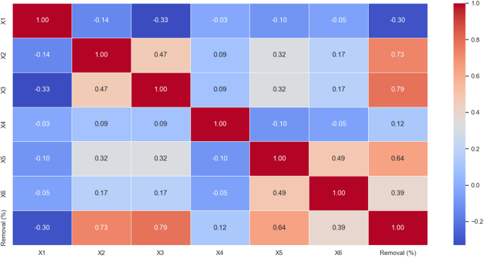
Pearson correlation matrix between the six input variables (X1 to X6) and the target output (Removal (%)). pH (X1), moisture content (X2), applied voltage (X3), sodium persulfate concentration (X4), surfactant amount (X5), and ultrasonication time (X6).
Contour plot analysis of removal (%) with variables X1 to X6
The Contour Plot within Fig. 2 helps researchers study multi-variable interactions within their collected data. The plot axes display variable values. The colors in the plot indicate the values of Removal (%). Warm colors (red and orange) represent higher removal values (over 50%), while cool colors (blue and green) represent lower removal values (less than 50%). In the plots, particularly on the right-hand side where higher removal rates are observed, for example, in the X1 and X3 combination (upper left plot), the red areas indicate that changes in these two variables significantly increase the removal rate. The plot uses blue and green shaded areas to show variable value changes affecting removal percentage to a minor degree, and allows visual interpretation of variable relationships with percent removal23,31. The research data shows distinct colored areas for specific condition pairs that either increase or decrease the percentage of removal. Maximum removal occurs within the designated red zones, whereas the blue zones represent unfavorable conditions for removal results23,31.
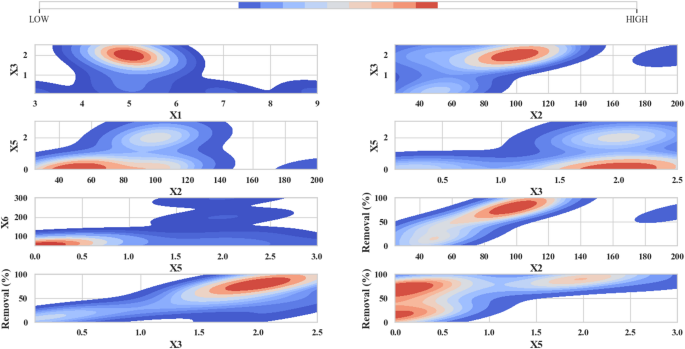
Contour Plot of Removal (%) Based on X1 to X6. pH (X1), moisture content (X2), applied voltage (X3), sodium persulfate concentration (X4), surfactant amount (X5), and ultrasonication time (X6).
Analysis of model prediction with ridge plot and ECDF
Figure 3 consists of two main parts: training and test datasets benefit from the Ridge Plot and the Empirical Cumulative Distribution Function for comparison between actual and predicted values. The prediction precision tracks through graphical tools which display data distribution across an X-axis scale from 0 to 150 with density calculations shown on the Y-axis. Different colors are assigned to each dataset: actual training data appears in blue together with orange showing predicted training data, while test data actual values are represented in green, and test data predictions use red on the graphs. The Ridge Plot shows that regions with high density which appear as red and orange zones demonstrate higher prediction-data correspondence and indicate strong model performance in these areas. The predictive accuracy of the model decreases proportionally with the density of blue and green shading across the geographic region. In the Empirical Cumulative Distribution Function (ECDF), this part of the plot shows the ECDF for the actual and predicted values in both the training and test datasets. The visual presents quantitative information from 0 to 100 on the X-axis together with its cumulative percentage distribution on the Y-axis. Each color again represents a dataset: the graph displays actual training values indicated by blue points and predicted training values as orange points with actual test values shown in green and predicted test values in red. A better match between actual and predicted values in an ECDF analysis appears through smoother lines. When the predicted data line stays near the actual data line it shows that the model performed precise predictions. The analysis of test information displays that green and red lines display ideal alignment patterns which maintain accurate correspondence to the modeled predictions. On the other hand, clear differences between the lines (for example, in the training data) may indicate lower prediction accuracy for all values. The conclusion from these plots shows that the prediction model performs well on the test data. In the Ridge Plot, the predictions are mostly close to the actual values, especially for the test data. In the ECDF, a strong agreement is observed between actual and predicted values, especially in the test dataset. The plots show high prediction performance on test data though training data accuracy might be slightly decreased22,32,33,34.
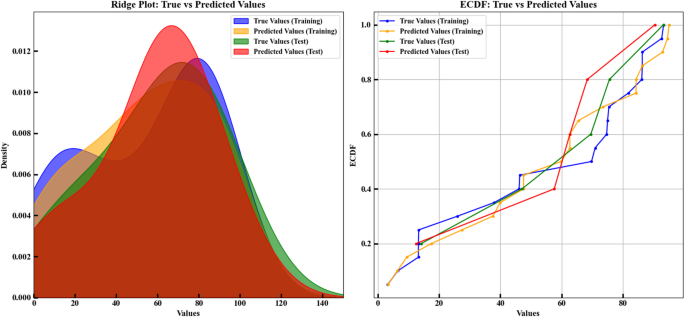
Ridge plot and ECDF comparison of actual vs. predicted Removal (%) values using the RANSAC model. Analysis was performed on standardized features (X1–X6) with an 80:20 train-test split (random_state = 42) using standardScaler.
Error and R² metrics comparison for training and test data
Within Fig. 4, the four subplots illustrate the comparative examination of both training test datasets for error metrics alongside R² values. The model assessment utilizing graphical representation demonstrates prediction outcomes by comparing training data against test data through error measurements spanning 0 to 100 on both axes. Tokens reveal training errors surpass test errors demonstrating the model’s insufficient training among training inputs yet its competence in detecting new inputs. The second subplot (top right) is also a Box Plot, but it compares the R² values for the training and test datasets. On the Y-axis, the plot demonstrates R² values starting at 0.89 and extending to 0.95 while using X-axis labels to separate training and test data points. The R² value for training data reaches 0.90 while the test data R² matches the training data R², indicating no overfitting occurred. Furthermore, the bottom left subplot shows training set metrics with error metrics alongside R² values. The plot shows error metrics such as Mean Squared Error (MSE), RMSE, Mean Absolute Error (MAE), and R² on its Y-axis scale from 0 to 100. The X-axis represents the four error metrics: the values in this plot reveal that MSE possesses the highest value, with MAE sitting at a much reduced level and RMSE sits lower than MSE, while R² approaches 0.9. In this plot, it is observed that the model performs poorly in terms of MSE for the training dataset, but the other error metrics show lower values. Similar to the preceding subplot, the bottom right window displays the results from the test dataset35. In this plot, MSE still has the highest value but is lower than the training dataset. Other error metrics like MAE and RMSE are at lower levels. The model exhibits strong performance characteristics for test data according to its obtained R² value thus eliminating overfitting as an issue. Throughout the final analysis our evaluation shows that error values in the training set exceed those in the test set, likely because the model learned too much from the training data without sufficient ability to adapt to new data points. Parallel R² values discovered through this comparison signify accurate test data prediction from this model. The simulation functioned to maximize beneficial parameter configurations while testing sensitivity ranges. The outcome defies conventional overfitting patterns because the model establishes better generalization abilities although it did not completely memorize training data patterns. The high MSE value relative to MAE and RMSE shows that the mean square error calculation gets affected by one or more points with outsized prediction errors due to its squaring methodology. Additionally, the MSE, MAE and RMSE discrepancy reveals information about prediction error types. In both datasets the high MSE value indicates that several points contain huge error values leading to increased MSE values as a result of squaring. The high values of MAE and RMSE suggest anomalies and rare cases have affected the training data collection. On the other hand, the lower stable values in test data indicate better error distribution in unused data. The model shows reliability according to Box Plots analysis through symmetrical R² value distributions which keep central tendency measures tightly grouped between data sets. All testing situations demonstrate that the model generates exact system behavior predictions through the use of untested data. The model shows higher training errors, but the similar R² values and test dataset errors prove that it strikes an excellent trade-off between accuracy and generalizability. This model functions with caution to address issues related to overfitting which makes it an optimal choice for using real data characterized by usual variations36,37.
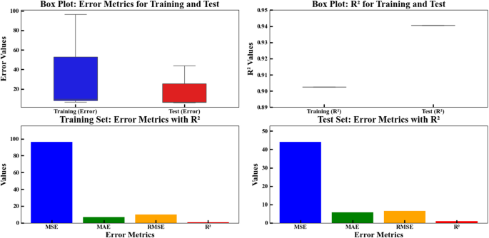
Box plots and bar plots comparing training and test error metrics for the regression model. The upper row shows box plots of MSE, MAE, and RMSE errors and R² values for training and test datasets, while the lower row presents bar plots of the same metrics for both sets. The model evaluation is based on six features: solution pH (X1), moisture content (X2), applied voltage (X3), sodium persulfate concentration (X4), surfactant amount (X5), and ultrasonication time (X6).
Analyzing model performance and metrics with varying training set sizes
Figure 5 displays four distinct segments that track model metrics against training data size and follow observed patterns in each section.
Training Score: The training set score initially shoots up until it shows a descending pattern.
Test Score: The metrics show better performance with growing training datasets until they start deteriorating because the data has probably overfitted.
Standard Deviation: The metrics present considerable data waves before they reach stability at a threshold level.
Cross-Validation MSE: This graph displays fluctuating performance results for the model through its multiple cross-validation folds, where some folds produced higher variable outcomes.
The first chart (on the left) is Training Score vs. Training Set Size. The graph displays training set size growth from 10 to 15 through its X-axis, together with model training data score scale from 0.7 to 0.9 on the Y-axis. The model’s performance demonstrated consistent growth until reaching maintenance at training set size 12 with a shaded area representing potential score range variations. The second chart (middle right) is Test Score vs. Training Set Size. The ascending training set scale from 10 to 15 on the X-axis corresponds with the corresponding test data score changes along the Y-axis. In this graph, we see that increasing training data quantity elevates test data score performance until reaching a point where it begins to decline. This phenomenon could indicate a generalization shortfall which implies that overfitting is possible. The third chart (on the right) is Standard Deviation vs. Training Set Size. The training set size variable on the X-axis corresponds to standard deviation measurements between 0.2 and 1.0 shown on the Y-axis. Standard deviation results in this plot demonstrate an upward trend at training set size growth yet reaches a definitive stability zone over time22. The fourth chart (on the far right) is cross-validation MSE (Negative). The X-axis shows the fold numbers (ranging from 1 to 4), while the Y-axis shows negative values of MSE, ranging from 0 to 2000. This chart represents the evaluation of the model through cross-validation. It is observed that the MSE values in some folds are very high, especially in fold number 2, indicating that the model might have performed poorly during that fold. A negative MSE approach for calculations seems to be the explanation behind displaying such values in negative form. A shaded portion of the chart shows how MSE values change during different cross-validation folds in the analysis. These diagrams track performance changes of models relative to training data quantity and additional measurement variables. The rising score levels within the Training Score vs. Training Set Size graph show training data improvement from additional information but the following downward trend demonstrates a learning saturation effect since extra training data does not improve model accuracy. This issue could stem from structural limitations of the model in fully utilizing new information. In the second chart (Test Score vs. Training Set Size), the improvement of test score followed by a decline indicates the onset of overfitting. The drop occurs because the model acquires specialized training set characteristics which diminish its ability to handle new data points. The achievement of robust performance requires adoption of data augmentation with regularizing methods. The third chart shows standard deviation variability which first reached high values before stabilizing at a specific training data size. The data shows a probable sign of model reliability through statistics but requires examination of how standard deviation impacts performance scores to verify effective learning against reduced data variability. The fourth chart (cross-validation MSE) shows inconsistent model performance because MSE varies substantially between folds particularly in fold 2. The unreliable model results seem to originate from unequal data distribution or rare data points in some of the training folds. Evaluating each data set in more detail and applying stratified sampling to create balanced training partitions can boost prediction reliability. In summary, although the model demonstrates acceptable accuracy and stability in certain aspects, challenges such as overfitting, MSE fluctuations during cross-validation, and learning saturation demand further optimization strategies to enhance real-world model performance21,38.
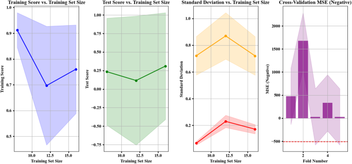
Performance and evaluation metrics of the RANSAC regression model for predicting Removal (%). The four subplots show: training score vs. training set size, test score vs. training set size, standard deviation of scores, and 5-fold cross-validation negative MSE. The model was trained on scaled data using six input features: solution pH (X1), moisture content (X2), applied voltage (X3), sodium persulfate concentration (X4), surfactant amount (X5), and ultrasonication time (X6).
Feature importance analysis
Figure 6 consists of two parts that display model feature analysis through two visual representations. The first part uses a Pie Chart showing the distribution of feature importance. In this chart, feature X2 has the highest importance, accounting for 84.8% of the total model importance. Next, feature X3 has an importance of 11%. Features X4 and X1 have small percentages, 2.9% and 0.8%, respectively. The model attributes only minimal importance to the X5 and X6 features which collectively amount to less than one half percent of the model’s total importance. The chart displays that feature X2 plays a crucial role in the model as compared to other characteristics39. The second chart is a Bar Chart used to display the importance of each feature as bars. Properties (X1 to X6) appear in this bar chart with length indicative of their relevance to model performance. The chart measures feature significance through an X-axis scale between 0 and 1. Feature X2, with the highest importance (0.85), has the longest bar on the right side of the chart. Feature X3 also has significant importance (0.11), but it is much less than X2. The importance ratings for Features X4, X5 and X6 come out to be minimal (0.03, 0.00, 0.00). This chart also indicates the very high importance of X2 and the lower importance of the other features. Analyzing the conditions in these charts, it can be said that feature X2 has the most impact on the model, suggesting that it is the primary factor for prediction in the model. Features like X3 also have some significance, but they are much less important than X2. Features X4, X5, and X6 have very little importance, indicating that they likely have almost no impact on the model’s results. These charts can be very useful for selecting effective features to improve the model or for removing ineffective ones. The graphical analysis displays model input feature significance for optimized feature selection and performance assessments40.
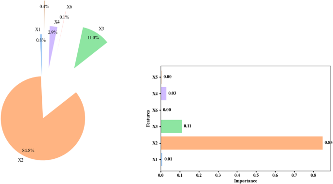
Feature importance distribution of the random forest model for predicting removal (%). The pie chart and horizontal bar chart display the importance of six features: solution pH (X1), moisture content (X2), applied voltage (X3), sodium persulfate concentration (X4), surfactant amount (X5), and ultrasonication time (X6). The importance values are shown as percentages.
Q-Q plot for residuals analysis
A Q-Q plot (Fig. 7) performs model assessment on both training and test data residuals plotted against empirical and theoretical normal distributions. The plot contains two separate sections for its information. The chart shows training data residuals on its left portion then displays test data residuals on its right side. The X-axis represents the theoretical quantiles, which are obtained from a normal distribution (or another assumed distribution). The Y-axis represents the sample quantiles, which are the residuals of the model in the actual data. The analysis of training data points follows the red ideal line across the entire plot showing normal distribution in residuals while revealing increased tail variance in both ends. For the test data (right plot), the residuals generally deviate from the red line22,34,41. That most of the distribution points match the red line demonstrates normality until extreme outlier data points show different distributions. This deviation is most prominent in the right tail section. In summary, for the training data, most points are close to the ideal line, but the deviation at the tails is noticeable. In the test data analysis, a significant deviation emerges away from the red line because the model did not succeed at normalizing the residual distribution for these datasets. This graphical assessment checks whether the model maintains compliance with normal residual assumptions22,34,41.
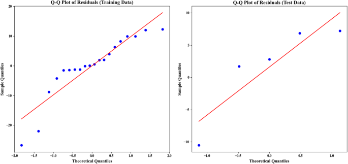
Q-Q plots for the residuals of the RANSAC regression model on the training (left) and test (right) datasets, showing the comparison between sample and theoretical quantiles. Residuals were calculated from the difference between actual and predicted values. The data includes six features (X1 to X6) and ‘Removal (%)’. The dataset was split 80 − 20 for training and testing, with visualizations generated in Matplotlib.
Residuals and actual vs. predicted analysis
The visual presentation in Fig. 8 includes four distinct panels for assessing residuals, together with model prediction versus actual value analysis. The first plot is a Violin Plot used to analyze the residuals in both training and test data. A frequency analysis of training data residuals occurs in the left graph against numerical residuals’ values. The distribution shows most points cluster near zero, while deviations create skewness throughout both positive and negative regions. The wider section in the middle shows the concentration of residuals in that range. The right plot represents the residuals in the test data. The residuals follow a similar pattern to the training data with zero-centering but exhibit reduced quantity which reflects potential deviations during new data predictions. The second part includes two Bar Charts comparing the actual vs. predicted values for both training and test data. Within the bottom left portion of the display area the model prediction data overlaps with the training data actual values. The X-axis displays which index positions appear while the Y-axis shows actual and predicted measures of every index using blue for future predictions and green for actual data points. Observational differences exist between predicted and actual data points at selected indexes, potentially due to modeling errors23. Test data actual versus predicted value comparison is presented in the bottom-right chart with blue prediction marks and green actual value marks. Analysis of the model shows its test prediction accuracy is lower because observed prediction vs. actual value discrepancies have become larger. In the analysis of the conditions in these plots, for the training data, the model has made relatively accurate predictions, as the difference between actual and predicted values is small. Model restrictions alongside distinctive features from the dataset cause data inaccuracies as analysis of test data indicates possible generalization challenges through enlarged differences between predicted and actual values. The outcome evaluation assessment utilized data to examine model predictive performance but also collected extra information for future predictive needs42,43,44.
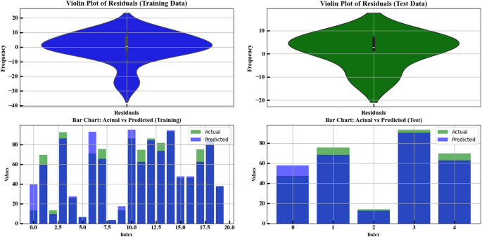
Violin and bar plots illustrating residual distributions and actual vs. predicted values for training and test datasets using the RANSAC regression model. Input features (X1–X6) were standardized using StandardScaler, and data were split into 80% training and 20% testing sets (random_state = 42).
Comparison of error metrics for regression models
The comparison between different regression models’ error values (MSE, RMSE, MAE) appears within this chart. A graph (Fig. 9) with regression models ranging from RANSAC Regressor to Linear Regression displayed on the Y-axis exhibits error values separated into three sections on the X-axis. These three errors are: the three performance metrics include MSE which measures squared errors and RMSE that calculates the square root of mean squared errors and MAE which indicates mean absolute errors. These three errors are: the three performance metrics include MSE that measures squared errors and RMSE that calculates the square root of mean squared errors and MAE which indicates mean absolute errors. In the analysis of the conditions in the chart, the colors and markings specifically represent each type of error. Better performance occurs with Random Forest and Gradient Boosting because their error rates (MSE, RMSE, MAE) produce lower results than other models utilized. The conclusion from this chart provides a comparison of the three error metrics (MSE, RMSE, MAE) for each model. The error values calculate model power to classify their strength as weak, strong or average by quantitative methods. Models with lower error rates represent strong categories whereas higher error rates indicate weak models along with the middle group containing average models. The categorization of models is as follows: (1) Strong Models (Low Error/Best Performance): the error results from these models remain below all additional metrics which points to superior performance. Models in this group include: Random Forest, Gradient Boosting, AdaBoost Regressor, Decision Tree. (2) Average Models (Medium Error/Average Performance): These models deliver average results at higher error levels than strong models although their performance beats weak models. Models in this group include: RANSAC Regressor along with K-Nearest Neighbors and Linear Regression. The weak models which exhibit the highest error rates across performance metrics. Models in this group include: ElasticNetCV Regressor, LassoCV Regressor, RidgeCV Regressor, Tweedy Regressor, Poisson Regressor, ElasticNet.
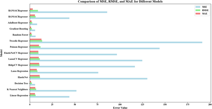
Comparison of MSE, RMSE, and MAE values for various regression models trained and tested on the scaled dataset using StandardScaler. The data includes six input variables (X1–X6), and the target is ‘Removal (%)’. An 80/20 train-test split was applied. The RANSACRegressor’s MSE value (85.89) was used as a benchmark for comparison. Each model was evaluated on the test set to assess generalization performance.
Monte Carlo optimizationVisualization of feature removal percentage and its relationship
Figure 10 provides a visual representation of the relationship between features (X1 to X6) and removal percentage (Removal (%)). The X-axis represents the values of the various features (X1 to X6), which range from 0 to approximately 300. Each feature is displayed in a different color. Duplicate data variables receive individual color coding as each one uses blue for X1, red for X2, green for X3 and continues through the remaining variable designations. Y-axis data shows the Removal (%) scale between 0 and 100% to depict process efficiency levels that adjust according to feature values. Different chart areas display different colors to represent changing removal percentage values. On the left side, lower removal percentages (starting from 0) are shown in red45. The analysis chart shows a color change from pink to blue as the percentage numbers near 100% on the chart. Some points stand out in black to show optimal feature values and removal percentages. Specifically, X1 at 8.50 has a 100% removal rate, while X2 at 188.67 reaches nearly 90% removal. The analysis shows optimal values of X3 = 2.45 and X6 = 198.02 as well as X4 = 0.64 and X5 = 0.07. The analysis shows the removal percentage changes through the transition from blue to red colored areas. Lowest removal percentages appear in red areas, while blue areas show the highest removal percentages. The scattered points on the chart display results from different feature value combinations. These points are generally spread out, with differing removal percentages. This graphic shows various parameter combinations while reporting their impact on removal percentage together with optimal performance conditions45.
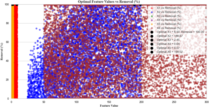
Monte Carlo simulation results showing the relationship between six input features (X1 to X6: pH, moisture content, applied voltage, sodium persulfate concentration, surfactant amount, and ultrasonication time, respectively) and the predicted Removal (%). A total of 10,000 random samples were generated within the defined operational ranges (X1: 3–9, X2: 25–200, X3: 0.1–2.5, X4: 0.5–1.5, X5: 0–3, X6: 50–300). The Removal (%) was calculated using the fitted second-order interaction-based optimization formula. Colored scatter points represent individual simulation outcomes, while black dots indicate the optimal values of each variable corresponding to the maximum predicted Removal (%). This visualization provides insight into variable influence and optimal operating conditions.
Distribution of removal percentage with statistical representations
Figure 11 includes three different types of statistical displays for analyzing the removal percentage (Removal (%)), namely Boxplot, Violin Plot, and KDE (Kernel Density Estimate). The visual graphs present vital data patterns alongside statistical features responsible for understanding removal percentage distributions. The X-axis represents the removal percentage (Removal (%)) ranging from 0 to 100%. In some of the charts, such as the KDE and Violin Plot, the Y-axis represents density, while in the Boxplot chart, the Y-axis is not present and only the removal percentage and its statistical features are shown. In the Boxplot chart, the distribution of the removal percentage data is displayed as a rectangular box. The box’s median represents a pinpoint marking both statistical upper and lower halves of all collected data. The Interquartile Range sections in the box display the data area that holds 50% of the data values extending between the 25th and the 75th percentile. The whiskers represent the minimum and maximum values outside 1.5 times the interquartile range. Values outside these whiskers are considered outliers. Potential data distribution patterns emerge through the elongated funnel structure of Violin Plots which resembles stretched boxplots. The thickness of the curve represents the density of the data at each removal percentage point. Areas with higher density are thicker. Graph viewers observe data density distributions clearly through this visual method to identify areas of concentrated data points. The Kernel Density Estimation (KDE) graph displays smoothed data distribution estimates and depicts data probability density through smooth curves. In this chart, two peaks are observed. The majority of data points cluster within the ranges of 0 to 20% and 70 to 90%. Additionally, the chart clearly shows that the removal percentage is more concentrated at the lower and higher ends of the range, with fewer observations in the middle range22,32,33,34. Most data points in the Boxplot chart cluster between 0% and approximately 95% while exceptional points above 95% occur only infrequently. The Violin Plot reveals extensive data density showing clear concentration in two primary areas from 0 to 20% and from 70 to 90% while the KDE chart provides detailed visual data distribution illustrating peak concentrations at 0 to 20% and 70 to 90%. The KDE chart also shows that specific ranges of removal percentages (0 to 20% and 70 to 90%) contain higher data densities. The system seems to show two different operational behaviors based on the multimodal data distribution which becomes visible through dual peaks in KDE and Violin plots within the 0 to 20% and 70 to 90% removal ranges. Clustering in the dataset data points to distinct operational areas that correspond to pH and oxidant dosage values. Such findings may emerge from performing cluster analysis. A right-skewed distribution of data in the KDE plot demonstrates that low removal efficiencies are more frequent than higher removal efficiencies which tend to emerge in optimized scenarios. Non-parametric statistical methods should be deployed across the dataset since right-scaled distribution breaks the validity of normality assumption. Future experimental research should concentrate on investigating the mid-range (20–70%) destruction percentages because these data points remain lightly explored in the present study. The density curves together with boxplot boundaries identify a few extreme data points which measure exceptionally well and could qualify as outliers. The points need to be identified using particular outlier detection algorithms such as Isolation Forest or Local Outlier Factor to determine their origins from experimental or measurement errors. Overall, these observations support the idea that while the removal percentage distributions offer clear insights into where the model performs well or poorly, a more granular analysis rooted in data structure and statistical shape can provide valuable direction for both model optimization and experimental refinement23,34,46.
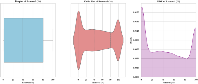
Boxplot, Violin Plot, and Kernel Density Estimation (KDE) of the simulated Removal (%) distribution obtained from Monte Carlo simulations (n = 10,000). The simulations were based on a quadratic polynomial regression equation involving six process variables: solution pH (X₁: 3–9), moisture content (X₂: 25–200%), applied voltage (X₃: 0.1–2.5), sodium persulfate concentration (X₄: 0.5–1.5), surfactant amount (X₅: 0–3), and ultrasonication time (X₆: 50–300). All variables were sampled from uniform distributions across their respective experimental ranges. The model output was clipped to the range [0, 100] to reflect the physical limits of percentage removal.
Interactions between features and removal percentage in 3D
Figure 12 includes several 3D plots that examine the interactions between two features (X1 to X6) and the removal percentage (Removal (%)). The Z-axis displays the removal percentage across plots which use pairs of features from the collection as points on the X-Y axes. The X axis in these plots represents one of the independent features (X1 to X6), which is placed horizontally in each plot. The Y axis represents another feature from the feature set, placed vertically. The Removal (%) graph (Z axis) demonstrates vertical data display from zero to 100% in each chart. The graphs present selective areas within the X2 and X3 combination where removal percentage rates rise significantly when values exceed 80%. The color change from blue to yellow indicates that the removal percentage increases as these features grow. The double-plot showed a dramatic enhancement in removal percentage when X1 and X2 concentrations were elevated together. As feature values reach their maximum points the removal percentage achieves nearly complete success. The interaction between X2 and X4 displays similar results by showing a premium removal percentage rise to approximately 100% with increasing combinations of these features. The fourth plot investigates the effects of the interaction between X2 and X5, showing that the removal percentage increases from lower values (under 20%) to higher values (around 100%) in different combinations of these two features. The fifth analysis delivers findings about X3 and X6 interactions showing increased removal percentage over time while the sixth analysis demonstrates the positive impact of X1 and X6 combination on process efficiency using color-coded regions. Within the conditions of these plots yellow coloring marks regions where feature interactions yield maximum removal percentage observations approaching 100% success rates22,23,31. The darker areas such as blue and purple areas correspond to lower removal percentage ranges where feature combinations show less effectiveness in improving the process outcomes. The removal percentage demonstrates predictable changes from low to high levels while visible color elements show this evolution in these plots. Together these plots illustrate how various features affect removal percentage outcomes. This analysis identifies optimal combinations of features that achieve maximum removal efficiency so process enhancement insights become available23,31.
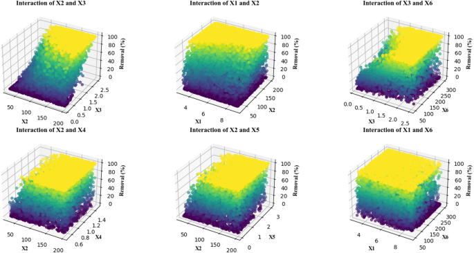
3D interaction plots showing the effect of key experimental variables on removal efficiency. Each subplot represents the interaction between two parameters among solution pH (X1: 3–9), moisture content (X2: 25–200 mg/L), applied voltage (X3: 0.1–2.5 V), sodium persulfate concentration (X4: 0.5–1.5 mM), surfactant amount (X5: 0–3 mg/L), and ultrasonication time (X6: 50–300 s), as obtained from Monte Carlo simulations (n = 10,000) using the optimized regression model. Color intensity corresponds to the predicted removal percentage.
Scatter plots analyzing feature interactions with removal percentage
Figure 13 consists of a set of scatter plots that analyze the relationship between various features (X1 to X6) and removal percentage (Removal (%)). There are six distinct plots in the visualization which present the correlation between features and removal percentage. parameter X1 vs. Removal shows a randomized distribution of scatter points across the entire removal percentage spectrum while X1 values span 3 to 9 along the X-axis and removal percentage covers 0 to 100 along the Y-axis. X1 features show no statistically significant relationship to removal percentage as scatter points are randomly distributed across the entire data range. The analysis sets X2 values from 25 to 200 on the X2 vs. Removal plot’s horizontal axis while showing removal percentage concentration in the plot’s upper segment as X2 values rise. Feature X3 values presented on the horizontal axis span from 0 to 2.5 in the X3 vs. Removal plot. This plot demonstrates the same trend as X2, where feature X3 increase correlates with increased removal percentage as plotted points reside in the upper part of the graph. The X4 vs. Removal plot features a 0.6 to 1.4 scale on its horizontal axis to display feature X4 values while its points evenly distribute across removal percentages without discernible patterns indicating X4 shows no regard for removal outcomes. The X5 vs. Removal graph shows feature X5 values extending from 0 to 3 across its horizontal axis as scatter points maintain even distribution within the full removal percent range indicating no correlation between these variables23. In the X6 vs. Removal plot, the horizontal axis represents the values of feature X6, ranging from 50 to 300. Like the X2 and X3 plots, most points are located in the upper portion of the plot, indicating that as X6 increases, the removal percentage also increases. The X1, X4 and X6 conditions proved insignificant because their corresponding scatter points were randomly spread throughout the removal percentage range. The X2, X3 and X5 features demonstrate a positive correlation with the removal percentage because rising values of these features result in higher removal percentage values. Plotty graphics reveal that X2, X3 along with X5 generate positive effects on removal percentage but X1, X4, and X6 show no observable effects on removal percentage variations. The scatter plots serve as an analytical tool for statistical studies alongside predictive modeling needs because they help reveal connections between features and removal percentage patterns21.
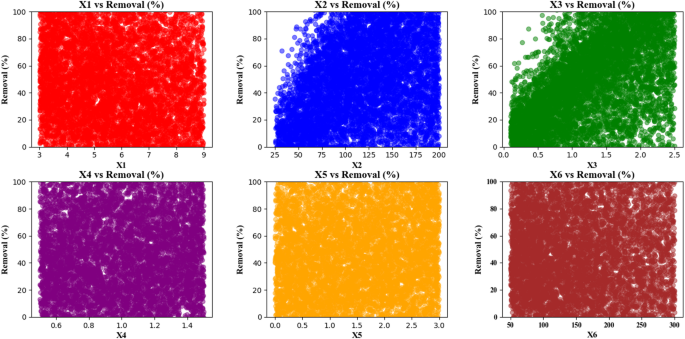
Scatter plots showing the simulated relationship between each input variable (X1–X6) and the predicted Removal (%) using a Monte Carlo simulation (n = 10,000) based on the optimized polynomial regression model derived from experimental data.
Distribution, mean, and risk analysis of removal percentage
Figure 14 presents three plot types to analyze the removal percentage data. The first plot is a histogram that shows the distribution of removal percentages. A removal percentage scale from 0 to 100% appears on the x-axis while the frequency count of samples per percentage range appears on the Y-axis of this plot. The density curve reveals the data distribution through a smooth visual format which shows most points fall within the 20–60% removal range with minimal clustering. As the removal percentage increases or decreases towards the extremes (0% or 100%), the frequency of data points decreases. A standard deviation chart together with a mean chart shows the removal percentage data excluding outliers in the plot. The X-axis of this plot includes two categories. The blue portion displays a 50% mean removal percentage while the yellow segment shows standard deviation measurements at levels below the mean data point concentration. The third plot presents the box plot analysis of removal percentage through statistical methods. The chart outlines data values that are displayed through a box where the X-axis shows removal percentages while the y-axis demonstrates values at various points from 0 to 100%. A red dashed line indicates the 95% risk threshold positioning marks above it. This visualization shows data points clustering in the center zone while points that deviate from this distribution surface as outliers. In summary, the distribution plot shows that most of the data is concentrated in the 20–60% removal range, the mean and standard deviation plot shows little dispersion with a mean removal percentage around 50%, and the box plot highlights the concentration of data in the middle and identifies the 95% risk threshold. These plots enable risk analysis and better data distribution understanding by helping decision-making processes requiring undesirable data point removal21,23,32.
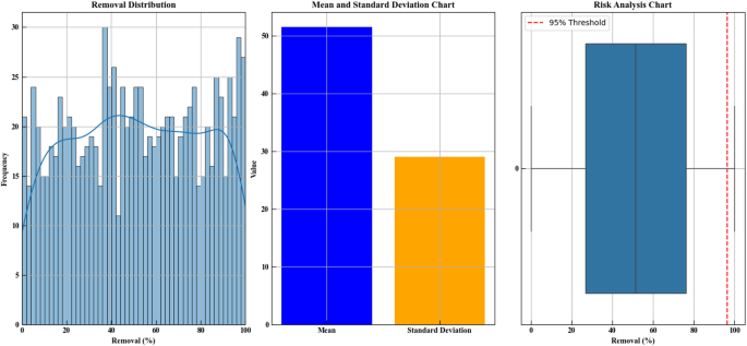
Statistical analysis of simulated Removal (%) values. The first subplot illustrates the distribution of predicted Removal values using Monte Carlo simulation (n = 1000) with a kernel density estimation. The second subplot presents the calculated mean and standard deviation of the simulated data. The third subplot shows a boxplot with a risk threshold line at the 95th percentile, representing the upper bound of expected Removal efficiency. This analysis was based on outputs from a trained machine learning model under experimentally optimized conditions.