What are you using to determine ‘expected pension age’?
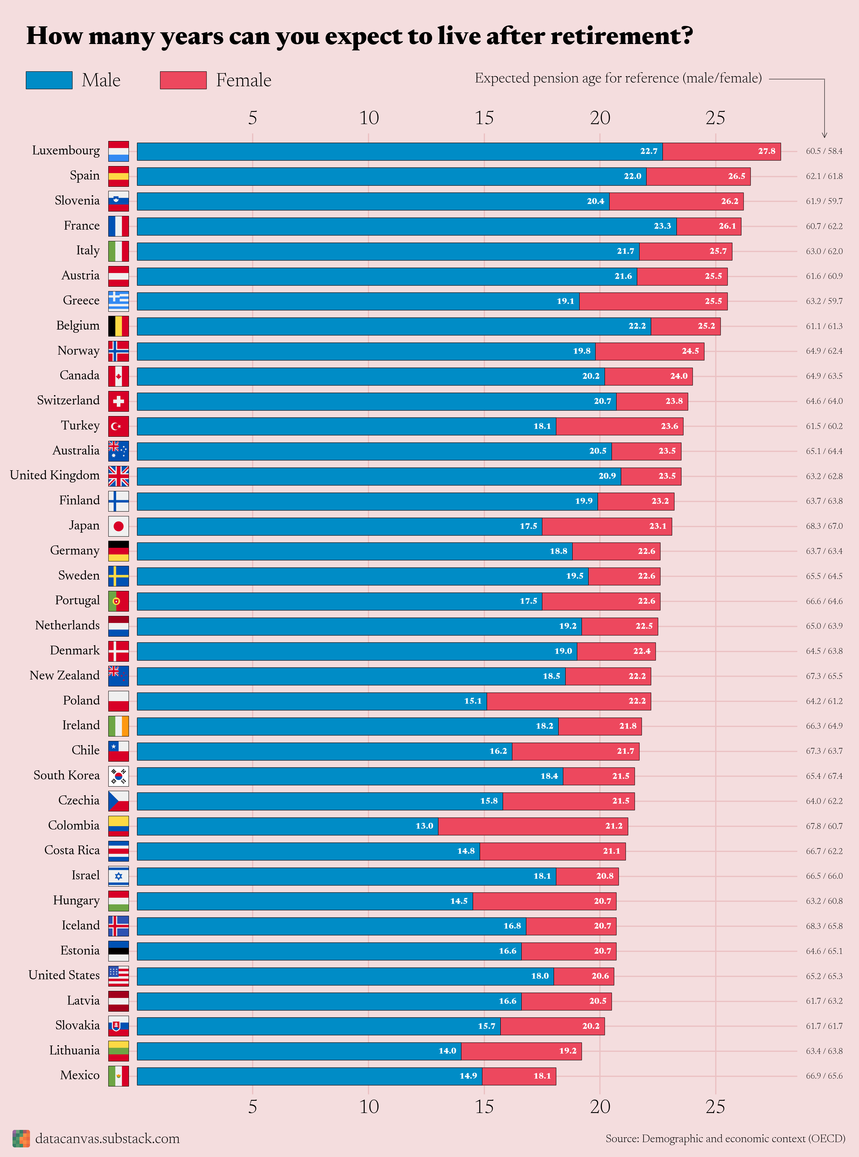
Very bizarre choice to use stacked bars. It makes zero sense and implies that the male + female ages add up to something meaningful, which they don’t. Clustered bars would have been better.
The ordering is weird because it’s done on women, making men less comparable; two graphs would’ve been better.
20 years retirement.
20 years education.
That’s 40-45 years in the middle from age 20-65.
Basically we need massive wealth transfer from the extremely wealthy and corporations to the working people to fund this kind of social safety net.
That’s just a slightly less informative life expectancy chart with retirement ages added, isn’t it?
Iceland seems like an outlier to me.
Is the pension for some reason poor, or the costs of retirement unusually high compared to Nordic countries?
Not gonna lie, pretty sad numbers there. I get that people need to make a living, pitch in to society, etc. But going to school for like 13-20 years, then working for ~40 years, just to get 18-20 years of “relaxation” kind of blows. Who wants to get in on a weekly lottery pool with me?
I like the idea of this graph/data a lot. Super interesting, but I think the retirement ages should be easier to read, and maybe even visualised. There are some countries here where women retire later than men, which explains some jumps in the blue /red ratio.
65 isn’t the right retirement age for the us. Should be either 62 for early or 67 for full
You made a mistake with Poland. Due to different retirement age by gender, men should be at 10 years post retirement not 15, vs 22 for women.
(Incidentally, that makes Poland having the shortest period for post retirement men among the listed countries)
Edit/ OP, there’s actually a mistake in the OECD table. Maybe write them or something, u/oscarleo0
Nvm I’m an idiot confused expectancy at birth and at retirement age. Otoh interesting how the expectancy kinda catches up as men age…
I’ll never be able to afford to retire. Thus, I will simply live forever, checkmate, death.
I thought US life expectancy was way lower than what this shows
I like to see life expectancy as well in the graph
If Lyndon Johnson had run for a second full term as President in 1968 and won, his retirement would have lasted less than 24 hours.
It would be interesting to see the pension age included on the bar graph. Then you could see both the life expectancy effect by country, as well as the retirement age effect. Some of the differences are simply because certain countries retire much later than others (and have similar life expectancy).
You’d want to be in a country where you can retire earlier but life longer!
It’s a cool graph, a bit of a shame the data on retirement age is wrong for the countries I checked.
Here in Sweden according to the official calculator, at my age (31) my expected retirement age is at 69.
Bold of you to think we’ll be able to retire.
So, should men retire earlier? Isn’t the whole point of retiring having some good last years?
So what I’m learning from this is the key to a longer life after retirement is to just retire earlier. Got it.
Wait, you guys are going to retire?
A good argument for not retiring young.
That’s going to drop a lot by the time I’m retirement age, since I don’t see retirement being an option for me.
Living just 1 or 2 decades after you retire makes the whole endeavor of working all of your life just to “live your life once you retire” seem completely pointless.
And that’s IF you’re lucky enough to even be able to afford retirement let alone a comfortable retirement and IF you’re lucky enough to even be healthy after retirement.
What the hell are we even doing here?
The World outside OECD is very different from OECD countries. Yet, because the most available data is from OECD, a general perception made for the world is based on this smaller, more affluent set.
Surprise twist: US makes retirement impossible
The patriarchy needs to step it up, women live longer everywhere.
So, is this graph saying Americans get to live for 2 years after retirement? I just want to make sure I’m understanding, because…
![[OC] How many years can you expect to live after retirement?](https://www.europesays.com/wp-content/uploads/2025/07/ga83jfqn9baf1-1920x1024.png)
29 comments
As an Italian… Retirement?
UK state pension age is 66, rising soon to 67.
What are you using to determine ‘expected pension age’?
Very bizarre choice to use stacked bars. It makes zero sense and implies that the male + female ages add up to something meaningful, which they don’t. Clustered bars would have been better.
The ordering is weird because it’s done on women, making men less comparable; two graphs would’ve been better.
20 years retirement.
20 years education.
That’s 40-45 years in the middle from age 20-65.
Basically we need massive wealth transfer from the extremely wealthy and corporations to the working people to fund this kind of social safety net.
That’s just a slightly less informative life expectancy chart with retirement ages added, isn’t it?
Iceland seems like an outlier to me.
Is the pension for some reason poor, or the costs of retirement unusually high compared to Nordic countries?
Not gonna lie, pretty sad numbers there. I get that people need to make a living, pitch in to society, etc. But going to school for like 13-20 years, then working for ~40 years, just to get 18-20 years of “relaxation” kind of blows. Who wants to get in on a weekly lottery pool with me?
I like the idea of this graph/data a lot. Super interesting, but I think the retirement ages should be easier to read, and maybe even visualised. There are some countries here where women retire later than men, which explains some jumps in the blue /red ratio.
65 isn’t the right retirement age for the us. Should be either 62 for early or 67 for full
You made a mistake with Poland. Due to different retirement age by gender, men should be at 10 years post retirement not 15, vs 22 for women.
(Incidentally, that makes Poland having the shortest period for post retirement men among the listed countries)
Edit/ OP, there’s actually a mistake in the OECD table. Maybe write them or something, u/oscarleo0
Nvm I’m an idiot confused expectancy at birth and at retirement age. Otoh interesting how the expectancy kinda catches up as men age…
I’ll never be able to afford to retire. Thus, I will simply live forever, checkmate, death.
I thought US life expectancy was way lower than what this shows
I like to see life expectancy as well in the graph
If Lyndon Johnson had run for a second full term as President in 1968 and won, his retirement would have lasted less than 24 hours.
It would be interesting to see the pension age included on the bar graph. Then you could see both the life expectancy effect by country, as well as the retirement age effect. Some of the differences are simply because certain countries retire much later than others (and have similar life expectancy).
You’d want to be in a country where you can retire earlier but life longer!
It’s a cool graph, a bit of a shame the data on retirement age is wrong for the countries I checked.
Here in Sweden according to the official calculator, at my age (31) my expected retirement age is at 69.
Bold of you to think we’ll be able to retire.
So, should men retire earlier? Isn’t the whole point of retiring having some good last years?
So what I’m learning from this is the key to a longer life after retirement is to just retire earlier. Got it.
Wait, you guys are going to retire?
A good argument for not retiring young.
That’s going to drop a lot by the time I’m retirement age, since I don’t see retirement being an option for me.
Living just 1 or 2 decades after you retire makes the whole endeavor of working all of your life just to “live your life once you retire” seem completely pointless.
And that’s IF you’re lucky enough to even be able to afford retirement let alone a comfortable retirement and IF you’re lucky enough to even be healthy after retirement.
What the hell are we even doing here?
The World outside OECD is very different from OECD countries. Yet, because the most available data is from OECD, a general perception made for the world is based on this smaller, more affluent set.
Surprise twist: US makes retirement impossible
The patriarchy needs to step it up, women live longer everywhere.
So, is this graph saying Americans get to live for 2 years after retirement? I just want to make sure I’m understanding, because…
I don’t.
I’m on the ‘die at my desk’ retirement plan.
Comments are closed.