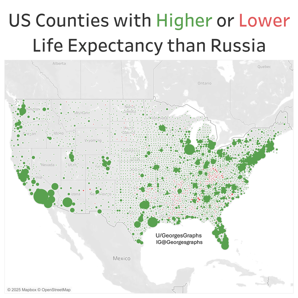
Almost all counties in the US have a higher life expectancy than Russia except for a few patches in Appalachia and the Deep South. I made this map in Tableau using data from the US Census and the University of Wisconsin.
Posted by GeorgesGraphs
Almost all counties in the US have a higher life expectancy than Russia except for a few patches in Appalachia and the Deep South. I made this map in Tableau using data from the US Census and the University of Wisconsin.
Posted by GeorgesGraphs
6 comments
Also notably Native American areas are real bad.
I’d love if people used scales that aren’t red and green, the most common forms of colorblindness.
Your map is literally a colorblind test that I’m failing
https://preview.redd.it/l49yrhouswaf1.jpeg?width=1200&format=pjpg&auto=webp&s=8807a846ab78c07d1087489a818f161dd41055ab
OC Map created in Tableau [https://public.tableau.com/app/discover](https://public.tableau.com/app/discover) with data from US Census [https://censusreporter.org/](https://censusreporter.org/) and University of Wisconsin Poplation Health Insitute [https://www.countyhealthrankings.org/health-data/population-health-and-well-being/length-of-life/life-span/life-expectancy?year=2025](https://www.countyhealthrankings.org/health-data/population-health-and-well-being/length-of-life/life-span/life-expectancy?year=2025)
Now compare it to Australia, where just about every type of animal can end you. Something tells me that our map would be a quite a bit more red, but how much more?
Interesting that they’re seems to be higher rates near large cities, why do you think that it?
I mean, Russia isn’t exactly a high bar to set yourself against …
Comments are closed.