![[OC] Coffee styles and tasting notes from ~7,000 coffee reviews](https://www.europesays.com/wp-content/uploads/2025/07/e4iqo2nz2obf1-1763x1024.jpeg)
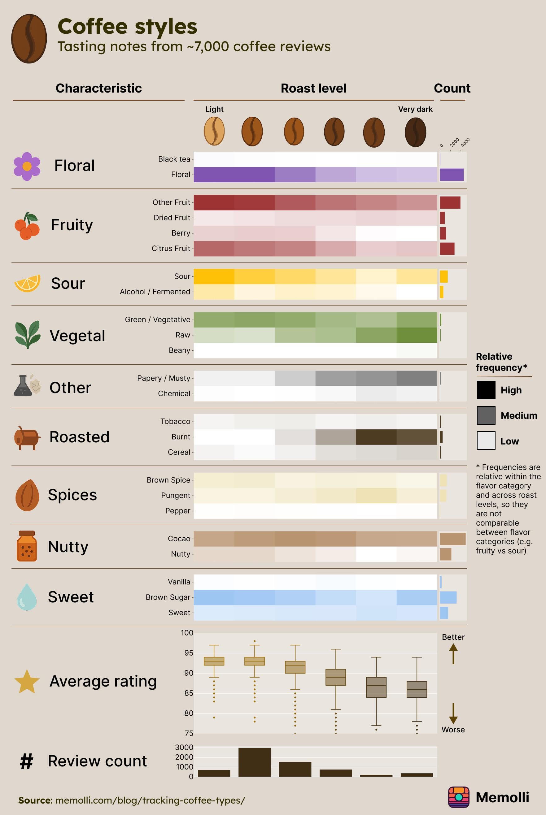
The figure was made using Python’s Plotly library and Figma. The data is from a publicly available dataset of ~7,000 coffee reviews. Links to the data source and Jupyter notebook are here: https://www.memolli.com/blog/tracking-coffee-types/
Posted by Alive-Song3042
5 comments
Using counts instead of percentages make the coffees with fewer reviews look like they were so flavorless they didn’t get rated on anything. I’d normalize the data for this kind of chart.
something seems amiss here, you only really get vegetal notes from light roasts and below (white roasts). seems super strange the frequency is more or less in favor of dark roasts as that’s not really possible
edit: it’s amiss because you used chatgpt to process the review text jesus christ what is wrong with you
It looks neat, but the source and data gathering method pretty much make the data senseless.
Also, the coffee bean itself makes more of a difference than roast level, especially at light-medium roasts. So not a great comparable when you don’t have constant beans and you’re trying to generalize about roast levels as if you did.
“Raw” most frequent with darker roasts? Was it being used as an adverb?
How’s black tea a floral note?
Comments are closed.