![[OC] Male-to-Female Ratio by Age in Qatar](https://www.europesays.com/wp-content/uploads/2025/07/mshjll738ubf1-1920x1024.png)
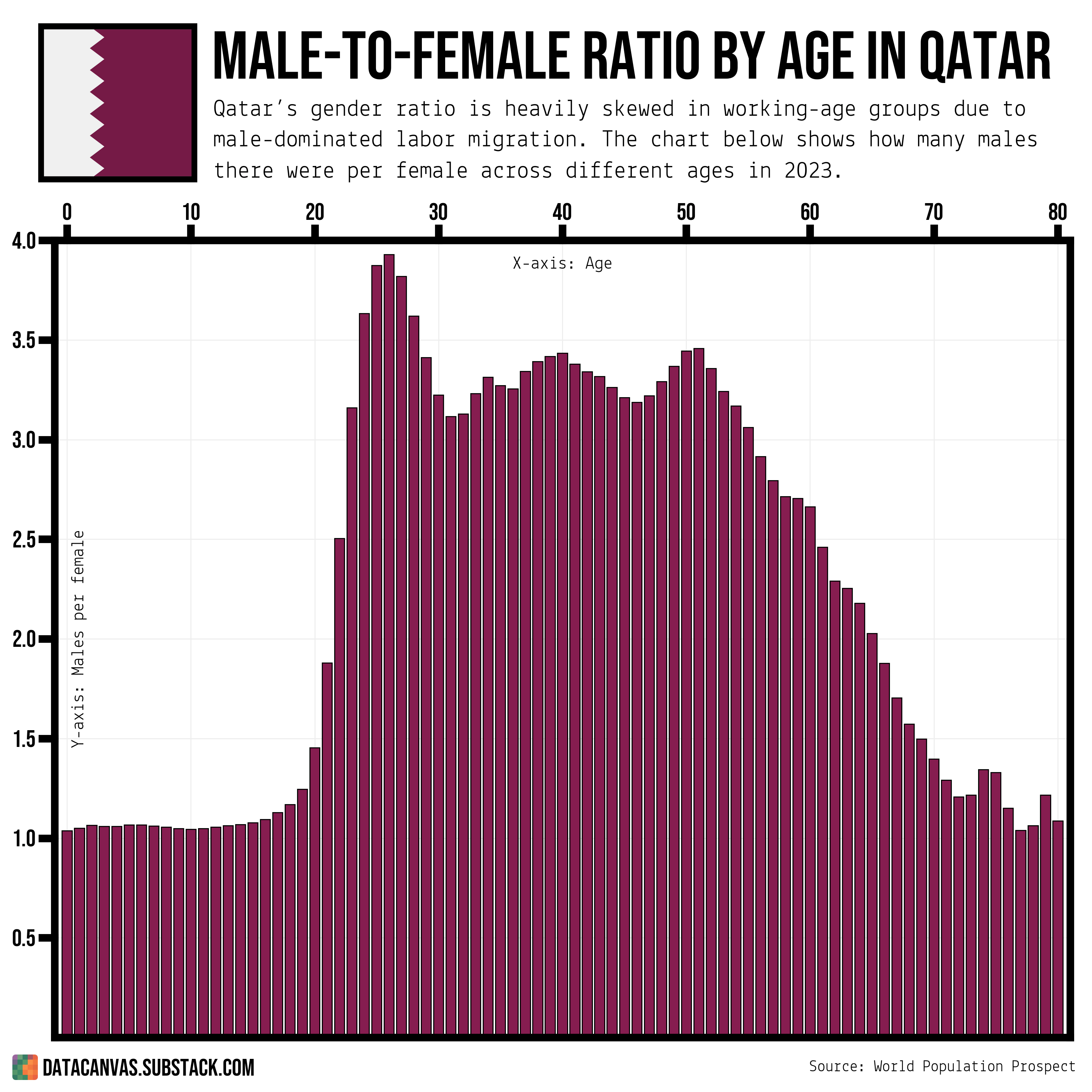
Data source: World Population Prospect – Population by Single Age, Both Sexes
Tools used: Matplotlib
Some design decisions:
- I put the x-axis at the top because it makes it easier to see in which age groups the peaks are
- I use Qatars flag-color for the bars. Since there's only one it felt ok to use a color that doesn't usually represent male in charts.
- I'm using Bebas Neue for the title and labels and Lekton for detail text
Posted by oscarleo0
10 comments
76 year old men are lapping it up!
Interesting that even in below working age, the ratio of males to females seems like a small but not insignificant amount toward males.
Missed opportunity to turn the graph 90° for an even better Qatar flag !
Really interesting nonetheless
Tinder must be even more depressing for men there.
Font should be slightly larger for x and y axis’
Visually it’s a bit strange to use ratios, but I guess it works specifically for Qatar because they’ve never really had more female births.
It’s the migrant workers (whose living conditions are often condemned as slavelike by humanitarian organizations). They’re not Qatari citizens. Working long hours in construction doesn’t leave them much energy for Tinder woes.
UAE has very skewed gender ratio for this reason as well. It’s intereseting that abundance of migrant workers also affects their calculated fertility rate as well. Migrant workers are predominantly male, but there’s a lot of female too. So UAE average fertility rate that looks “below replacement level” is actually a combination of 1 child per immigrant woman and 3 per Emirati national.
Don’t worry they’ll import some more slaves to fix it
This would work better if the bars diverged from 1 (i.e. parity, same number of male as female) that way it would be much easier to see when there are more males than females or vice versa, you could also annotate the axis to say so.
Shut about Qatar! Shut up about Qatar (Table slam!!)
Comments are closed.