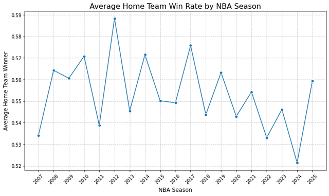
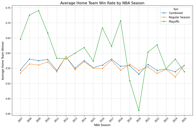
I analyzed over 18 years of NBA game data and found a fascinating trend: the home court advantage has steadily declined in the modern NBA.
Key Findings: 🏠 Home teams peaked at ~59% wins (2012), down from ~54% in 2007 📉 Recent seasons show ~52-56% (2024 hit a low of 52.2%) 😷 2020 COVID bubble: 53.2% with no crowds 🏆 Playoff home advantage is highly volatile (42-74% range) 📊 Total games analyzed: ~12,800 (11,700 regular season + 1,100 playoffs)
Posted by One-Anywhere-3348
4 comments
Mostly just how pro sports are, playing at home helps but only marginally cause of travel, usually the better team just wins. Now college sports, we need a graphic for that because I’m sure it’ll be pretty tilted
I do appreciate minimalism as an elegant art form. While my comment on another post was about not always needing to start the x,y axis at zero, I do feel that labeling the xy axis helps communicate to the reader what the chart is about. Liven it up a little with a bit of tasteful flair to draw the readers eye to pertinent data rather than forcing them to read your analysis separately. But interesting finding.
I’d be interested to see how this breaks down by team—The Denver Nuggets play at a higher altitude in their home court versus the Miami Heat playing at their home court, for example.
Home field advantage is not an advantage unless you take advantage of it.
Comments are closed.