Data source: World Population Prospect – Population by Single Age, Both Sexes
Tools used: Matplotlib
Posted by oscarleo0
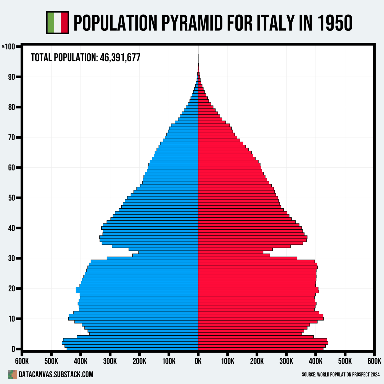
![[OC] Population Pyramid Animation for Italy from 1950 to 2100](https://www.europesays.com/wp-content/uploads/2025/07/v3hgiicyt0cf1-1500x1024.gif)
Data source: World Population Prospect – Population by Single Age, Both Sexes
Tools used: Matplotlib
Posted by oscarleo0
10 comments
what the hell happend to the ~80yolds in 1994/95
i assume thats an error in the graph?
“Should we specify what the colours mean?”
“Nah, fuck ’em.”
Ought to be manditory viewing for all those great replacement numbskulls. Racism is a distraction utilized by those facilitating a decline caused by offshoots of late stage capitalism.
I hate that these are gifs and I can’t pause / scroll them.
That’s an interesting way of visualising population changes over time. Can show some interesting historical events, such as the dip in 30-35 years-old in 1950 would mean unusually low birth rates during 1920-25.
Do you have code to do this for any country and any timespan?
It 100% will actually Look nothing like that
SHAWARMA ROLLER YEAH
https://preview.redd.it/9b8b586yw0cf1.jpeg?width=355&format=pjpg&auto=webp&s=38b6d0c43d03095b76028f75083647506c07dff0
I wonder why they are expecting the population to drop. I know some areas are rapidly emptying out and many western countries are experiencing lower birth rates, but surely as a whole most populations are still expecting to increase?
40’s and 50’s are gonna suck so much. There will be like as many pensioners as working age people
The battles of Isonzo left their marks I see.
All twelve of them.
Comments are closed.