I need to see this graphed for more than just a couple of years.
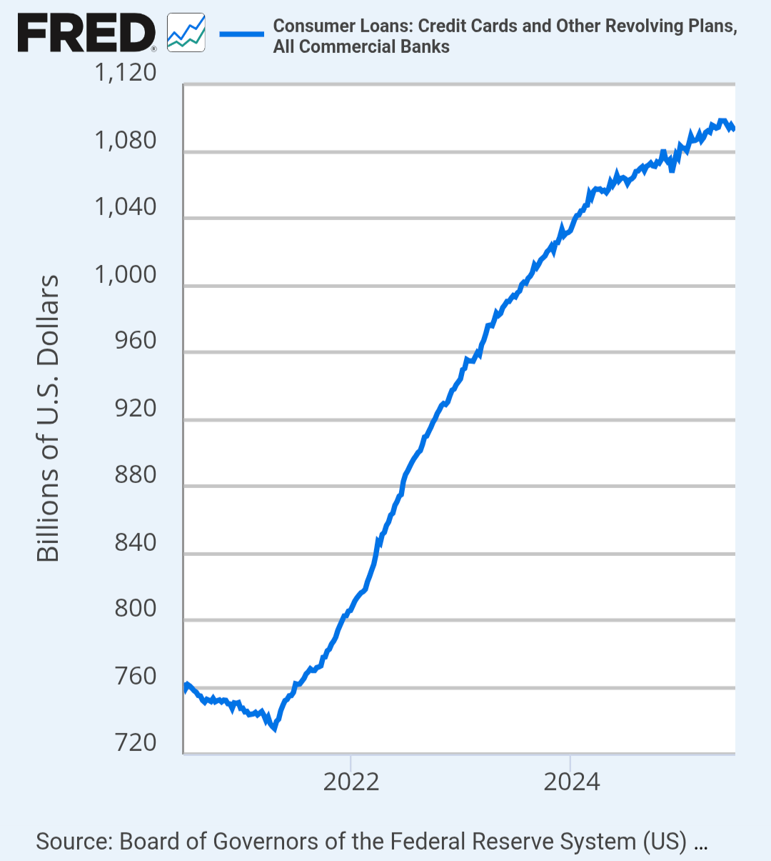
Wow personal debt shot up in only a couple of years. Too bad, folks had made progress on their debt during the pandemic. That’s all gone now.
I’d like to see how much of this is Klarna, Affirm, etc
Where does your X axis start in your first chart? The gap between the start and 2022 is smaller than the gap between 2022 and 2024, but larger than half of that measure. It looks like it might be 5 years before today?
If you’re showing two similar charts together like you are here, I’d recommend synchronizing the date axes – it looks like the first one is ~July 2020-July 2025, while the second one is ~Jan 2020-Dec 2024.
This isn’t just about bad budgeting—it’s systemic.
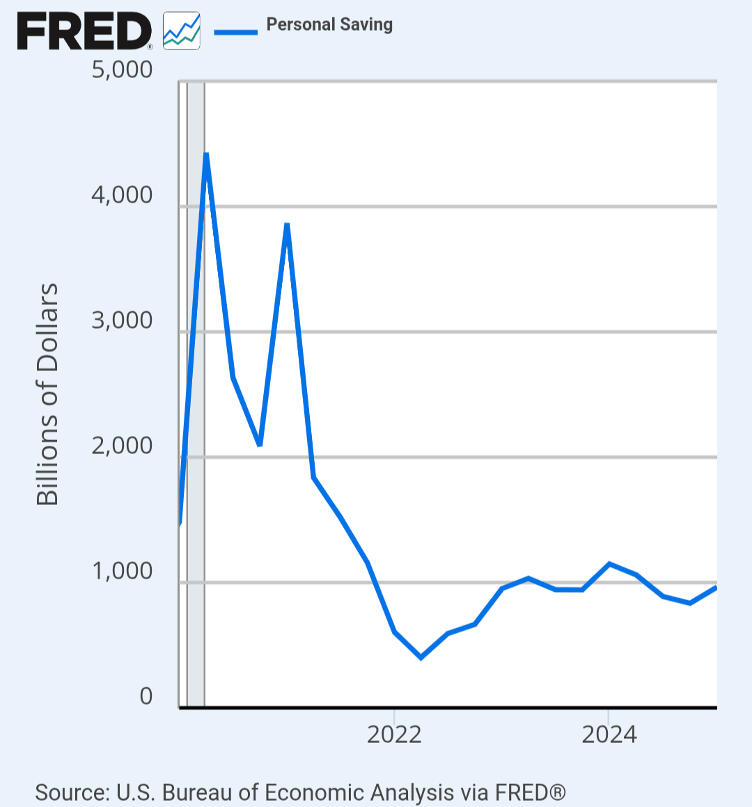
In 2020–21, stimulus checks and shutdowns caused personal savings to spike. But once the aid ended and inflation hit, people burned through those savings fast.
Now we’re facing a combo of: High inflation on essentials (rent, food, gas), Wage growth that hasn’t kept up, 20%+ credit card interest rates, Record housing costs, Student loan payments restarting, No major policy relief post-COVID
People are using credit cards to survive, not splurge. Meanwhile, the Fed raised rates aggressively, making it even harder to dig out.
We boosted savings during COVID, but then pulled fiscal support too soon while prices soared. Now the average person is left with more high-interest debt than they can save—because they’re covering basic needs, not luxuries.
Edit: Tariffs! They are a tax on American consumers. Higher prices! Check out Isabella Webers writing on seller inflation.
There’s about 120 million households in the USA?
So if I interpret these charts correctly, the average household has a total of 9000 dollars in high interest credit, but is saving a little over 8000 each year? That is not that bad for an average, I guess?
The problem is of course not in the averages, but these two charts don’t seem to show the actual problem.
astonishingly beautiful data. Is there a print of this that I can get framed?
Realize that credit card balances is not the same thing as “amount of high interest debt people have”
Credit card balances is a figure taken from reported amounts to consumer bureaus. A good number (i think it’s over half?) of people pay their credit card balance in full every month and never incur any interest.
I would intuit (no evidence) that the higher income people who are more likely to pay in full also report higher balances cause they buy more stuff.
Is this cherry picking is beautiful?
I ask people to recognize attempts to reshaped reality by posting misleading Information.
This data is not helpful in understanding many people’s personal experiences in the economy or ability to actually understand it.
Factor in that the long term view of personal savings is not factoring in inflation. Not as a percentage of wealth or income.
Do you think the average American has 2-3x more savings now than in 1980 in terms of purchasing power or life style? But they do have it in dollar terms.
Same with debt. The debt can look big – but it’s not index for inflation. It also fails to factor in the burden of that debt. I have >2M in sub 2% interest. I have zero interest in prepaying it. Someone who has a much smaller balance at 12% is going to struggle a lot more. The balance is irrelevant if it can easily be paid.
Any chart that starts in 2021 – 2022 is brain rot. 2022 is not a baseline for anything due to the Covid impact on savings, fiscal stimulus, interest rates and job market.
Smart people don’t keep loads of cash in a savings account. In most cases it should be only an “emergency fund”
Not saying debt in this country isn’t a problem, but this is not a good metric IMO.
now show it as a percentage of income
They are just following the moral hazard guidance of daddy government. Neat. Weimar Republic here we come!
Aren’t these completely different things?
PSAVE how much they’re saving annually. The other is total revolving debt.
Total savings will be much, much higher than annual savings.
My boyfriend talked me into getting two high-interest, high-limit credit cards when I was in my early 20s. I was immature and maxed them both out. The burden of that debt was crushing. It just about ruined my life. I am lucky enough to have paid it all off, now.
I would urge any young person getting their first credit card to ask the bank to lower the limit, unless you know yourself to be highly conscientious. Do not give yourself the option to do what I did.
I’m not sure personal savings is cumulative.
Um, you’ve really cherry picked a timeframe here. Expand it out pre-Covid
OK now make the same graph with x starting at 2010 and y starting at $0. Because this shit tells me nothing about history, and your post title describes history.
Cutting the savings rate graph off at the start of the pandemic isn’t doing much for your credibility
connecting these two charts is really misleading and generally shows a lack of understanding of US macroeconomic trends
the US economy works on basically everyone spending 90% of what they get. 5-10% savings rate is typical in america. the last few years have had lower than average savings rate but they’re also not very far out of the norm [Personal Saving Rate (PSAVERT) | FRED | St. Louis Fed](https://fred.stlouisfed.org/series/PSAVERT)
Consumer spending is around 65% of GDP, and the low consumer spending rate (savings rate of ~45%) is one of the reasons that china’s economy hasn’t exploded. [Shares of gross domestic product: Personal consumption expenditures (DPCERE1Q156NBEA) | FRED | St. Louis Fed](https://fred.stlouisfed.org/series/DPCERE1Q156NBEA)
The low savings rate isn’t very worrying, the revolving debt accounts is a bit more so, but also not really, consumer debt as a fraction of GDP is down
Debt servicing rates relative to income for consumers is also near its historical average: [Consumer Debt Service Payments as a Percent of Disposable Personal Income (CDSP) | FRED | St. Louis Fed](https://fred.stlouisfed.org/series/CDSP)
We should all create a big corporation that’s too big to fail and then cut the pay of Congress, get rid of their healthcare, etc, etc to help pay off our debts.
It would be awesome to know how the debt was gained. Was it mostly luxury items or health care debt?
Another chart comparing flow (savings) with balance sheet (debt). This happens so often it would be funny if it wasn’t sad.
That is…interesting? I guess. I don’t think there is a single economic implication driven by these charts though.
You can have $300K in investments, and only 10k in savings in your bank. We don’t know if this graph is including investments, which are basically a type of “savings.”
Wage slaves country. But we got social media and cheap entertainment to distract us.
I thought this was dataisbeautiful, not dataislazy
But even at high interest, you’re only paying 20% of that in a year, while you keep 100% of the saved money.
So this comparison is more like 1:5
Sweet! The economic “problem of thrift” has been solved! /S
One is a flow and one is a stock. This is idiotic.
This getting upvotes and people commenting random rants is so frustrating for a data sub.
If you give people access to debt they will use it. Low interest and easy credit is destroying America.
When looking at credit card debt/similar – the norms of avoiding credit cards and using cash/debit have been changing. So even if spending is flat and carried balances are flat (the part which accrues interest) – the chart could still look like this.
This seems more like an interesting starting point for an investigation rather than telling us anything meaningful.
Reminds me of the people comparing company X’s valuation to the GDP of a country. They’re not completely different things but mostly…one is a per year rate and the other is a total amount.
60% also live paycheck to paycheck. Thank you billionnaires for taking away more and more benefits from the workers since the 1960ies, rendering them into serfs working nonstop just to keep the roof, TV and street raised kids growing up into drug zombies now roaming every US city. Meanwhile these bxxxxxxx work tiredlessly to hermetise tax evasion accounts and gated communitities, image laundered and praised by their C-SPAN songbirds. Goodbye civic consciousness, it is now the ultra rich against society.
35 comments
We learned about the great depression in history class;
-high inflation
-high debt
-low savings
-no wage growth
All we need is a dust storm and we’d be all set
I need to see this graphed for more than just a couple of years.
Wow personal debt shot up in only a couple of years. Too bad, folks had made progress on their debt during the pandemic. That’s all gone now.
I’d like to see how much of this is Klarna, Affirm, etc
Where does your X axis start in your first chart? The gap between the start and 2022 is smaller than the gap between 2022 and 2024, but larger than half of that measure. It looks like it might be 5 years before today?
If you’re showing two similar charts together like you are here, I’d recommend synchronizing the date axes – it looks like the first one is ~July 2020-July 2025, while the second one is ~Jan 2020-Dec 2024.
This isn’t just about bad budgeting—it’s systemic.
In 2020–21, stimulus checks and shutdowns caused personal savings to spike. But once the aid ended and inflation hit, people burned through those savings fast.
Now we’re facing a combo of: High inflation on essentials (rent, food, gas), Wage growth that hasn’t kept up, 20%+ credit card interest rates, Record housing costs, Student loan payments restarting, No major policy relief post-COVID
People are using credit cards to survive, not splurge. Meanwhile, the Fed raised rates aggressively, making it even harder to dig out.
We boosted savings during COVID, but then pulled fiscal support too soon while prices soared. Now the average person is left with more high-interest debt than they can save—because they’re covering basic needs, not luxuries.
Edit: Tariffs! They are a tax on American consumers. Higher prices! Check out Isabella Webers writing on seller inflation.
There’s about 120 million households in the USA?
So if I interpret these charts correctly, the average household has a total of 9000 dollars in high interest credit, but is saving a little over 8000 each year? That is not that bad for an average, I guess?
The problem is of course not in the averages, but these two charts don’t seem to show the actual problem.
astonishingly beautiful data. Is there a print of this that I can get framed?
Realize that credit card balances is not the same thing as “amount of high interest debt people have”
Credit card balances is a figure taken from reported amounts to consumer bureaus. A good number (i think it’s over half?) of people pay their credit card balance in full every month and never incur any interest.
I would intuit (no evidence) that the higher income people who are more likely to pay in full also report higher balances cause they buy more stuff.
Is this cherry picking is beautiful?
I ask people to recognize attempts to reshaped reality by posting misleading Information.
This data is not helpful in understanding many people’s personal experiences in the economy or ability to actually understand it.
Factor in that the long term view of personal savings is not factoring in inflation. Not as a percentage of wealth or income.
Do you think the average American has 2-3x more savings now than in 1980 in terms of purchasing power or life style? But they do have it in dollar terms.
Same with debt. The debt can look big – but it’s not index for inflation. It also fails to factor in the burden of that debt. I have >2M in sub 2% interest. I have zero interest in prepaying it. Someone who has a much smaller balance at 12% is going to struggle a lot more. The balance is irrelevant if it can easily be paid.
Any chart that starts in 2021 – 2022 is brain rot. 2022 is not a baseline for anything due to the Covid impact on savings, fiscal stimulus, interest rates and job market.
Smart people don’t keep loads of cash in a savings account. In most cases it should be only an “emergency fund”
Not saying debt in this country isn’t a problem, but this is not a good metric IMO.
now show it as a percentage of income
They are just following the moral hazard guidance of daddy government. Neat. Weimar Republic here we come!
Aren’t these completely different things?
PSAVE how much they’re saving annually. The other is total revolving debt.
Total savings will be much, much higher than annual savings.
My boyfriend talked me into getting two high-interest, high-limit credit cards when I was in my early 20s. I was immature and maxed them both out. The burden of that debt was crushing. It just about ruined my life. I am lucky enough to have paid it all off, now.
I would urge any young person getting their first credit card to ask the bank to lower the limit, unless you know yourself to be highly conscientious. Do not give yourself the option to do what I did.
I’m not sure personal savings is cumulative.
Um, you’ve really cherry picked a timeframe here. Expand it out pre-Covid
OK now make the same graph with x starting at 2010 and y starting at $0. Because this shit tells me nothing about history, and your post title describes history.
Cutting the savings rate graph off at the start of the pandemic isn’t doing much for your credibility
connecting these two charts is really misleading and generally shows a lack of understanding of US macroeconomic trends
the US economy works on basically everyone spending 90% of what they get. 5-10% savings rate is typical in america. the last few years have had lower than average savings rate but they’re also not very far out of the norm [Personal Saving Rate (PSAVERT) | FRED | St. Louis Fed](https://fred.stlouisfed.org/series/PSAVERT)
Consumer spending is around 65% of GDP, and the low consumer spending rate (savings rate of ~45%) is one of the reasons that china’s economy hasn’t exploded. [Shares of gross domestic product: Personal consumption expenditures (DPCERE1Q156NBEA) | FRED | St. Louis Fed](https://fred.stlouisfed.org/series/DPCERE1Q156NBEA)
The low savings rate isn’t very worrying, the revolving debt accounts is a bit more so, but also not really, consumer debt as a fraction of GDP is down
[Household Debt to GDP for United States (HDTGPDUSQ163N) | FRED | St. Louis Fed](https://fred.stlouisfed.org/series/HDTGPDUSQ163N)
Debt servicing rates relative to income for consumers is also near its historical average: [Consumer Debt Service Payments as a Percent of Disposable Personal Income (CDSP) | FRED | St. Louis Fed](https://fred.stlouisfed.org/series/CDSP)
We should all create a big corporation that’s too big to fail and then cut the pay of Congress, get rid of their healthcare, etc, etc to help pay off our debts.
It would be awesome to know how the debt was gained. Was it mostly luxury items or health care debt?
Another chart comparing flow (savings) with balance sheet (debt). This happens so often it would be funny if it wasn’t sad.
That is…interesting? I guess. I don’t think there is a single economic implication driven by these charts though.
You can have $300K in investments, and only 10k in savings in your bank. We don’t know if this graph is including investments, which are basically a type of “savings.”
Wage slaves country. But we got social media and cheap entertainment to distract us.
I thought this was dataisbeautiful, not dataislazy
But even at high interest, you’re only paying 20% of that in a year, while you keep 100% of the saved money.
So this comparison is more like 1:5
Sweet! The economic “problem of thrift” has been solved! /S
One is a flow and one is a stock. This is idiotic.
This getting upvotes and people commenting random rants is so frustrating for a data sub.
If you give people access to debt they will use it. Low interest and easy credit is destroying America.
When looking at credit card debt/similar – the norms of avoiding credit cards and using cash/debit have been changing. So even if spending is flat and carried balances are flat (the part which accrues interest) – the chart could still look like this.
This seems more like an interesting starting point for an investigation rather than telling us anything meaningful.
Reminds me of the people comparing company X’s valuation to the GDP of a country. They’re not completely different things but mostly…one is a per year rate and the other is a total amount.
60% also live paycheck to paycheck. Thank you billionnaires for taking away more and more benefits from the workers since the 1960ies, rendering them into serfs working nonstop just to keep the roof, TV and street raised kids growing up into drug zombies now roaming every US city. Meanwhile these bxxxxxxx work tiredlessly to hermetise tax evasion accounts and gated communitities, image laundered and praised by their C-SPAN songbirds. Goodbye civic consciousness, it is now the ultra rich against society.
Comments are closed.