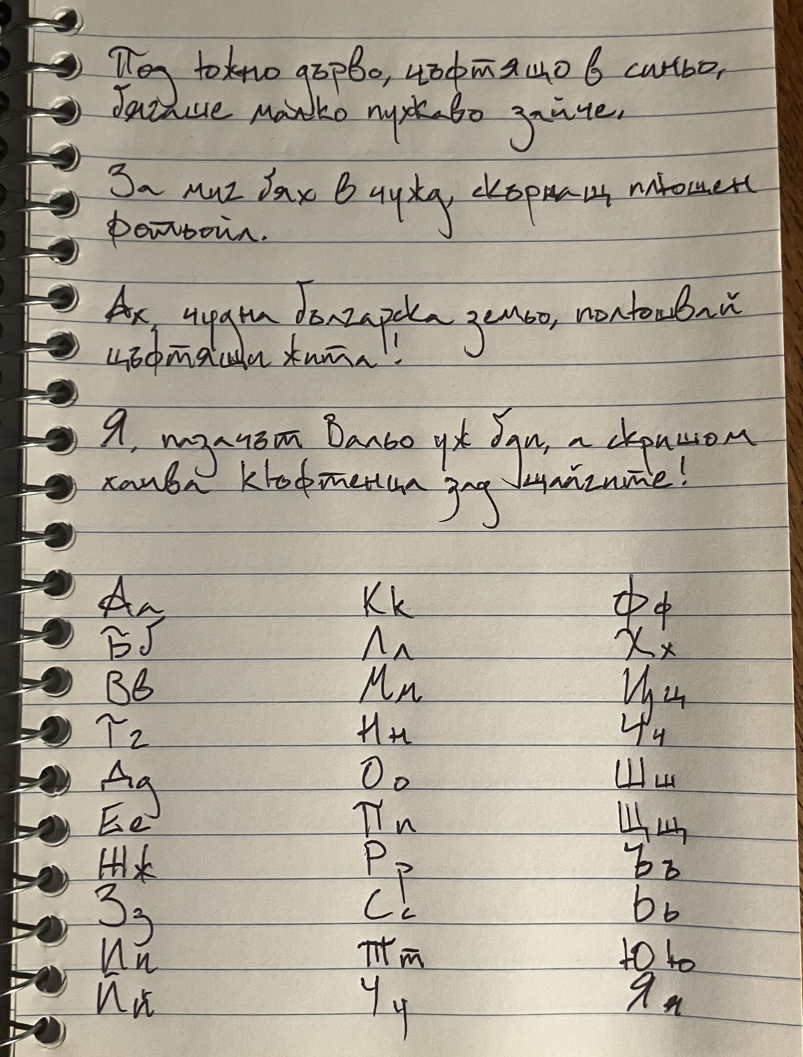
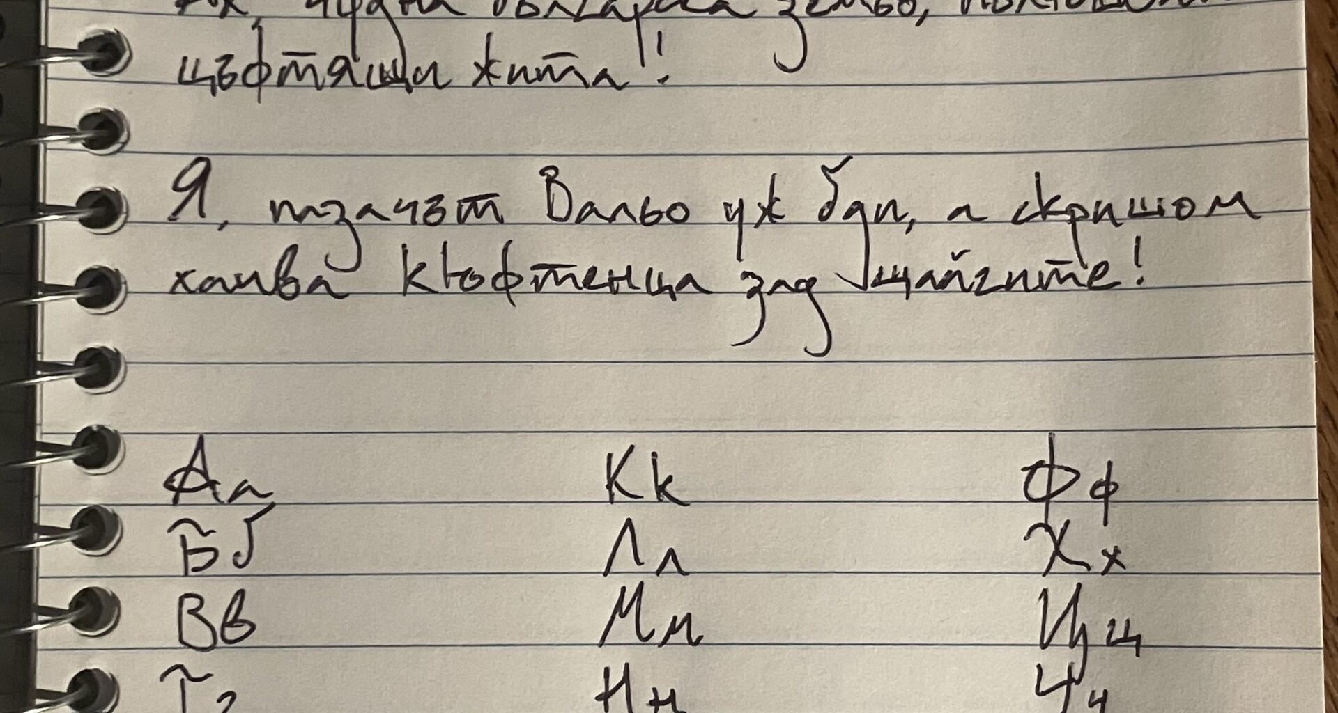
Is there anything strange about the way I write certain letters? Do you have any suggestions on how to make my handwriting look more Bulgarian?
by BeneficialConcept122
Is there anything strange about the way I write certain letters? Do you have any suggestions on how to make my handwriting look more Bulgarian?
by BeneficialConcept122
24 comments
Looks perfectly fine to me.
Looks like some weird funky font, but it’s readable and that’s all that matters.
I know people with worse handwriting than yours, so all things considered I’d call it about average 🙂 If you want to improve, maybe you can try your hand at cursive since we’re all taught to write that way in school ( at least I was when I was young )
Ngl, one of the more unique handwriting I’ve seen in a while. Perfectly readable, just… strange. The Ю and Ч specifically. Not bad at all, just strange.
Keep on keeping on!
Edit: I think what’s mostly strange to me is is the mix of very typed letters and handwritten ones. The ц is very typed-like, while the П is more handwritten.
Prettier and more readable than my handwriting.
Looks all good, by brother writes similarly to you and bear in my mind he is born ’95 and been in Bulgaria since then so looks alg mate.
It’s definitely unique and not how most people write, but it makes me think “this is an artsy person” and not “this is a foreigner”. I like it! Even though some letters are a bit different from how most people write them, I wouldn’t try to change it!
edit: honestly I might steal how you write some of these lol. I kinda really like this font…
It’s better than mine for sure. It looks great
It’s angular and a maybe a bit clunky, but it doesn’t look all that different from my own handwriting to me. I write my lowercase and uppercase Ш with two strokes as “UU”, not four strokes. Both lowercase and uppercase T are, well, two-stroke “Т”s. My uppercase Д is a “D”, and my lowercase д is a “g”. Your lowercase г looks very much like a latin “z” to the point of interrupting my reading, so I’d work on that—turn it counterclockwise 30° or so and it’ll be fine. The weird flourishes also stand out to me (uppercase A, Б, T), but that’s just a personal quirk and there’s nothing wrong with that.
Other than that, your writing is quite legible and not so different from mine or that of my contemporaries.
Very unique handwriting – a bit harder to read, but still readable. There is no fixed rule on the handwriting style and everyone’s is different, so whatever is your preference – go with it.
You can see different handwriting styles in a guest book here:
https://preview.redd.it/1wfz1ytrl6cf1.jpeg?width=2048&format=pjpg&auto=webp&s=b0ab10014c135e84a199a0cf452fa6402270e444
Hard to read for me.
It is strange to write к and ю with so long first stroke. Leters like и, й, ш, щ must have round connections at the bottom.
Is it readable. Mostly yes. But it is very frustrating to read. At least for me.
PS https://m.youtube.com/@tuni4403/videos
Might be useful
[https://www.youtube.com/watch?v=2bcmsAWxwsQ](https://www.youtube.com/watch?v=2bcmsAWxwsQ)
Your capital G(Г) looks a bit like a T, but nowadays nobody writes on paper so you’re good.
More rounded corners on the “г”, “ш”, “ч”, “ц” and “щ” and it will be better. The “г” is espesaly garring.
Your г is too z-ish, try to soften it, make it like a reverse s or just lowercase the uppercase.
It’s more legible than mine that’s for sure
It’s wonderfully cooky! good luck with your studies of Bulgarian!
It’s great. Better than a lot of people’s I’ve seen, including mine. It’s easy to read and visually pleasing.
Granted, we write automatically and quickly, so we don’t care about readability a lot, but you’ll get there once you’ve written a whole book or 2 soon.
If you want suggestions, your “д” and “з” can be shorter below the line. I usually try to go to half of the next row, as to make sure the letters do not cross each other. But that’s not really a big issue and very few people actually care for that.
Other than that, amazing work. I hope you’re having fun learning our language 🙂
The only bad handwriting is the unreadable one.
i write worse so…
More readable than many native speakers.
It almost looks like the style of the ancient Bulgarian stone carvings.
Quite legible! Good work
Comments are closed.