Data source: World Population Prospect – Population by Single Age, Both Sexes
Tools used: Matplotlib
Posted by oscarleo0
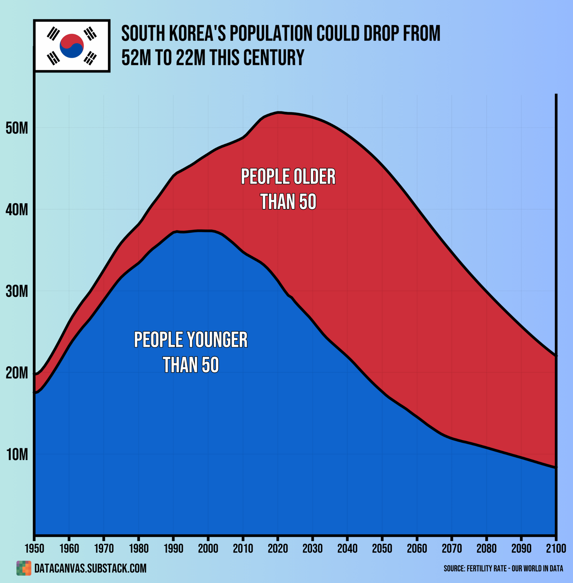
![[OC] South Korea's Population Could Drop From 52M to 22M This Century](https://www.europesays.com/wp-content/uploads/2025/07/n45lsci19scf1-1919x1024.png)
Data source: World Population Prospect – Population by Single Age, Both Sexes
Tools used: Matplotlib
Posted by oscarleo0
14 comments
I like how it looks like the Korean flag. Neat touch
Kurzgesagt has an interesting video about that issue: South Korea is Over
https://m.youtube.com/watch?v=Ufmu1WD2TSk
Can’t they clone or make people from what they cut off during plastic surgeries.
its a competition:
1. korean
2. japan
3. taiwan
4. hongkong
who will won on this?
They just keep increasing their official retirement age, hell it was 55 in the 90’s iirc. I believe it’s slated to increase to 62 by 2027 and is all ready scheduled to increase to 65.
It’s also a bit of a mess for anyone over 50, they tend to get involuntarily retirement and end up bouncing between low paying jobs just trying to get by until they can actually retire.
[https://biz.newdaily.co.kr/site/data/html/2019/04/15/2019041500046.html](https://biz.newdaily.co.kr/site/data/html/2019/04/15/2019041500046.html)
It’s interesting how bad the employment prospects for older people are in South Korea considering the age demographics crisis they’re facing.
In before people saying “good, we are overpopulated”
What’s with the jump in people older than 50 in 2010ish?
BRB moving to Korea to help with the stats 📉😅 Seriously tho, this graph is insane! From 52M to 22M?! Imagine the ghost towns we could have. #AbandonedKoreaTour2022
Currently the population of South Korea is twice larger than in North Korea. By 2075-2080 they are expected to be equal.
I just realized the South Korean flag symbol looks like Pepsi logo
Will this make their housing cheaper at least?
It’s such a curious thing with humans. The more money we have, the less children we have…
At this point it seems like redditors are really obsessed with Korean population.
These demographic trends can be explained by a thorough understanding of blumpkinomics
Comments are closed.