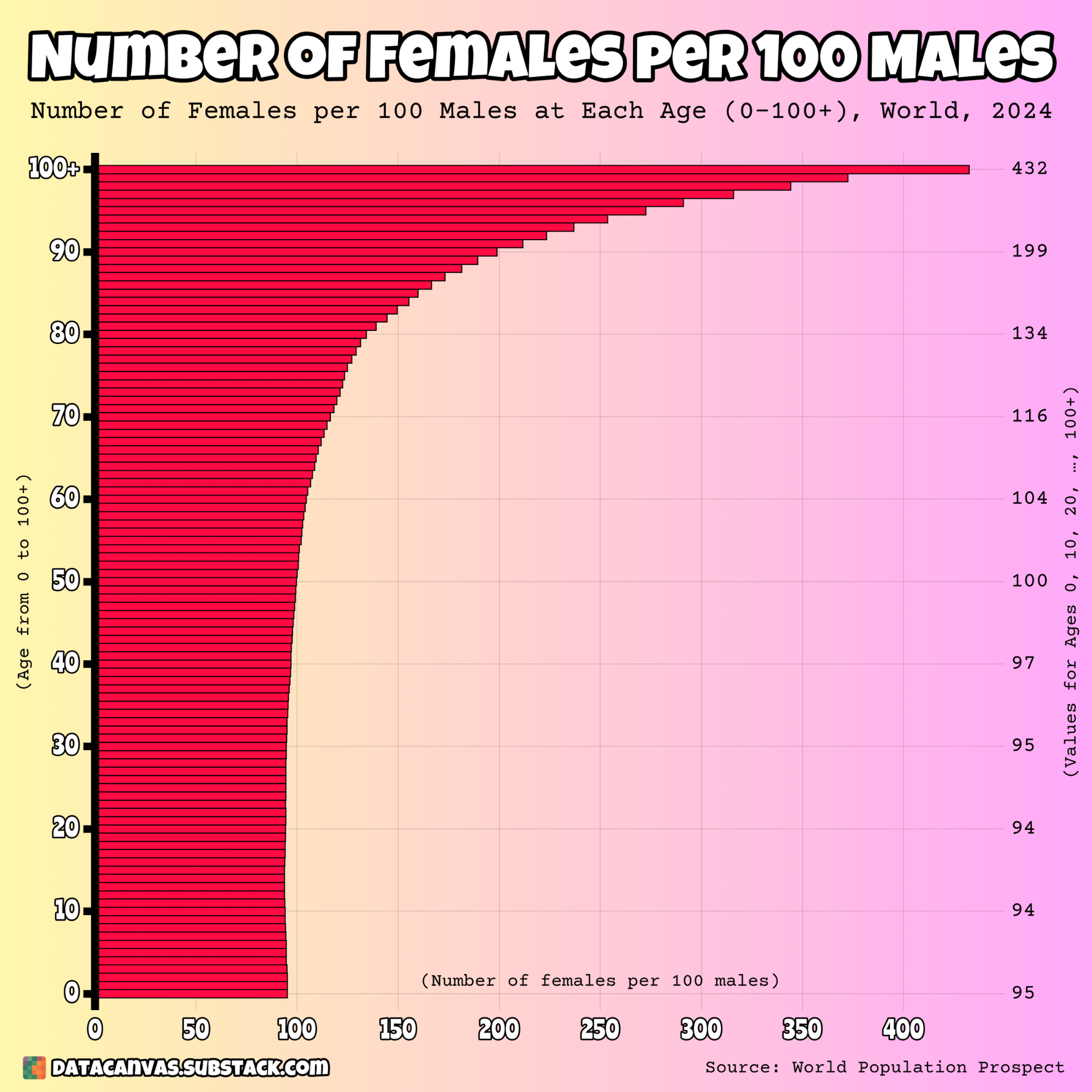
Data source: World Population Prospect – Population by Single Age, Both Sexes
Tools used: Matplotlib
Posted by oscarleo0
![[OC] Number of Females per 100 Males at Each Age (0–100+), World, 2024](https://www.europesays.com/wp-content/uploads/2025/07/kcjg7c8v9wcf1-1920x1024.png)

Data source: World Population Prospect – Population by Single Age, Both Sexes
Tools used: Matplotlib
Posted by oscarleo0
17 comments
I was under the impression consistently more females are born than males, but this data implies the opposite to be true?
Women live longer than men.
Pretty interesting to see how fast the difference accelerates past 80
90 year old men living them “Surf City” ratios.
“Two remarkably consistent and poorly understood features of human biology are the slightly male-biased sex ratio at birth and the female survival advantage throughout life. These patterns appear across geography and time wherever reliable birth and death records are available.” [Austad, 2015](https://pmc.ncbi.nlm.nih.gov/articles/PMC4413335/)
Why is the independent variable on the y-axis? Is there some reason this makes the data easier to understand?
Good news, everyone! My dating odds are now nearly at peak at age 90.
Some of those Ladies and Gents choose to be with others like themselves. Or choose no partner at all, to work on themselves.
This is the same guy who did the bad male-to-female-ratio-by-age diagram. At least he learned a bit from the comments, but not as much as inhad hoped lol.
I think this is awesome, but would rephrase to “number of women per 100 men”
Dating gets easier at 50, eh? Phew
There’s a male-biased sex ratio at birth?! Is that due to biology or people snorting female fetuses?
Given another commenter said it existed throughout time, something biological?
Ci seppelliscono tutti!!! 😂⚰️
Unfortunately, I probably won’t have the energy to take advantage of the situation when I get to that age.
That drop from 0 to 10 is the only surprising/sad part of this.
So all those extra males in china and india should marry grandmas and great grandmas. Problem solved
So we’re allowed to use the word “female” again? I thought reddit outlawed that.
Comments are closed.