
We used the SCNT package to analyze and explore the peripheral blood mononuclear cell (PBMC) dataset (3000 cells) provided by 10X Genomics, as well as human kidney tissue data from Visium and Visium HD. For the PBMC dataset, we performed basic quality control using SCNT, applying the following filtering thresholds: (1) Mitochondrial (MT) genes ≤ 5%; (2) Ribosomal protein (RP) genes ≤ 5%; (3) Hemoglobin (HB) genes ≤ 1%; (4) Feature counts ≥ 200 and ≤ 5000. After applying these filters, 2639 cells passed the quality control (Fig. 2A). We then performed PC analysis (PCA), retaining the first 50 dimensions. Using SCNT, we found that the cumulative variance contribution and the variance decay plateaued after the 10th PC, indicating that the first 10 PCs best captured the underlying structure of the data (Fig. 2B). Thus, we selected PC = 10 as the optimal number for subsequent analysis.
SCNT efficiently identified 56 potential doublets and filtered them out. This simplified doublet detection process offers significant advantages over traditional methods like DoubletFinder and DoubletDecon [14], reducing the learning curve and trial-and-error for new users or those less familiar with R. Subsequently, using the 10 retained PCs, we performed clustering and UMAP dimensionality reduction on the PBMC dataset. With a resolution of 0.2, the 2583 remaining cells were divided into 5 distinct clusters (Fig. 2C).
To demonstrate the visualization capabilities of SCNT, we selected a set of commonly used PBMC markers (CD3D, MS4A1, NCAM1, GNLY, CD14, LYZ, CD1C) and tested the scDot function [15]. The scDot function, similar to Seurat’s DotPlot, is based on ggplot2 but retains much of the familiar functionality of Seurat, making it easier for users to transition between the two tools. To facilitate a smooth transition for users working across different R packages, the scDot function in SCNT adopts the same syntax and parameter structure as Seurat’s DotPlot function. The key difference lies in its implementation: scDot is built upon ggplot2, which enables users to take full advantage of ggplot2’s theming system. This allows for highly customizable adjustments to various plot elements, including bubble style, borders, font sizes, legend formatting, and more.
In addition, the scDot function supports visualization of both the raw expression values and the scaled (Z-score normalized) values for genes. Raw expression values, typically normalized counts from SC data, often vary greatly in magnitude, making it difficult to compare across genes within the same plot. To facilitate better visual comparison, scDot offers a scales option, which applies row-wise Z-score normalization to gene expression values and rescales them to a fixed plotting range (e.g., 0–1). Users can flexibly choose whether or not to apply this scaling based on their specific visualization needs (Fig. 2D and E). As SC research grows increasingly complex, visualizing gene expression across multiple group conditions has become more important. To address this, we developed the scMultipleDot function. To demonstrate its capability, we randomly divided the PBMC dataset into two groups (Control and Disease) and used it to visualize marker gene expression across different groups and cell types in a single bubble plot (Fig. 2F and G).

SCNT testing on PBMC dataset. (A) Violin plot showing the number of count RNA and feature RNA, as well as the proportions of hb (hemoglobin), red blood cells, mt (mitochondrial), rp (ribosomal) genes after quality control of the PBMC dataset using the EasyQC function. (B) Calculation of the optimal PCs for dimensionality reduction using the GetPC function. (C) UMAP plot of the PBMC dataset generated by scPlot. (D) and (E) Bubble plots displaying the expression of various markers in five cell clusters, both original expression values and scaled expression values. (F) and (G) Bubble plots showing the expression of the same markers in five cell clusters and across different groups, for both original expression values and scaled expression values. The original expression values are obtained by normalizing the gene count matrix from SC data, and the scaled expression values are derived by applying Z-score normalization to the original expression values, which rescales them to a fixed range
Conversion between seurat and H5ad objects
The Load10X_Spatial function in the Seurat package, by default, only supports the reading of low-resolution tissue H&E images. However, high-resolution background images are often necessary for many analytical scenarios. To address this, we developed the ReadST function in the SCNT package, which allows users to read high-resolution H&E images and construct spatial Seurat objects. This function supports both Visium and Visium HD data with the same operating mode. Its parameters are similar to those in Load10X_Spatial, making it easy for users to quickly learn and use.
R and Python are the two most commonly used platforms for SC and ST data processing. Many excellent analysis tools are available on both platforms, requiring researchers to switch between them. For example, Monocle in R is often used for pseudotime analysis [16], while Velocyto in Python is used for RNA velocity analysis [17]. Although packages like SeuratDisk and sceasy enable the conversion between Seurat and H5ad files, their workflows are often not straightforward, with many dependencies that can lead to installation and usage errors. More importantly, these tools do not support the conversion of spatial-related data, such as scaling factors and spatial coordinates, which are critical for ST analysis.
SCNT leverages reticulate to integrate Python into R, allowing for simple and efficient conversion of Seurat objects to H5ad objects. This conversion process retains essential data from the Seurat object, including counts, metadata, dimensional reductions, and image parameters. Furthermore, SCNT also supports converting H5ad objects back into Seurat objects within R. We have tested this functionality on the processed PBMC dataset as well as human kidney tissue data from both Visium and Visium HD (https://github.com/746443qjb/SCNT).
Visualization of spatial transcriptomics data
Since the emergence of ST, Python has been the dominant platform for visualizing ST data, with several excellent packages such as Scanpy and Squidpy [18] offering a wide range of functions for spatial data visualization. However, the R ecosystem has remained relatively limited in this regard, with Seurat being the only package that provides a relatively comprehensive visualization framework. The development of SCNT aims to address this gap by bringing more advanced and customizable ST visualization capabilities to the R environment.
SCNT leverages ggplot2 within R for ST data visualization. By overlaying the ST data matrix with background images, we enable easy and effective spatial clustering and gene expression visualization. Additionally, with the use of a simple image row-column slicing function, sub-region visualization becomes much more accessible. Users can input any row and column coordinate range to observe the distribution of cells and gene expression in specific sub-regions. While packages like Squidpy and Scanpy also support sub-region visualization [19], they typically do so by dividing the coordinates into fixed grid-based segments, which can be limiting for more flexible analysis. Due to the integration of gene expression and tissue imaging data, ST results are inherently more complex to interpret. As the resolution of ST technologies continues to improve, the resulting images capture increasingly detailed and intricate spatial information. Therefore, generating accurate, clear, and aesthetically pleasing visualizations, especially for key subregions, is crucial. High-quality visual outputs are essential both for effectively presenting research findings and for enhancing the reader’s understanding of the results.
To demonstrate SCNT’s functionality, we processed Visium HD data of human kidney tissue using the 10X official tutorial, including dimensionality reduction and clustering. Using SCNT, we visualized 12 cell clusters across the entire tissue and in specific sub-regions. By adjusting the ggplot2 theme parameters, we were able to generate spatial cluster plots in different styles. Furthermore, we visualized the expression of genes such as LRP2 in particular regions [20], highlighting SCNT’s ability to offer detailed insights into gene localization. SCNT provides researchers with more flexible and customizable visualization options for ST data, allowing for the creation of a variety of visual styles using ggplot2.
To demonstrate the functionality of SCNT, we applied it to a 10X Genomics Visium HD dataset of human kidney tissue, following the official tutorial, including dimensionality reduction and clustering. Using SCNT, we visualized 12 cell clusters across the entire tissue section as well as within specific subregions (Fig. 3A), revealing the general spatial distribution patterns of kidney cell populations. By further adjusting ggplot2 theme parameters, we achieved high-resolution visualization of selected subregions (Fig. 3B). Such subregion-focused visualization in both healthy and diseased tissues is critical for identifying disease-associated spatial patterns and understanding the spatial heterogeneity of cells under pathological conditions.
In addition, SCNT supports visualization of gene expression within specific subregions. For example, we visualized the spatial expression pattern of LRP2 in a localized region of interest (Fig. 3C). By inspecting the spatial localization of gene expression, researchers can easily detect abnormal or distinctive gene activity, which may aid in identifying key molecular targets. Overall, SCNT provides researchers with a more flexible and customizable ST visualization framework, allowing the creation of diverse visual styles using the full power of ggplot2.
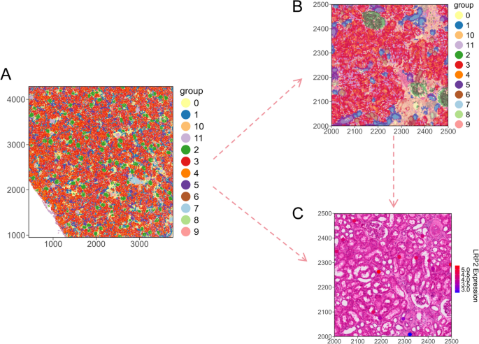
SCNT testing on human kidney 10X visium HD dataset. (A) Spatial clustering plot based on stPlot showing the distribution of 12 cell clusters across the entire tissue space. (B) Spatial distribution of the 12 cell clusters within a sub-region. (C) scFeature plot displaying the spatial expression feature of LRP2 within the sub-region