Data from the met office
Code python and matplotlib is here so you can remix it if you want to
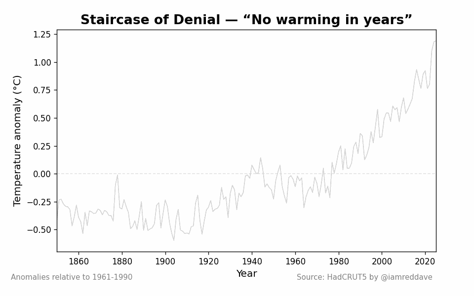
the idea is that between every record hot year people go 'look it hasn't gotten warmer in X years global warming is disproven. Checkmate now, king me'
And i want to make a way to easily see howthat warming continues inside normal variations (things like the el niño cycle) and a new record year is coming.
I heard about the escalator of denial here and wanted to update it and make the code public https://skepticalscience.com/graphics.php?g=465
Posted by cavedave
37 comments
Human brain has difficulties understanding data noise in a decade scale, it’s sad how that is used by bad faith arguments…
number goes up means good, right? RIGHT?
Yep. Why else do you think Billionaires are desperately trying to establish authoritarian governments across the world?
It’s really shocking how much has accelerated in the last 60 years vs the first c200 years of industrialisation.
Makes perfect sense when you consider exponential population growth and the majority of countries being now industrialised. Even knowing that, it’s really eye opening to see it so plainly visualised.
No time in earths history has the average temperature risen this fast in this extremely little time but I’m sure it’s just natural
/s
“This is perfectly normal for an El Niño year.”
My brother in Christ I have been alive long enough to see and feel the difference compared to when I was a child. In my area it would snow by Halloween sometimes. Often I had to wear my coat over my costume. The last really cold year I remember like that was maybe 2007?
Last year it barely snowed all winter. And then, in the spring, when we are normally dealing with flash floods when the snow melts in the mountains we were getting 100 degree days in May.
This. Is. Not. Good. (Also, cool chart.)
“Rome has never been as brightly lit as tonight.” 64 C.E.
Fantastic visualisation and data perspective!
What’s the go with the time period 1940-1980? It rose and then averaged out during this time period. Is there a known reason??
That’s a really cool and intuitive way to visualize this concept… Thanks!
This has to be one of the extremely rare cases in this sub where the animation does actually add value to the plot. Saving this. 🙂
From a US perspective.
I unfortunately believe this is a lost cause. There is too much profit to be made by ignoring this and the amount of change that would have to be brought about to make a significant difference is beyond the scope of the person of average intelligence to fathom. This includes me. Here in the US most are not willing to sacrifice much.
Go back to MWP. The data is out there. Also plot the model forecast against observed temps. Data is beautiful.
Genuine question. What’s the ‘nightmare scenario’? Like really. Since the assumption seems to be we aren’t really gonna stop this.
But with numbers of population, tons of food per capita, etc. In 2050? 2100? And how do those numbers compare to today?
I saw one demographic study that said (paraphrase) 2025 population 8B. 2100 _curb warming_ 10B. 2100 _worst case_ 7B.
Yes, individually, probably sux massively. But… Doesn’t sound like _the end of life as we know it!_
[ Removed by Reddit ]
Thanks for including the code!
The acceleration in the last few decades is terrifying when you compare it to historical trends, it’s like we’ve hit the gas pedal on a problem that was already bad enough. I’ve noticed the same shift in local weather patterns, where winters feel more like extended autumns now. It’s wild how people still dismiss this as “normal variation” when the data and lived experience both scream otherwise. Great job visualizing this escalation, it’s way harder to ignore when you see it laid out like this.
Replace the years w months and ask a tech bro if he would invest based on the chart
All the business people low key getting a chubby from this graph
where are we now in July 2025. Cause it’s getting hot HOT
I’d love to see how the “no warming in x years” period lengths have declined over time. Eyeballing the graph this could well have been 15-20 year periods in the past where we are now at 5 or 6 year max.
Can you clarify the Y axis, does “temperature anomaly” mean the delta in peak temp from one year to the next?
So “Staircase of denial” is just a fancy name for the “Frog in a slowly boiling pot”?
This is extremely informative and I would love to dive a bit deeper into the topic. Do you have any webpage or social media I can follow to stay up to date with climate trends?
I live in Scania in southern Sweden. We now have thirty more days with summer temperatures compared to fifty years ago. The seasons feel fucked up too. There is a spring, a very long summer with nothing that feels like a real autumn and a mild winter.
Don’t worry the world’s leaders insist it’s fake and will largely be dead when the real pain arrives which will be impossible to fix.
The first warning WAS DURING WW2!!!!
we should have kneecapped capitalism and stopped the population explosion bout 30 years ago to save the planet
I fucking hate the heat, can’t we have an ice age for a change
Absolutely fantastic visualization! Thanks man.
Seriously, who is even making the “no warming in years” argument?
I have never heard anyone make this argument before.
Guys, I think this data corresponds with the Industrial Revolution. I could be wrong though.
That’s great. Now expand it further back beyond the 1860s.
When in doubt, zoom out. Now show us a 50,000 year long scale
Imagine hearing how there’s a new temperature record every summer and be like: “there’s no global warming”
This argument is scientifically illiterate: The reason why “pauses” were cited was not to argue against a longer trend, but because models couldn’t reproduce them.
A scientific model purporting to be a physical needs to do more than reproduce a vague general trend, especially when that trend is neither significant in rate, if you consider Greenland proxies as opposed to low frequency Antarctic ones, nor significant in extent, if you look at proxy reconstructions of past interglacials.
“Trend is up” is the to science what technical analysis is to trading.
[Data from the met office](https://www.metoffice.gov.uk/hadobs/hadcrut5/data/HadCRUT.5.0.2.0/download.html)
[Code python and matplotlib is here](https://gist.github.com/cavedave/a11fa410a471b4fb50b656e76e3edbe0) so you can remix it if you want to
Comments are closed.