![[OC] Real personal incomes per capita with and without adjustments for regional prices differences](https://www.europesays.com/wp-content/uploads/2025/07/o62l044wnhff1-1080x1024.jpg)
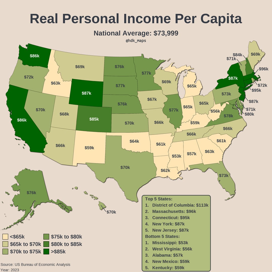
The data are from 2023, adjusted to 2025 dollars
Data: https://apps.bea.gov/regional/downloadzip.htm
Tools: R (packages: dplyr, ggplot2, sf, usmap, tools, ggfx, grid, scales)
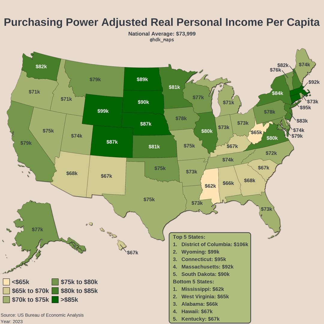
Here is the methodology for the regional price adjustments: https://www.bea.gov/sites/default/files/methodologies/Methodology-for-Regional-Price-Parities_0.pdf
Posted by haydendking
14 comments
Data: [https://apps.bea.gov/regional/downloadzip.htm](https://apps.bea.gov/regional/downloadzip.htm)
Tools: R (packages: dplyr, ggplot2, sf, usmap, tools, ggfx, grid, scales)
Edit: here is a version for metro areas
[https://www.reddit.com/user/haydendking/comments/1mb0ro6/purchasing_power_adjusted_real_personal_income/](https://www.reddit.com/user/haydendking/comments/1mb0ro6/purchasing_power_adjusted_real_personal_income/)
Note that the key is different
Love the data and hate to be that guy but I need this at a County level. Sincerely – upstate NY resident.
This really would be more meaningful with median data
ok, now do average real income per employed person on a full time basis.
This seems to imply that the unemployed and children are making fists of cash.
Is the gist here that cost of living is notably cheaper in the upper Midwest?
Why are Indiana and Michigan a different color than Ohio if they all have a real personal income of 65k?
I wonder what that numbers would look like if you removed anyone who makes over $100m
You need to do the median for this type of stuff. Average will get blown out in certain states with lots of billionaires.
Nice graph, do median to make it more accurate.
as a broke fuck from norcal, i second this data would be a lot more ‘beautiful’ on a county level </3
Wyoming billionaires destroying this chart
What does the word “real” mean in these two, graphics / sets of data?
I need this without the billionaires skewing the data in Wyoming and other states.
Pretty useless using average.
Comments are closed.