Hiya! It's flat search season again, so I wanted to share this to whomever might find this helpful
I made this when I first moved to London. You’d think something like this probably already existed, but to my surprise, no one had made one for postcode districts as they aren’t officially used for mapping property or crime data, even though renters and estate agents use them all the time.
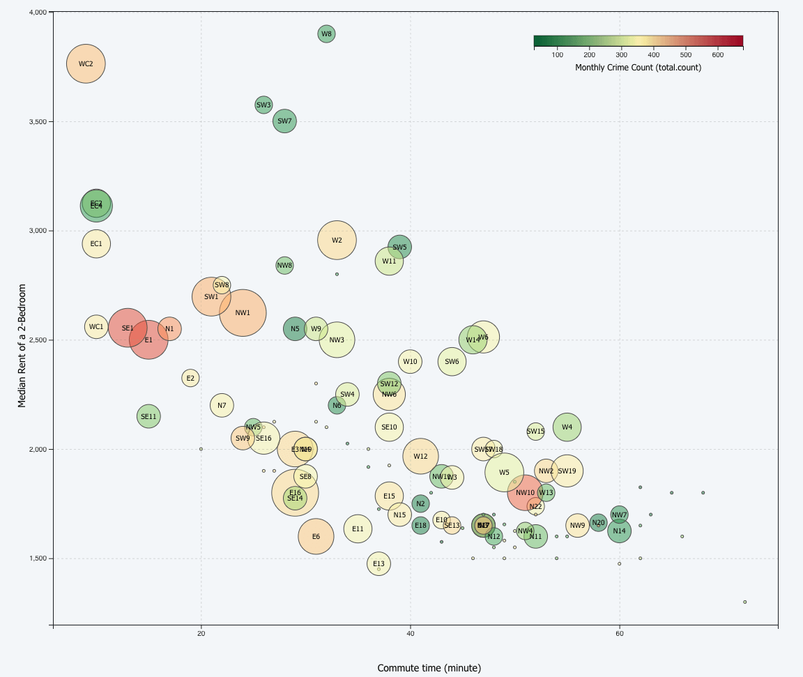
Here's my page with the interactive graph: https://leamhc.github.io/project/londonflatsearch
- Color = crime rate (I only scraped one month of data as I struggled to remap police LSOA data by postcode – let me know if you have thoughts on this!)
- Bubble size = number of tube station
- Median rent and commute time as x-axis and y-axis
Data source: Police.UK (crime rate), Valuation Office Agency (median rent), Google API (commute time, which is set to Fleet Street, central london), Findthatpostcode API (postcode crime mapping), tube-postcodes/Robin Kearney@GitHub (tube station per postcode)
Tools: D3.js, Rstudion (Selenium, httr, jsonlite)
I probably didn't use the most efficient way to collect data as I'm still learning how to deal with spatial data. Suggestions and advice are welcome!
Posted by IllustriousDouble775
8 comments
Love this! It would maybe be helpful as to which postcode the commute time is computed to 🙂
Kennington still rocking the value metric.
Where N4 at?
It’s a bit of a shame we do use postal districts to identify areas, because they’re not at all homogeneous in terms of the properties on this plot. N4, for example, incudes both Crouch End borders (quite fancy) and Green Lanes (above a kebab shop).
In order for this to be beautiful in the sense of conveying information accurately, the Y axis has to begin at zero.
This visualizartion results is false conclusions, which is very unbeautiful. The problem is that the proportional rent is exaggerated a great deal. For example, it looks as if the rent in W4 is 150% higher than the rent in N11, when it is really only 30% higher.
We call that data misrepresentation, a serious dataviz transgression.
3500 max at 0 commute time.
1500 min at 90 minutes commute time.
That’s about 2000/90 = £22/minute/month in what you’d pay to reduce the commute time by 1 minute every month.
At first glance I assumed the size of the bubble represented the size of the postal zone in terms of available flats to rent (or population).
Why do people use such small font sizes on the plots? Especially the axes where there is plenty of room
I think you need to put what the bubble size means on the graphic. All the other data is labelled except that, and it means that the image isn’t otherwise standalone.
Comments are closed.