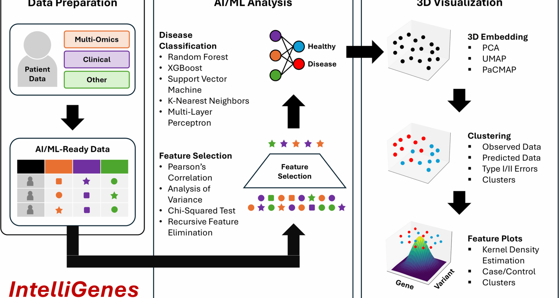
3D IntelliGenes is composed of two modules: (1) AI/ML-Ready Data and Algorithms and (2) 3D Visualization, each containing various submodules. AI/ML-Ready Data and Algorithms interfaces support the user with data preparation, AI/ML configuration and analysis, and 2D Visualizations, while 3D Visualization interface enables the interactive visualization of results with submodules for Clustering and Feature Plots (Fig. 1).
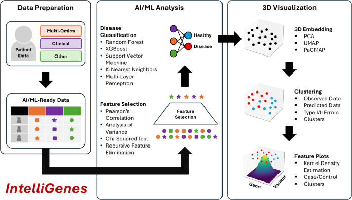
3D IntelliGenes workflow: (1) Data Preparation, (2) AI/ML Analysis, (3) 3D Visualization. Data Preparation enables the user in curating an AI/ML ready dataset. AI/ML Analysis offers robust and configurable feature selection and ML classification models. 3D Visualization provides three dimensional embeddings, clustering, and feature specific plots
AI/ML-ready data and algorithms
Multi-omics data management, processing, and integration is inherently challenging due to its complex and heterogenous nature [8, 9]. Earlier, in addressing such challenges, we proposed and designed a new data format for extensibility, interpretability, and AI/ML readiness i.e., Clinically Integrated Genomics and Transcriptomics (CIGT). It supports structuring various genomic, transcriptomic, and clinical and demographic features, which can be then used for AI/ML-based predictive analysis. The CIGT data structure encodes patient data in a tabular format, with each feature represented as a separate column and each patient as a distinct row. Individual samples are identified by a unique identifier. It supports encoding clinical demographic information (e.g., race, sex, age) alongside multi-omics data (e.g., gene expression counts, presence of genetic variations) as separate features. Furthermore, the case and control status of each patient is encoded in a binary Type feature (control = 0 and case = 1). Further standardizing the CIGT format will enable the use of additional features to represent more diverse and comprehensive multi-modal/omics data sources.
IntelliGenes implements a dual-stage technique for biomarker discovery and AI/ML classification for single-disease prediction based on a collection of classical statistical techniques and ML classifiers. To identify significant features for predicting disease, IntelliGenes combines results from four separate selector models: Pearson’s correlation, chi-square (χ2) test, analysis of variance (ANOVA), and recursive feature elimination (RFE). Only features found significant in all tests are preserved for subsequent classification. Combining multiple selectors has the benefit of reducing the false positive rate but has the drawback of potentially eliminating important features, potentially leading to an overly conservative model. To address this, it is important to tune the precise cutoffs for each selector, to ensure the desired set of features are selected. Although the IntelliGenes interface provides sensible defaults for the cutoffs, it is essential that the user tests different parameters based on their dataset-specific needs. IntelliGenes then uses these models to train a user-driven ensemble of five ML models: random forest (RF), support vector machine (SVM), Xtreme Gradient Boosting (XGBoost), k-nearest neighbors (KNN), and multi-layer perceptron (MLP), which are compiled downstream by a voting classifier i.e., Intelligent Gene (I-Gene) score. Through IntelliGenes, the user can configure and tune various hyperparameters to improve model accuracy. We published a study describing the advantages and disadvantages of different ML algorithms and their application to various diseases, which could be considered in the configuration of the software [10]. In summary, these models were initially selected due to their performance on diverse datasets. Tree-based models like XGBoost and RF tend to minimize overfitting, whereas KNN and SVM models are better at accounting for spatial relationships. Deep learning models like MLP can capture much more complex relationships but also require larger datasets. Generally, the combination of models ensures the methodology generalizes well to both dense and sparse datasets of varying cardinalities [10]. Moreover, the modular design of IntelliGenes allows for adding newer and more powerful models for specific needs.
The overall graphical interface of 3D IntelliGenes adapts the original framework of the earlier published version of the IntelliGenes GUI [4]. This includes three submodules: (1) Data Manager, (2) AI/ML Analysis, and (3) Visualization. The Data Manager module supports the user in preparing and editing their CIGT-formatted AI/ML ready multi-omics dataset and in choosing an output directory to save all generated results. The AI/ML Analysis module enables the selection of statistical-based selection models and ML classifiers through an interactive and extensive configuration panel. It also supports the execution of AI/ML analysis and the monitoring of progress through a live console. Lastly, the Visualization module supports the user in filtering results generated during analysis and offers a convenient viewport to inspect results directly within the interface, including all the 2D visualization options (e.g. SHAP scores, ROC curves, confusion matrices, feature correlations using heatmaps, scatter and swarm plots and, and feature distribution plots) generated by IntelliGenes. Here, after completing AI/ML analysis, the user is also presented with an option to launch the interactive 3D Visualization module in a separate window.
In embodying FAIR4RS principles, we have open-sourced the code for our 3D IntelliGenes platform like earlier versions of the IntelliGenes [4, 7]. 3D IntelliGenes is developed in the Python programming language and relies on standardized, widespread, and state-of-the art libraries. To transform and manipulate the data for analysis and visualization, we use Pandas and numpy. The scikit-learn, SciPy, and XGBoost libraries are used for the various statistical and ML algorithms central to the IntelliGenes methodology. SHAP is used to generate interpretable feature importance scores for otherwise black-box ML methods. The diverse set of 2D and 3D visualizations are generated using Matplotlib and seaborn, and Qt with PySide6 is used to render cross-platform GUI components. To package the executable across all major operating systems (i.e., MacOS and Windows), we used PyInstaller.
3D visualization
Data visualization is a crucial aspect of exploratory data analysis and data interpretation. Visually understanding the distribution and inter-relationships of multi-omics data can provide deeper insights into the underlying biological pathways and structures observed in the data. The first and second released versions of IntelliGenes offer 2D visualizations due to the general simplicity and widespread accessibility of such plots [4, 7]. Each plot offers a specialized interpretation of the underlying dataset, enabling the user to understand metrics such as AI/ML model performance, data distribution, and inter-relationships. Furthermore, during the development of first two versions of IntelliGenes, we were more focused developing a customizable AI/ML data analysis approach. However, moving forward we are keen on improving the annotation, interpretation, and presentation of AI/ML results with better visualization techniques [4, 7].
2D visualizations of high-dimensional multi-omics data add great value to data interpretation and presentation, however, this approach is inherently limited due to its inability to explain finer structural nuance and inefficacy in discriminating between two equally important patterns [5]. Extending 2D into 3D can capture greater proportions of multidimensional variability in the original dataset and can better represent underlying structures. Although 3D visualizations have seen advances in fields like medical imaging (e.g., cancer detection) [11], protein folding [12], and chemical space visualization [13], it has yet to see similar advancements in the realm of multi-omics. In 3D IntelliGenes, we implement a robust 3D visualization workflow comprised of two important stages to explore the structure and inter-relationships of the data respectively: (1) Clustering and (2) Feature Plots (Fig. 2). Each stage is contained within a separate tab in the 3D IntelliGenes application window, which may be launched directly from the Visualization module. We embedded 3D IntelliGenes module in a separate window to emphasize the distinctions between 2D and 3D visualization, as 3D visualization necessitates a more dynamic and interactive viewport that warrants a separate context. Furthermore, creating two separate windows ensures compatibility and consistency with our original GUI.
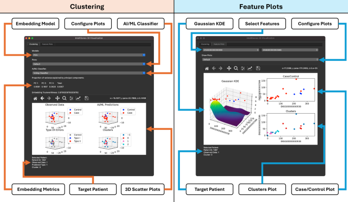
3D IntelliGenes interface with Clustering (left) and Feature Plots (right). Clustering enables the configuration of 3D embedding models to view data and AI/ML model performance in 3D. Feature Plots provide density plots and scatter plots to understand inter-feature relationships
Clustering – method
The visualization of high dimensional data in 3D is particularly useful in identifying key structures that may be overshadowed in 2D. Clusters visualized in 3D are superior to their 2D counterparts because the additional dimension often allows for better segregation of classes e.g., indistinguishable diseases states in 2D visualizations may appear more separable when viewed in 3D, may lead to greater understanding of disease-related characteristics. Furthermore, data clustering has the potential to enable the identification of similarities between patients which may be used in downstream investigation to explore correlated pathways. 3D IntelliGenes offers data visualization and clustering using a 3D-embedded dataset and enables the user to explore and interact with 3D Visualizations with extensive configuration options. The user is presented with options to select and assess linear and nonlinear embedding models, explore predictions of individual AI/ML classifiers, and analyze patient-specific data. It generates four primary plots: (1) Observed Data, (2) AI/ML Predictions, (3) Type I/II Errors, (4) Clusters. Each of these plots may be independently explored for greater visibility or viewed simultaneously for comparison purposes.
3D embedding
The visualization of high dimensional data in 3D necessitates embedding the dataset into a 3D vector space, a technique also referred to as dimensionality reduction. To understand the high-level organization of a multi-omics dataset, linear embedding models such as Principal Component Analysis (PCA) are preferred as they preserve global structure by projecting the data into a subspace that minimize the amount of variability lost through dimensionality reduction. However, linear embedding models are ineffective at interpreting highly complex and nonlinear structures in higher dimensions. On the other hand, nonlinear embedding models can better represent these nuanced relationships but offer a skewed view into the underlying global structure. Uniform Manifold Approximation and Projection (UMAP) is a nonlinear embedding model that is effective at preserving local structure [14], making it effective at identifying patient similarities. However, it is unwise to use local structure-preserving models to generalize global patient relationships. Pairwise Controlled Manifold Approximation and Projection (PaCMAP) is a variation of UMAP that aims to strike a middle ground between preserving global and local structure while remaining effective at capturing nonlinear structures [15]. Crucially, each embedding model offers a different view and interpretation into the underlying data organization and structure. In 3D IntelliGenes, the user may visualize their CIGT-formatted dataset using any of three different embedding models (i.e., PCA, UMAP, PaCMAP), allowing the user to select the one best tailored to their use case. For the currently selected embedding model, an accuratemetric is reported which indicates the effectiveness of models in preserving the original high-dimensional structure. Moreover, the PCA model also reports how much variability is accounted for through the linear projection.
ML classifiers
To compare the performance and biases of the ensemble of ML models supported by the current IntelliGenes methodology, it is crucial to visualize the predictions and errors each classifier makes on a particular dataset. 3D IntelliGenes enables the user to explore the individual predictions made by each individual classifier: RF, SVM, XGBoost, KNN, MLP, or the ensembled voting classifier. In doing so, the user can comparatively analyze which ML models perform best on specific regions of data. Within the interface, the user may select a specific classifier or view the default voting classifier. Upon selecting a target classifier, the generated plots automatically update to reflect the predictions and errors of the selected model.
Observed data
The Observed Data plot in 3D IntelliGenes shows the distribution of each data point under the currently selected embedding model. It distinguishes between case and control patients, enabling the user to quickly discern how the two classes are related and clustered. Control patients (i.e. patients without the disease state) are labeled in blue, and case patients (i.e. those with the disease state) are labeled in red. 3D IntelliGenes also supports the user in inspecting this embedding. Moreover, by hovering over a specific point in any of the scatter matrices, the user is presented with detailed information pertaining to the patient, such as their unique identifier, disease state, predicted disease state using the selected AI/ML classifier, and estimated cluster. The hover preview feature is supported for all clustering plots.
AI/ML predictions
Such visualization supports inspecting the individual predictions made by the currently selected ML classifier. By analyzing such visualization, the user can better understand the accuracy as well as assess any biases present in the model. Specifically, regions where a model tends to overpredict a certain disease state could indicate overfitting or the presence of unknown factors that may warrant further investigation. 3D IntelliGenes supports the user in visualizing the predictions of each ML classifier, allowing for their comparison within these regions of interest. Consistent with the Observed Data plot, this plot differentiates case and control patients with a unique color: blue points are control patients and red points are case patients. Hovering over individual patients provides similar information about the predicted disease state.
Type I/II errors
Understanding the inaccuracies in the predictions of the ML classifiers is crucial towards assessing and comparing their performance on specific datasets. Although the AI/ML Predictions plot crucially offers a view into the distribution of disease predictions, the specific types of errors made remain obscured. Differentiating between Type I (i.e. false positive) and Type II (i.e. false negative) errors are important towards understanding any inherent imbalance or bias present in each classifier’s predictions. This plot marks correct predictions in gray while highlighting the Type I and Type II errors in blue and red, respectively. Like the 2D confusion matrix heatmap generated by IntelliGenes GUI, the user may use this visualization to understand general accuracy and performance of the models. However, unlike 2D heatmap, this 3D plot allows for simultaneously understanding the structural significance of the misclassifications. Not only can the user inspect what types of errors were made, but also where in the embedded space they occur to determine crucial information, such as whether the misclassification was due to an outlier or because of some other bias.
Clusters plot
To quantify and visualize how patients are biologically similar to each other, 3D IntelliGenes supports clustering patients with a density-based algorithm. Identifying points that are more densely packed together might indicate shared biological traits and extracting these clusters may enable the identification and stratification of potential patient populations to explore cluster-specific structures. 3D IntelliGenes uses OPTICS, a density-based clustering algorithm which, unlike other clustering algorithms like K-Means or DBSCAN [16], is more resilient to variable density present in the dataset [17]. Effectively clustering patients using density and neighbor-based information can also improve prediction performance on rare alleles [18]. For large datasets with many data points, it is possible for 3D scatter plots to become chaotic. To help combat this, 3D IntelliGenes offers numerous features to better interpret the data. Firstly, the interactive visualization interface enables zooming into targeted regions of the embedded space to better understand local structure. Additionally, the use of color to segregate important clusters and data points helps provide a broader understanding of the distribution for denser regions. Although subsetting is not directly supported within the interface, it can be achieved by removing the corresponding data points from the resulting dataset.
Feature plots – method
Interpreting the significance of multi-omics features requires exploring their inter-relationships and visualizing how two features are co-expressed can provide deeper insights into biological pathways underlying their regulation [19]. 3D IntelliGenes supports the user in exploring pairwise specific feature plots to visualize the distribution and correlations between biomarkers of interest. In the Feature Plots tab of the interface, the user is presented with options to select two distinct features to visualize. Upon doing so, they are presented with 3 distinct plots combining 3D and 2D into a multi-dimensional approach to support joint feature analysis.
Gaussian KDE plot
Kernel Density Estimation (KDE) is a robust technique used to visualize a smooth probability distribution of samples in a dataset. Unlike a 2D scatter plot where it may be difficult to interpret density and estimate the likelihood of observing new samples in specific regions, a KDE plot more easily distinguishes denser regions in the third dimension through higher peaks and can provide smoother approximations for sparser datasets. 3D IntelliGenes generates a KDE plot for a pair of selected features under the assumption of a gaussian (i.e. normal) kernel. In addition, because 3D plots are often more effective when paired with 2D plots to display crucial slices of the 3D structure [20], 3D IntelliGenes plots each patient’s disease state (i.e. case/control) in 2D directly above the 3D KDE surface. This enables the user to gain additional information that is not easily acquired by separately analyzing each plot, such as simultaneously identifying regions of high-density as well as understanding the distribution of diseased and healthy patients. When viewed directly from above, this 3D KDE plot has the added effect of appearing as a 2D density heatmap.
Case/control plot
Although the distribution of disease states is viewable above the 3D KDE plot, 3D IntelliGenes also separately generates a flat 2D scatter plot for improved accessibility and navigability. This plot is displayed adjacent to the KDE plot but can be viewed in isolation for better visibility. Consistent with the Clustering module, hovering over each individual point also presents the user with information about the target patient, including their unique identifier, disease state, predicted disease state, and estimated cluster. This hover preview allows for the contextual identification and understanding of each patient.
Clusters plot
For the selected pair of features, 3D IntelliGenes also plots the estimated clusters predicted with the density-based OPTICS clustering algorithm as a 2D scatter plot adjacent to the 3D KDE plot. Notably, this plot can be used to assess whether the co-expression of two features is significant in discriminating against clusters. In other words, if two distinct clusters have minimal overlaps among each other, then the expression of the selected pair of features may help in stratifying the densely packed regions of the original higher dimensional space. Since these clusters may represent some shared biological similarities, such a discovery could indicate a need for further investigation to determine how the biomarker interaction relates to the corresponding biological and disease states.
The overall user interface (UI) of 3D IntelliGenes was designed to support the data analytic workflow and needs of the user. Each module is sequentially navigable through separate tabs within the GUI, ensuring that the user is supported at each stage of data pre-processing, analysis, and visualization. The motivation behind a desktop graphical interface ensures the software remains accessible and intuitive to a broader scientific audience. It enables an interactive modality, by allowing the user to zoom and pan across 3D visualizations.