


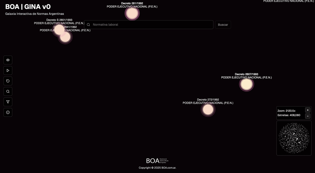
Demo: https://gina.boa.com.ar
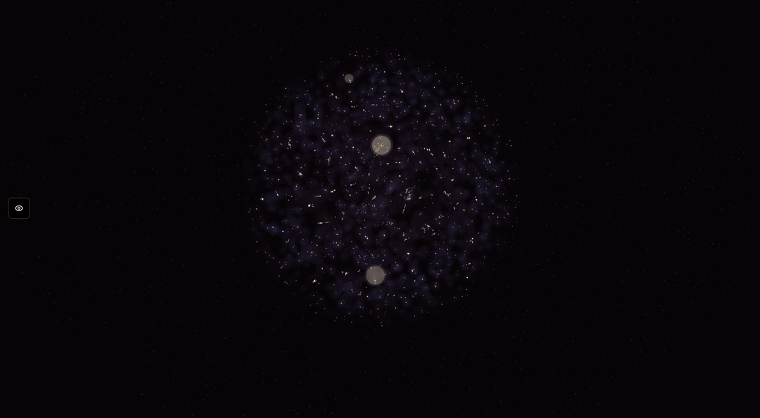
Hi! I’m looking for honest feedback on the aesthetics, UX, usefulness, and performance of a data visualization tool we’re testing. GINA v0 is the first public version of the Interactive Galaxy of Argentine Regulations. Each point represents a publication from the Official Gazette of the Argentine Republic (408,533 in total). I processed the content using 1,536-dimensional embeddings and reduced it to 2D so that the distance between points approximates semantic similarity. The app allows zoom/pan, real-time semantic search, filtering by date and regulation type, and viewing details on click.
This is a v0, so it sometimes crashes and performance varies greatly depending on the device. It runs well on a Mac M1 and iPhone 13, shows stuttering on a Google Pixel Tablet, and is very sluggish on mid/low-end Android devices. I’m considering dynamically reducing the number of points on screen or letting the user choose how many to render. I’d appreciate knowing how you would tackle this (technical or UX ideas), as well as any comments on the overall aesthetics, label/minimap readability, interaction clarity, bugs you find, and what features you’d add to make it truly useful. Any hints about bottlenecks, stuttering, memory leaks, or errors spotted in devtools are also welcome.
Dataset: Base Infoleg de Normativa Nacional (1997–present), CC BY 4.0.
Ministry of Justice and Human Rights of the Argentine Republic. (2025). Base Infoleg de Normativa Nacional [Dataset]. datos.gob.ar. License CC BY 4.0. https://datos.gob.ar/dataset/justicia-base-infoleg-normativa-nacional
Tools: Embeddings (1,536 dims) reduced to 2D + custom web viewer.
Posted by Round_Cantaloupe_372