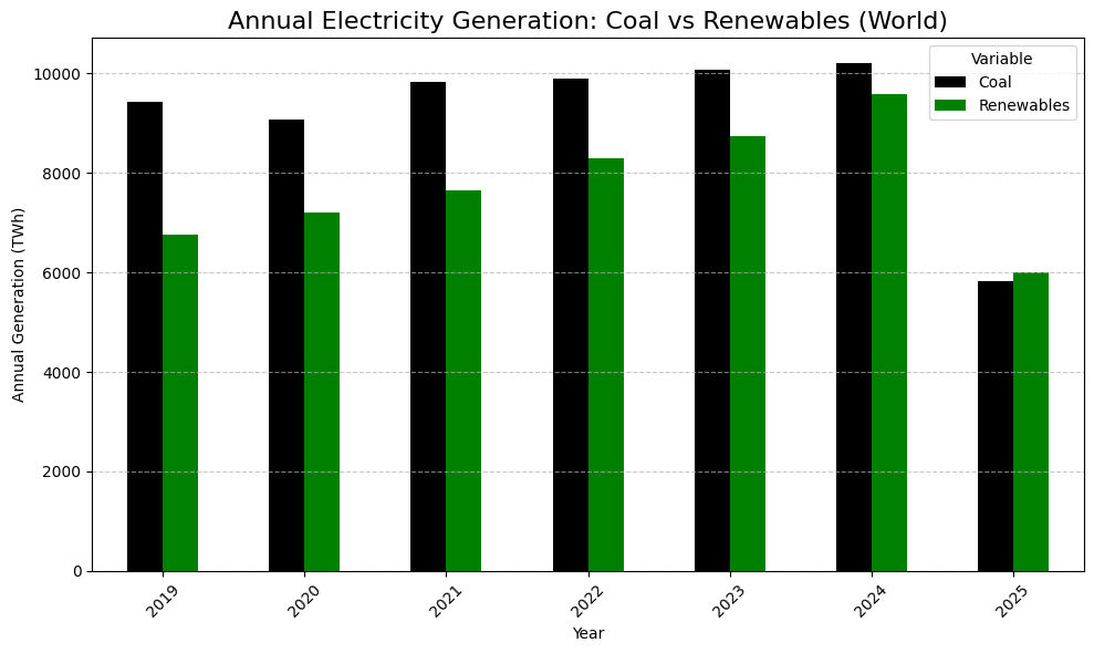
So i took ember energy data and matplotlib and graphed it. and it looks vaguely plausible given how this year is going. Winter Northern Hemisphere is different to summer. But also renewables are growing fast so next year will be more renewables. Renewables here means Hydro (big) Solar (not as big but growing fast) Wind (growing faster than hydro but smaller) bioenergy (small)
Code
import matplotlib.pyplot as plt
import pandas as pd
df = pd.read_csv(“https://storage.googleapis.com/emb-prod-bkt-publicdata/public-downloads/monthly_full_release_long_format.csv”)
df_world = df[df[‘Area’] == ‘World’].copy()
# Filter the dataframe for ‘World’, Electricity generation, TWh unit
df_world_gen = df[
(df[‘Area’] == ‘World’) &
(df[‘Category’] == ‘Electricity generation’) &
(df[‘Unit’] == ‘TWh’)
].copy()
# Convert ‘Date’ to datetime and extract the year
df_world_subset[‘Date’] = pd.to_datetime(df_world_subset[‘Date’])
df_world_subset[‘Year’] = df_world_subset[‘Date’].dt.year
# Group by Year and Variable and sum the values
annual_generation = df_world_subset.groupby([‘Year’, ‘Variable’])[‘Value’].sum().reset_index()
# Pivot the data for plotting
annual_generation_pivot = annual_generation.pivot(index=’Year’, columns=’Variable’, values=’Value’)
plt.figure(figsize=(10, 6))
annual_generation_pivot.plot(kind=’bar’, ax=plt.gca(), color={‘Coal’: ‘black’, ‘Renewables’: ‘green’}) #legend should be source not variable. I made this quick
# Change the legend title from variable to this (my mistake)
ax.legend(title=’Source’)
plt.tight_layout()
plt.show()
I know Aus doesnt count for much globally, but our coal is very near end of life. It’ll be less of gradual change and more of a step change as the remaining coal generators are retired within the next 10yrs
Could be similar for other countries too
We are hitting peak emissions right now (like this year/already hit), mainly as China is slowing down coal and massively adopting solar
It looks promising but I still worry about the “developing” world. We’ve got to find a way to make renewables cheap and accessible enough to let them grow their standard of living without increasing emissions.
This chart seems rather misleading since 2025 is in summer time now, of course renewables peak in summer. We have to wait for a year to end to get any meaningful year to year comparison. It is getting better but the graph makes it look like renewables took over…
A default bar chart with slightly modified colors. Is this really r/dataisbeautiful ?
Also you shouldn’t be reporting on 2025 as it’s incomplete data. Better to remove it completely or show end-of-year projection
But how is that even possible when the Republicans say renewables don’t even work?! 😄
Be nice if the coal number actually came down instead of just reducing as a percentage of total
9 comments
[I saw this article ](https://www.carbonbrief.org/iea-renewables-will-be-worlds-top-power-source-by-2026/)that said renewable energy would surpass coal next year and thought that must be BS.
So i took ember energy data and matplotlib and graphed it. and it looks vaguely plausible given how this year is going. Winter Northern Hemisphere is different to summer. But also renewables are growing fast so next year will be more renewables. Renewables here means Hydro (big) Solar (not as big but growing fast) Wind (growing faster than hydro but smaller) bioenergy (small)
Code
import matplotlib.pyplot as plt
import pandas as pd
df = pd.read_csv(“https://storage.googleapis.com/emb-prod-bkt-publicdata/public-downloads/monthly_full_release_long_format.csv”)
df_world = df[df[‘Area’] == ‘World’].copy()
# Filter the dataframe for ‘World’, Electricity generation, TWh unit
df_world_gen = df[
(df[‘Area’] == ‘World’) &
(df[‘Category’] == ‘Electricity generation’) &
(df[‘Unit’] == ‘TWh’)
].copy()
df_world_subset = df_world_gen[df_world_gen[‘Variable’].isin([‘Coal’, ‘Renewables’])].copy()
# Convert ‘Date’ to datetime and extract the year
df_world_subset[‘Date’] = pd.to_datetime(df_world_subset[‘Date’])
df_world_subset[‘Year’] = df_world_subset[‘Date’].dt.year
# Group by Year and Variable and sum the values
annual_generation = df_world_subset.groupby([‘Year’, ‘Variable’])[‘Value’].sum().reset_index()
# Pivot the data for plotting
annual_generation_pivot = annual_generation.pivot(index=’Year’, columns=’Variable’, values=’Value’)
plt.figure(figsize=(10, 6))
annual_generation_pivot.plot(kind=’bar’, ax=plt.gca(), color={‘Coal’: ‘black’, ‘Renewables’: ‘green’}) #legend should be source not variable. I made this quick
plt.title(‘Annual Electricity Generation: Coal vs Renewables (World)’, fontsize=16)
plt.xlabel(‘Year’)
plt.ylabel(‘Annual Generation (TWh)’)
plt.xticks(rotation=45)
plt.grid(axis=’y’, linestyle=’–‘, alpha=0.7)
# Change the legend title from variable to this (my mistake)
ax.legend(title=’Source’)
plt.tight_layout()
plt.show()
I know Aus doesnt count for much globally, but our coal is very near end of life. It’ll be less of gradual change and more of a step change as the remaining coal generators are retired within the next 10yrs
Could be similar for other countries too
We are hitting peak emissions right now (like this year/already hit), mainly as China is slowing down coal and massively adopting solar
It looks promising but I still worry about the “developing” world. We’ve got to find a way to make renewables cheap and accessible enough to let them grow their standard of living without increasing emissions.
This chart seems rather misleading since 2025 is in summer time now, of course renewables peak in summer. We have to wait for a year to end to get any meaningful year to year comparison. It is getting better but the graph makes it look like renewables took over…
A default bar chart with slightly modified colors. Is this really r/dataisbeautiful ?
Also you shouldn’t be reporting on 2025 as it’s incomplete data. Better to remove it completely or show end-of-year projection
But how is that even possible when the Republicans say renewables don’t even work?! 😄
Be nice if the coal number actually came down instead of just reducing as a percentage of total
UK have closed all coal plants this past year
Comments are closed.