I like data that shows no correlation. It’s honest
It actually does explain something. Identifying the null hypothesis is just as important as defining the truth.
I think you need to break it down to the county level. You have a mix of rural and urban and both are getting averaged together. It’s muddying the data and making the differences less extreme
Proves how awesome Massachusetts is…
Even with no correlation, I feel like visually the axis should be swap for the bell curve.
Why would we expect the test scores of 4th and 8th graders in 2024 to be related at all to how adults voted that year?
4th and 8th graders voted? What’s the point of this? I think it says more about you than whatever you think you’re saying about Trump
I don’t think averaging a whole state makes sense, most of the breakdown will be between red and blue counties, urban and rural. Even the Trump margins are going to be mostly about how much of the population is rural vs urban.
I wonder if some states require this and others don’t. For example, let’s say it’s required in states in the first 25 states, alphabetically, but not in the last 25. Because every student is taking it in the first 25, you include those who generally don’t care about the test. But the last 25 select for people who need/want to take it – ultimately inflating those states’ scores.
You have some high leverage points. It may look entirely different if you look at the 40 most populous states or any subset of 40 states.
Can you redo it with the y-axis starting at zero? Just for funsies.
Mississippi scoring higher than California is wild
So how can we prevent the uneducated Drumpf supporters from voting and violating the democratic process like they did in 2016 and 2024?
Draw the line the other way, diagonally from the lower left to the upper right and you get a much more accurate grouping of preferences, the spectrum from Massachusetts to West Virginia. Mass is liberal paradise, WV is as MAGA as it gets.
What should it explain? There arent any 4th and 8th graders who voted, so why would we expect a correlation?
stop drawing trendlines on graphs with no significant correlation.
If you ask them, it’s why they voted for him. If you ask us, it’s why they voted for him.
one may wish to see this same data by county and state.
I mean it does explain why Donnie is so focused on fucking with Harvard. Outlier on both the intelligence and the voted against Donald axes.
Massachusetts fucking rules
If I were from New Mexico, I’d be deeply ashamed.
Now, what’s all this about education rankings?
That’s one hell of a linear regression.
The line of best fit changes by about 2 pts while all states are spread out by less than 25 pts, that’s still a change of more than 7,5%, I don’t thinks that’s the null hypothesis everyone thinks it is…
For what California spends on education, that’s an awful score.
it’d be interesting to use something that reflects how educated the voting population of each state is instead of how well the children of voters are performing
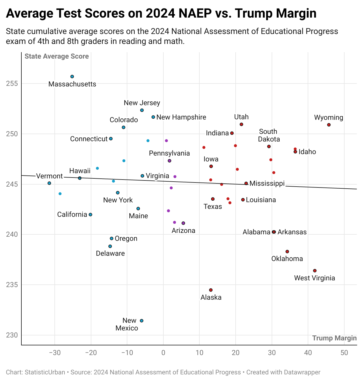
![[OC] US National Education Rankings by State vs. Trump 2024 Results](https://www.europesays.com/wp-content/uploads/2025/08/4wg3kzu5kpif1-1240x1024.png)
25 comments
I like data that shows no correlation. It’s honest
It actually does explain something. Identifying the null hypothesis is just as important as defining the truth.
I think you need to break it down to the county level. You have a mix of rural and urban and both are getting averaged together. It’s muddying the data and making the differences less extreme
Proves how awesome Massachusetts is…
Even with no correlation, I feel like visually the axis should be swap for the bell curve.
Why would we expect the test scores of 4th and 8th graders in 2024 to be related at all to how adults voted that year?
4th and 8th graders voted? What’s the point of this? I think it says more about you than whatever you think you’re saying about Trump
I don’t think averaging a whole state makes sense, most of the breakdown will be between red and blue counties, urban and rural. Even the Trump margins are going to be mostly about how much of the population is rural vs urban.
I wonder if some states require this and others don’t. For example, let’s say it’s required in states in the first 25 states, alphabetically, but not in the last 25. Because every student is taking it in the first 25, you include those who generally don’t care about the test. But the last 25 select for people who need/want to take it – ultimately inflating those states’ scores.
You have some high leverage points. It may look entirely different if you look at the 40 most populous states or any subset of 40 states.
Can you redo it with the y-axis starting at zero? Just for funsies.
Mississippi scoring higher than California is wild
So how can we prevent the uneducated Drumpf supporters from voting and violating the democratic process like they did in 2016 and 2024?
Draw the line the other way, diagonally from the lower left to the upper right and you get a much more accurate grouping of preferences, the spectrum from Massachusetts to West Virginia. Mass is liberal paradise, WV is as MAGA as it gets.
What should it explain? There arent any 4th and 8th graders who voted, so why would we expect a correlation?
stop drawing trendlines on graphs with no significant correlation.
If you ask them, it’s why they voted for him. If you ask us, it’s why they voted for him.
one may wish to see this same data by county and state.
I mean it does explain why Donnie is so focused on fucking with Harvard. Outlier on both the intelligence and the voted against Donald axes.
Massachusetts fucking rules
If I were from New Mexico, I’d be deeply ashamed.
Now, what’s all this about education rankings?
That’s one hell of a linear regression.
The line of best fit changes by about 2 pts while all states are spread out by less than 25 pts, that’s still a change of more than 7,5%, I don’t thinks that’s the null hypothesis everyone thinks it is…
For what California spends on education, that’s an awful score.
it’d be interesting to use something that reflects how educated the voting population of each state is instead of how well the children of voters are performing
Comments are closed.