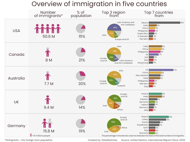
Crazy that the number is so low for germany and uk considering they’re european
So this data would be just before covid shutdowns?
Puerto Ricans are US citizens. It’s weird to call them immigrants.
nice, but outdated graph – as it’s from 2020! likely a bit different if use more current #s
Since 2020 Germany has added a million Ukrainians
I’ve seen this posted before, and I wanted to say now what I did then: this is a bad graphic on several axis.
the second column of this chart is formatted in a way that I find inherently manipulative. The size of the graphic in the first column emphasizes the the number of people over percentage of the population. This is not to say that raw numbers are not important, but just by the graph shows ~1/3 Australians as an immigrants, where that number is ~1/6.5 Americas. That demographic difference has it’s own challenges and opportunities. But a casual glance at this chart seem to indicate that America is uniquely burdened by immigrants.
I also question the graphic design on the left most column. The countries’ color code appears somewhat arbitrary and inconsistent (Why are Syria and Mexico the same color? And why is that color gunmetal grey? Would it not be better to match the colors in column 4?)
This is also based on a report from 2020. Since the data has been compiled, there has been several wars, a global pandemic and considerable change in various policies. If the above chart is still true, re-compile with new data. If it’s not, then this chart is by definition misleading.
I wonder if these migration numbers are fairly consistent around the EU. Which to me would indicate a more transitory kind of immigration. Where as canada and Australia (anecdotally as an Australian) it’s quite hard to immigrate here just based on distance so once you’re here many people stay for good.
Also on America i remember reading a recent poll about just how many Mexican born immigrants actually self identify as American. So i wonder if this affects the results.
Drake meme. Be India. Disgusted at Germany.
Looking happy with every other damn country in the world.
On the bar graph, why are the bars different lengths when there are multiples of the same value? For example, 3% is 3 different countries but different lengths on the bar graph. If it’s because it’s based on decimals, then surely the value on the graph should show the decimals too?
10 comments
Sources:
[https://en.wikipedia.org/wiki/Immigration_to_the_United_States](https://en.wikipedia.org/wiki/Immigration_to_the_United_States)
[https://en.wikipedia.org/wiki/Immigration_to_Canada](https://en.wikipedia.org/wiki/Immigration_to_Canada)
[https://en.wikipedia.org/wiki/Immigration_to_Australia](https://en.wikipedia.org/wiki/Immigration_to_Australia)
[https://en.wikipedia.org/wiki/Modern_immigration_to_the_United_Kingdom](https://en.wikipedia.org/wiki/Modern_immigration_to_the_United_Kingdom)
[https://en.wikipedia.org/wiki/Immigration_to_Germany](https://en.wikipedia.org/wiki/Immigration_to_Germany)
Crazy that the number is so low for germany and uk considering they’re european
So this data would be just before covid shutdowns?
Puerto Ricans are US citizens. It’s weird to call them immigrants.
nice, but outdated graph – as it’s from 2020! likely a bit different if use more current #s
Since 2020 Germany has added a million Ukrainians
I’ve seen this posted before, and I wanted to say now what I did then: this is a bad graphic on several axis.
the second column of this chart is formatted in a way that I find inherently manipulative. The size of the graphic in the first column emphasizes the the number of people over percentage of the population. This is not to say that raw numbers are not important, but just by the graph shows ~1/3 Australians as an immigrants, where that number is ~1/6.5 Americas. That demographic difference has it’s own challenges and opportunities. But a casual glance at this chart seem to indicate that America is uniquely burdened by immigrants.
I also question the graphic design on the left most column. The countries’ color code appears somewhat arbitrary and inconsistent (Why are Syria and Mexico the same color? And why is that color gunmetal grey? Would it not be better to match the colors in column 4?)
This is also based on a report from 2020. Since the data has been compiled, there has been several wars, a global pandemic and considerable change in various policies. If the above chart is still true, re-compile with new data. If it’s not, then this chart is by definition misleading.
I wonder if these migration numbers are fairly consistent around the EU. Which to me would indicate a more transitory kind of immigration. Where as canada and Australia (anecdotally as an Australian) it’s quite hard to immigrate here just based on distance so once you’re here many people stay for good.
Also on America i remember reading a recent poll about just how many Mexican born immigrants actually self identify as American. So i wonder if this affects the results.
Drake meme. Be India. Disgusted at Germany.
Looking happy with every other damn country in the world.
On the bar graph, why are the bars different lengths when there are multiples of the same value? For example, 3% is 3 different countries but different lengths on the bar graph. If it’s because it’s based on decimals, then surely the value on the graph should show the decimals too?
Comments are closed.