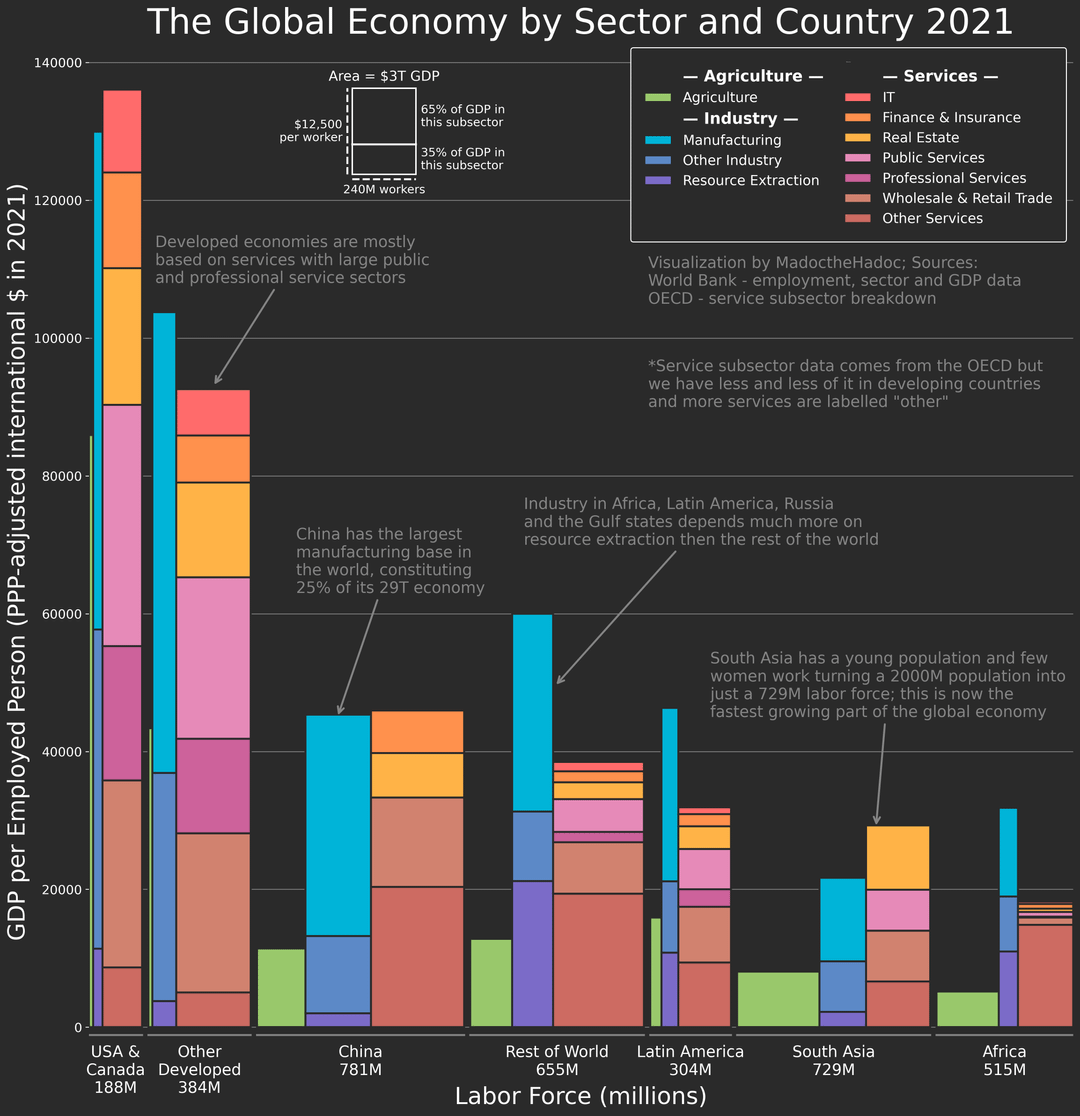
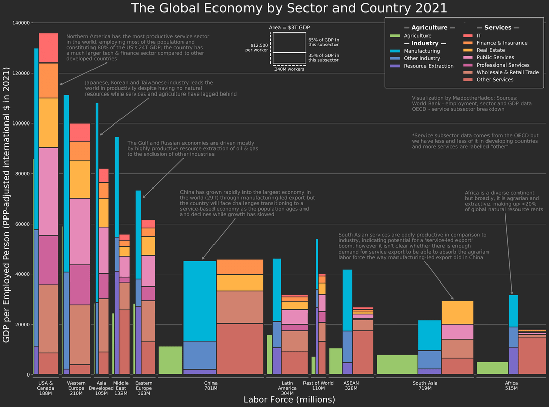
![[OC] The Global Economy by Sector and Country 2021](https://www.europesays.com/wp-content/uploads/2025/08/spraj98zdejf1-1080x1024.png)
Tools:
– I programmed this visualization myself using Matplotlib, it's a revamped (and much better looking) version of a visualization I posted here a week ago
Sources:
– I used the World Bank python API for almost all of the data
– I used the OECD for service sector data although as explained in the visualization, this dataset is patchy outside high-income countries
– The annotations are entirely my opinion as reading about this has become something of a hobby of mine recently, I intentionally made this text quite dark to let the data speak for itself more
To me, this visualization was worth making because the details connect so many others stories I know about:
– the failure of European tech compared to the US
– the fragility of resource dependence in extractive economies with little service productivity to back up the industrial base
– China's complete manufacturing dominance
– the abandonment of agricultural self-sufficiency in Japan
– India's surprising success in services and failure to industrialise, with parents who worked in agriculture having children that work as doctors, consultants and IT professionals
Posted by MadoctheHadoc
4 comments
This is an exceptionally well made graphic. No comments to add other than I’m very impressed.
I found this interesting! I think this would benefit from having a clearer split of Other Developed.
I really like the color palette and overall visual clarity. I think you could make the explanation of the relationship between the x- and y-axes more prominent. It’s an interesting way to represent a lot of different measures, but it breaks down a bit when attempting to compare two different sectors between different countries or horizontal sections (for example, a 2×10 rectangle has the same area as 4×5, but it’s difficult to compare them just by looking at them). Maybe it would be more effective as an interactive dashboard in tableau or something similar.
This is a very well made graphic, I’ve not seen such a well done illustration of labour force share and total value add for the tier 1 sector.
It’s quite unusual for me to see resource extraction in with manufacturing, resource extraction is a primary industry along with agriculture. Could you justify this choice to place it with manufacturing/secondary industries?
If you would like to make a second data set it’d doubtless be hard to keep it readable but I’d love to see the GDP PPP per capita for each of those sub sector breakdowns, ie allow a comparison of IT-other services- recourse extraction – pure manufacturing etc.
Comments are closed.