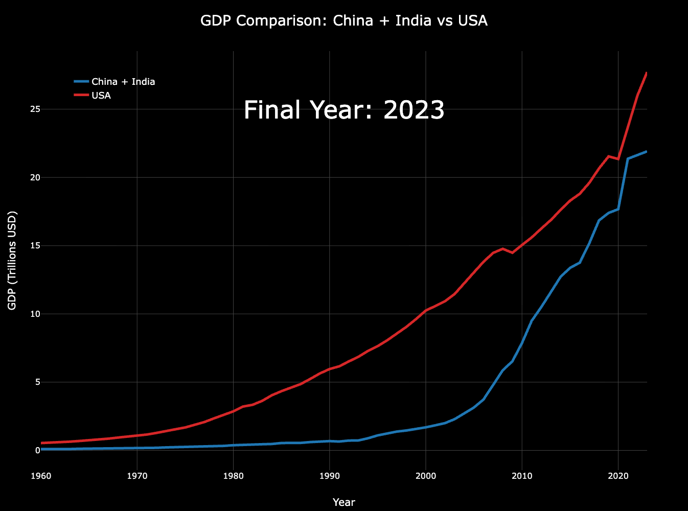
Data source: World Bank data
Tools: Jupyter notebook (pandas) and charts.js
Nominal GDP comparisons are extremely distorted by currency manipulation such as that practiced by China. Their “actual” GDP is a lot higher than what it is nominally because China artificially depreciates and keeps their currency value low to make their exports more attractive.
That’s why there’s seemingly no growth in Chinese GDP since 2020 when that couldn’t be further from the truth. A way to get around this is by measuring in PPP to get rid of currency fluctuations.
If you take out currency fluctuations, the Chinese economy grew nearly 57% from 2020 to 2025 and the US economy grew 43% over the same period. India managed 81% growth.
Please use the log, it would be so much better
Blue line: Almost 3 billion people
Red line: not even 350 millions
In what world is that comparable?
Comparing the *claimed* GDP. China’s numbers are highly dubious.
now do it by person inflation adjusted
“GDP” is vague, be specific about what you’re representing here
GDP is a horrible measure
Tends to be the case when you can print the world reserve currency out of thin air and dump it into your own economy
Why do you carry on India here? India’s GDP is 3.73 trillion, but China’s is 17.75 trillion. They are not even on the same level.
And the combination also doesn’t change anything. They are still far less than the US 26.95 trillion.
I’m not sure what the point of adding India into this is given that India’s GDP in 2023 was 6x smaller than China’s
GDP PPP
China $40 trillion
USA $30 trillion
India $18 trillion
Blue is falling behind but is it because of China or India?
During all us did was to print dollars. Because of dollar all that inflation is pushed on world
The entire world basically invests in the US, stores their money there, and uses USD as the global currency for everything. That gives the US tremendous freedom to print as much as they want without inflation, keeps prices low for their citizens, and inflates their own salaries and assets. It’s a crazy special case and hard to compare other countries to.
I sometimes wonder: What is the purpose of a post like this? Is this really what “data is beautiful” is about? The plot itself by no means meets the criteria of what users here would typically call “beautiful”. But much worse, what is the intention of this post? What’s the subtext?
To me it looks very self-congratulatory and also denigrating to people from south and east Asia – especially when I go through the comments this post attracted. Maybe I’m naive but shouldn’t a graph like this spark a discussion about the rampant inequality in the world or about the shortcomings of this metric (raw GDP numbers)?
Instead I find a wealth of derogatory and xenophobic comments against Asians, American exceptionalism, stupid shit about “Chinese and Indian tears” etc. Draw your own conclusions about what this implies about American society, I certainly draw mine.
Also worth pointing out: I usually call out propagandists and bots from China or Russia, but in what way is the above different? The account has exactly a 6 hour history that starts with this very post which can very easily be described as propaganda and would be called that if the data would have implied Chinese or Russian exceptionalism instead.
Can we please stop using GDP? None of that makes sense for the population supermajority. Have we not discussed the pizza example enough on Reddit?
17 comments
Data source: World Bank data
Tools: Jupyter notebook (pandas) and charts.js
Nominal GDP comparisons are extremely distorted by currency manipulation such as that practiced by China. Their “actual” GDP is a lot higher than what it is nominally because China artificially depreciates and keeps their currency value low to make their exports more attractive.
That’s why there’s seemingly no growth in Chinese GDP since 2020 when that couldn’t be further from the truth. A way to get around this is by measuring in PPP to get rid of currency fluctuations.
If you take out currency fluctuations, the Chinese economy grew nearly 57% from 2020 to 2025 and the US economy grew 43% over the same period. India managed 81% growth.
Please use the log, it would be so much better
Blue line: Almost 3 billion people
Red line: not even 350 millions
In what world is that comparable?
Comparing the *claimed* GDP. China’s numbers are highly dubious.
now do it by person inflation adjusted
“GDP” is vague, be specific about what you’re representing here
GDP is a horrible measure
Tends to be the case when you can print the world reserve currency out of thin air and dump it into your own economy
Why do you carry on India here? India’s GDP is 3.73 trillion, but China’s is 17.75 trillion. They are not even on the same level.
And the combination also doesn’t change anything. They are still far less than the US 26.95 trillion.
I’m not sure what the point of adding India into this is given that India’s GDP in 2023 was 6x smaller than China’s
GDP PPP
China $40 trillion
USA $30 trillion
India $18 trillion
Blue is falling behind but is it because of China or India?
During all us did was to print dollars. Because of dollar all that inflation is pushed on world
The entire world basically invests in the US, stores their money there, and uses USD as the global currency for everything. That gives the US tremendous freedom to print as much as they want without inflation, keeps prices low for their citizens, and inflates their own salaries and assets. It’s a crazy special case and hard to compare other countries to.
I sometimes wonder: What is the purpose of a post like this? Is this really what “data is beautiful” is about? The plot itself by no means meets the criteria of what users here would typically call “beautiful”. But much worse, what is the intention of this post? What’s the subtext?
To me it looks very self-congratulatory and also denigrating to people from south and east Asia – especially when I go through the comments this post attracted. Maybe I’m naive but shouldn’t a graph like this spark a discussion about the rampant inequality in the world or about the shortcomings of this metric (raw GDP numbers)?
Instead I find a wealth of derogatory and xenophobic comments against Asians, American exceptionalism, stupid shit about “Chinese and Indian tears” etc. Draw your own conclusions about what this implies about American society, I certainly draw mine.
Also worth pointing out: I usually call out propagandists and bots from China or Russia, but in what way is the above different? The account has exactly a 6 hour history that starts with this very post which can very easily be described as propaganda and would be called that if the data would have implied Chinese or Russian exceptionalism instead.
Can we please stop using GDP? None of that makes sense for the population supermajority. Have we not discussed the pizza example enough on Reddit?
Comments are closed.