Notes:
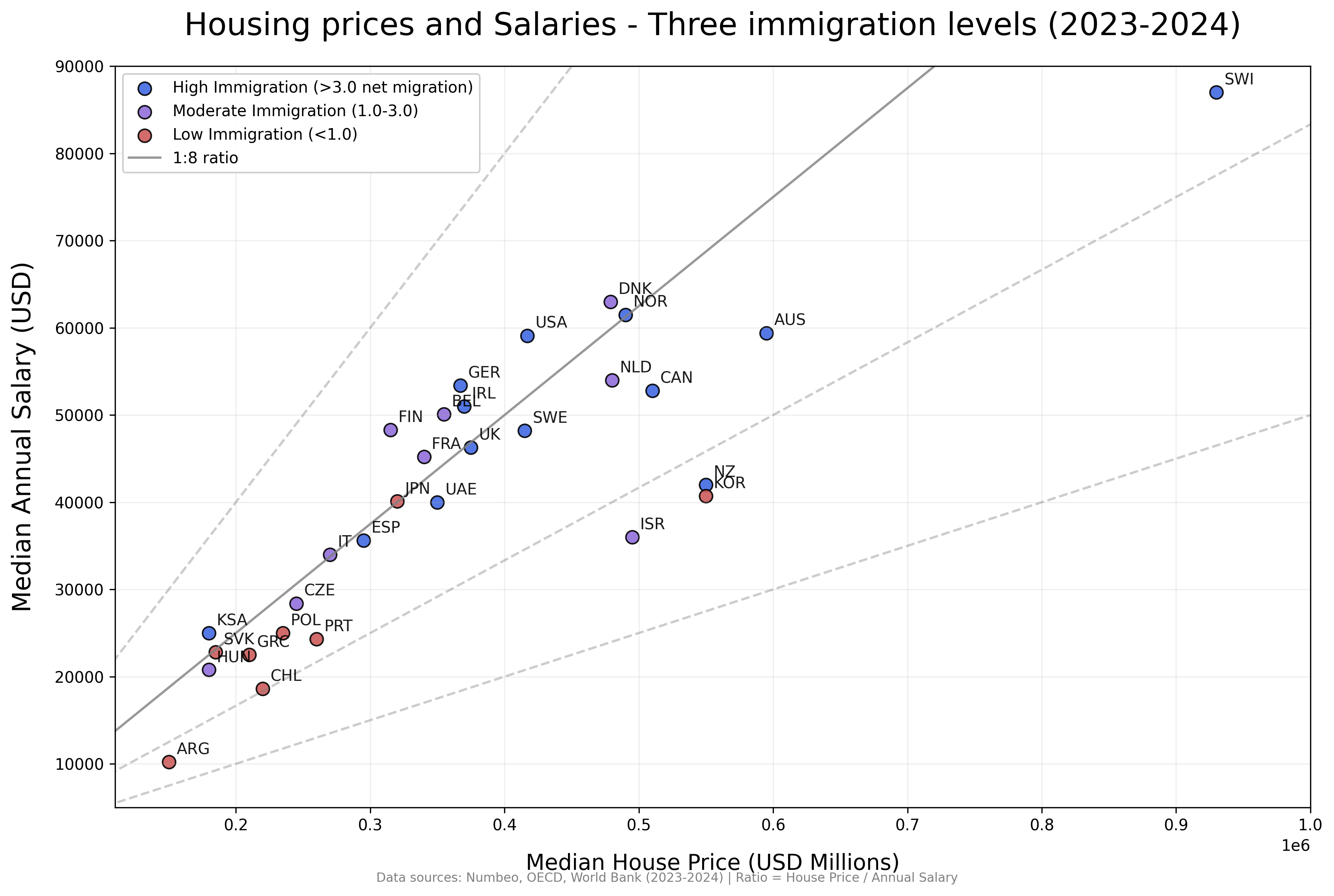
I only included countries with >0.830 HDI >5 Millions population.
Net migration rates are a cumulative average for the last 5-10 years.
Posted by Rauram99
![[OC] Housing prices and salaries - Three immigration levels (2023-2024)](https://www.europesays.com/wp-content/uploads/2025/08/7zm3o38belkf1-1920x1024.png)
Notes:
I only included countries with >0.830 HDI >5 Millions population.
Net migration rates are a cumulative average for the last 5-10 years.
Posted by Rauram99
31 comments
Sources: Numbeo, OECD, World Bank (2023-2024)
Done with python: [https://colab.research.google.com/drive/1OfgnSMIp5doRz6LE5-OWyR5NPYCDRT-9](https://colab.research.google.com/drive/1OfgnSMIp5doRz6LE5-OWyR5NPYCDRT-9)
The color axis here is difficult to really get a summary on. Is there a cor or cov between immigration and price/income ratio?
What exactly do the immigration rates mean sorry? Like what does “>3.0” mean.
This is an interesting graph. My interpretation is that immigration level plays a pretty minimal role in housing affordability. Given that 1:8 is the “standard” ratio used here. That seems to be basically telling me that housing is possibly not that much worse than it used to be. IF you are earning average or above average for your country and have two full-time incomes. If you’re missing either of those it’s worse.
Doesn’t really look like there’s any correlation with immigration levels here.
What’s with AUS btw? Chinese/American expats? Just lack of land? (Obviously this has nothing to do with the data presentation).
Having lived abroad, I feel like USA salaries are inflated. When you factor in healthcare costs and the fact that cars/insurance are mandatory, a 60k salary in the US feels like a €30k salary in France
Just use the House prices vs Median Income on the y axis — you could even include the ratio to lower and upper quartiles of the Median Income using dedicated box plots, or even density shapes if you have this data. Then use the x axis to gain granularity on the actual immigration level directly.
I dont understand how Chile is “low immigration”. Immigration is booming, and upsetting Chileans.
Housing in the USA is more affordable than in places like Poland and Portugal? That’s actually insane.
This to me seems like a correlative nightmare. I would assume immigrants are less likely to move to places with lower salaries and, importantly, employment prospects. High salaries and healthy relative employment is correlated to higher median housing prices.
So which way is it? Does immigration drive median housing costs up? Have no impact? Have minimal impact at a certain level of immigration?
Soo countries that have a lot of money and high house prices allow immigrants? Or are you trying to say lax immigration promotes high salaries and home costs?
Why not throw immigration on x axis since that’s what you’re trying to prove (unsuccessfully, albeit). If you run a PCA on all factors that might influence home price, immigration doesn’t crack the top 10.
This is good data although maybe rate of change in home price would be a better way to assess the effect of immigration. Anglo countries have high rates of home price growth and immigration
It’s not great to compare at the national scale as many modern nations have a strong urban-rural divide.
Better to compare the major cities of any given nation, or the typical small town of any given nation.
It seems like you’re trying to draw causation from loosely correlated indicators.
It seems logical that higher relative salaries would drive higher housing prices in most markets. So the correlation between the X and Y axis seems obvious, and it’s interesting to see where things fall on either side of the 1:8 ratio line, I think.
I’m not sure how much immigration levels fit in though… most immigration is economic and therefore the countries offering the highest salaries generally see the highest immigration levels. And high salaries generally would mean a tighter labor market, again, incentivizing more immigrants. But it doesn’t seem to add anything to the conversation about housing prices.
What is missing from understanding anything about housing prices is housing supply growth and policy relative to net migration and birthrates.
I think the Median Annual Salary variable should be on the x axis and make the Median House Price the dependent variable.
What point are you trying to make with this plot? Color scale is not very clear. All I’m getting is that salaries and housing prices are correlated.
This would seem to imply that US house prices are actually underpriced relative to other major economies, which is wild is true.
I never bought the argument low income, male workers from a 3rd world working at Tim Hortons, Walmart, Costco, etc. led to the massive housing appreciation.
It’s money printing
This isn’t a great way to visualise this data.
If you want to know what the correlation is between immigration and houseprice-to-income ratio, make those your axes.
Is 1:8 a particularly meaningful number? Is it the average?
What are the units for net migration? Percent population per year?
Why is the y axis in dollars and the x in millions of dollars? They could both in thousands and be within one order of magnitude.
Maybe I’m dumb but why would you not put immigration levels on one of the axes and home price as a percent of median income on the other?
At first glance I thought this showed a correlation with immigration and house prices, but now I realize I should be looking at the colors of the dots and it’s very hard to see if there’s an actual correlation there.
It’s almost like there’s an underlying cause to both….
Like the country’s level of wealth
Data is indeed beautiful. This though, is not.
I think your axis are the wrong way round. You’d really want the dependent variable on the Y axis.
Also what’s your 1.8 ratio line? Did you just pick a number or did you build some statistical model? Likewise what are the dotted lines?
What is the point? High immigration does not mean high housing prices.
Might adjust for the effective tax rate of the median income per country! Purchasing and servicing a payment (for the most part) comes from after tax income, but might be a hard data set to pull together
For some reason, I assumed below the solid line is better. Then I saw Canada and Australia. Based on how much they complained about home un-affordablity, I knew my assumption is wrong.
Damn this is damning for high immigration places
My recommendation would be to actually convert this to just a multiplier of annual salary pre-tax including benefits versus median housing price and then represent immigration on a continuous scale.
the lower the multiplier => the better for affordability, set x-axis to immigration levels then the correlation will either fall out obviously or not
So people dont immigrate a much to countries with lower average incomes as much as they do to countries with higher average incomes.
Huh.
This is the best demonstration of correlation not being causation I have ever seen. The only sensible conclusion is THE OPPOSITE of what is being implied.
People want to integrate into more prosperous places.
Comments are closed.