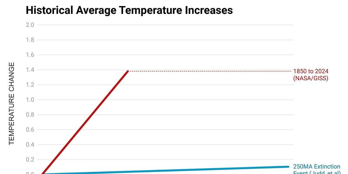
We Made a Graph | Here at Climate Town we almost never make our own graphs. But, these are not normal times. And so we have officially generated one simple and quite striking (beautiful even?) graph…
https://www.climatetown.news/p/we-made-a-graph
by crustose_lichen
3 comments
The graph is confusingly labeled. What are the units of the x-axis? I know the units should be degrees Celsius, but that’s not a temperature change, that’s a temperature. Temperature change should have units of degrees Celsius per year, or some other equivalent unit. Otherwise, reading the graph we may think that the temperature changed by 0.2, then by 0.4, then by 0.6, and so on, and we would have to take the definite integral of that curve from t = 0 to t = 150 to get the change in temperature. I see what you are trying to do, which is put our current climate change in perspective with the rest of Earth’s climate history, and we do need ways to put that in perspective that people can see, because people do not seem to be able to see it.
Thank you for finally making this fact so clear to skeptics. Everybody’s main argument against climate change is that the climate has changed in the past, so what’s the problem? Props to you!
Speed kills.
Comments are closed.