![[OC] Overall ranking for 51+ Countries](https://www.europesays.com/wp-content/uploads/2025/08/vt6dhwv55zkf1-1034x1024.png)
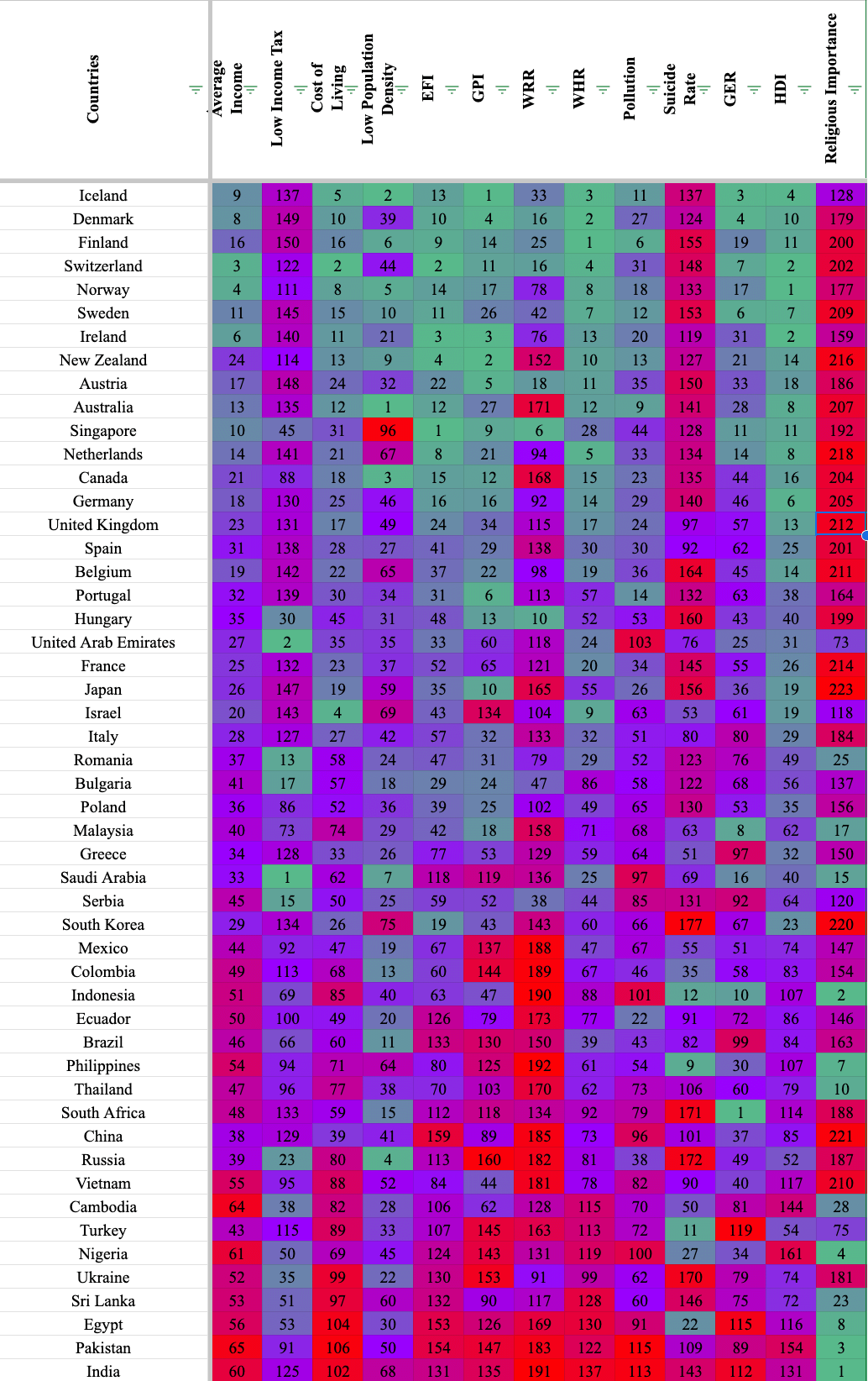
My sheets document includes the sources, but the ranking uses 13 different sources. Sadly, not every country is included in every source so you will see blank spaces for countries that are left out in the data. I've also created a correlation index to see how different metrics matched up with each other and you can see the data I used for each ranking.
https://docs.google.com/spreadsheets/d/1YbfVevxEthNgDtK69P48Xm39bXLHi8eqfeFwxTTYEJE/edit?usp=sharing
Hope you like it, lemme know if you have any questions.
Posted by FluidModeNetwork
8 comments
This is definitely not beautiful.
Religious importance should not be colorized really
Only 51 nations. You’re not playing with a full deck.
What does religious importance mean? Is it bad or good?
Because I’m seen countries where no one cares about your religion getting 180 points for some reason. If that’s good then why is it red?
Color scheme is rough. Id suggest going from white to a single color.
Would have been great to have a legend for acronyms.
Also does every components have the equivalent weight when it comes to the order they are in ? If so, why not add a total ?
There seems to be a quite clear correlation between religious importance and general outcome.. Of course, correlation isn’t causation, but interesting nonetheless
Cool data set! Is there any reason you left off the United States?
Comments are closed.